iOS 7 Squandered a Year of Third-Party Development on Superficial Changes
I feel compelled to lard the beginning of any critique of Apple with clarifications about how much I admire them and their work. Too often these kinds of discussions decay into apple fanbois are sheep lolz. So if you’re looking for some sick burns on Apple and iOS, you’re going to be disappointed.
With that out of the way, allow me to say that I’m frustrated with the current state of affairs on iOS. It’s been almost a year since version 7.0 was announced, yet as a developer I feel like a year’s worth of work has brought about only superficial changes to the apps I work on and the apps I use.
All the big problems facing iOS in the summer of 2013 are still with us. Some have gotten even worse. It’s still impossible for customers to easily discover new apps. It’s still impractical for apps to interact with the same data and documents. It’s still unclear what the role of the iPad is supposed to be in a lifestyle filled with digital devices. Paid app sales are still sagging as scummy IAP business models are enjoying the lion’s share of App Store promotion and profit. Productivity apps are still unsustainable.
Please note what I am not saying. I am not saying that iOS 7 was a bad update. While I think some of its visual choices are mind-boggling, there’s also a lot to like. New APIs like UIView snapshots, UIDynamics, and background app refreshing are welcome improvements. But I don’t judge iOS 7 in isolation from other concerns. Set against the context of all the challenges facing iOS last year, it’s hard to regard iOS 7 as anything but a superficial update. The bulk of the changes were visual in nature. None of them addressed the elephants in the room.
Fast-forwarding a year, the effect that iOS 7 has had on third party development is disheartening — which sounds like a fatuous thing to say, since there have been so many well-liked redesigns over the past year. But that’s the rub: the vast majority of third-party developers’ time has been spent redesigning and reimplementing apps to dress the part for iOS 7. Many shops, such as Tapbots and Cultured Code, were forced to delay new products indefinitely while they scrapped ongoing work in favor of reboots. I suspect that many other developers had to make similar decisions.
Some folks argue that the iOS 7 “flattening” was an urgent need. iOS 6, they claim, was looking long-in-the-tooth compared to Android and Windows Phone. They might be right from an informed designer’s perspective, but they’re wrong if they think that this was an urgent problem. Apple’s most important indicators for the success of iOS software, install base and customer satisfaction, were extremely high with iOS 6. It was a popular OS that showed no signs of waning in popularity. A total redesign of the OS — especially one that abandoned key visual brand elements in favor of an aesthetic that looks like every other popular OS — was an unnecessary risk.
The visual overhaul obligated third-party devs to follow suit. It reset all of their product pipelines, setting them back months or years. Developers, being the hard-working and clever folks that they are, made the best of the crisis. Lots of fresh ideas were shipped since last fall. But the bulk of the apps released over the last year are only superficially different from the apps they replaced. In many ways, the App Store is still stuck where it was on June 1st, 2013.
CocoaRadio
Justin Williams has started a new podcast called CocoaRadio. I like CocoaRadio’s premise a lot. It aims to be a tech podcast that doesn’t shy away from diving deep into technical discussions. He had me on as a guest to talk shop about OvershareKit, an open source iOS sharing library we launched together in October.
Bug in Videos.app Doesn't Clear Cached Data for Streamed TV Shows and Movies
If you’ve had problems with your iOS device frequently running out of disk space and you stream lots of video using Videos.app, you’ve probably encountered this bug without knowing it.
TV shows and movies purchased via iTunes can be “streamed” to your iPhone or iPad. From what I can tell, however, Videos.app’s implementation of this feature is not truly streaming those purchases. The content is not served in the same way that Apple recommends for third-party apps (HTTP Live Streaming). Instead, videos are downloaded in full (or at least very high) quality while the user watches them.
One way I can tell that videos are not streamed with HTTP Live Streaming is that videos never downgrade to a lower playback quality under poor network conditions. They simply fail to play. Videos.app also silently disables the streaming feature when the device is not connected to a Wi-Fi network.
If I stream enough video, I notice that an enormous amount of disk space steadily disappears without a trace. I verify this via the Usage screen in my device’s Settings.app. Strangely, one signal that the bug has taken hold of my device is I start to see “No Data” reported for these three apps:
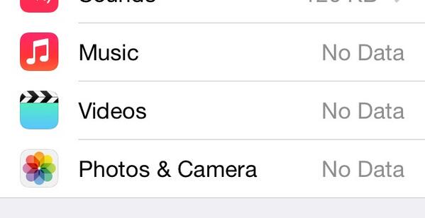
Music, Photos, and Videos falsely reporting “No Data.”.
It’s only by the total available size listed at the top of the Usage screen that I can tell how much disk space is actually being consumed.
After streaming lots of video in Videos.app, if I expand the full list of apps in this Usage screen and total all their used disk space, I find that there’s as much as 5 to 10 gigabytes of “dark matter” data unaccounted for – assuming, for the sake of diagnosis, that those three “No Data” values are valid (which they aren’t).
Hang on, this bug gets even weirder.
This bug has been present in iOS 7 since the first betas through at least version 7.1.1 The odd thing is that during the beta period, it was possible to delete cached videos by swiping right-to-left across a table view cell in Videos.app. There was no visual affordance for this. I discovered it by accident. After performing the delete gesture on all streamed videos, the Usage screen in Settings.app reported a correct amount of free disk space.
But hang on, this gets even weirder still.
You could only perform the delete gesture on cells for videos which you had streamed. Cells for videos you didn’t watch at all would not respond to the gesture. Since there was no visual difference between the two, the only way I could clean up after watching a season of The Sopranos was to try swiping to delete on every single cell in the table view. Ugh.
And weirder.
The publicly-available versions of iOS 7 disabled the swipe to delete feature for streamed content. I assumed – incorrectly – that the feature was removed because cached video content was being automatically removed from disk. This turns out not to be the case, as I have discovered tonight. This means that the developers of Videos.app removed the only way to delete cached video, seemingly without replacing it with any other cache-clearing strategy. Maybe it’s just an oversight, but either way it’s frustrating.
As of tonight, the only way I’ve found to delete cached Videos.app content is to sign out of my Home Sharing account in Setting.app’s “Videos” screen, launching Videos.app, then signing back into Home Sharing again. When I followed those steps tonight on my iPad, 7.5 gigabytes of free disk space reappeared. I had not downloaded any videos. I only used the streaming feature.
A side note for all iOS developers: if your app has an on-disk cache, please provide a simple mechanism for users to manually clear the cache. I also discovered a similar bug in Dropbox.app tonight. There was 3.5 gigabytes of cached data being stored on disk by Dropbox, without any way to clear it except to delete and reinstall the app.
If you use Unread, you can clear the on-disk image cache at the bottom of Unread’s settings screen.
-
I haven’t had a chance to test 7.1.1 yet. ↩
Friday App Design Review – eHarmony
Every Friday I will post a detailed design review of an iOS app. If you’d like your app to be considered click here for more information. I am also available to consult privately on your projects.
About eHarmony
This week’s design review is of the eHarmony iPhone app, by the online dating service of the same name. From eHarmony’s description of itself:
Santa Monica-based eHarmony launched in the United States in 2000 and is now the #1 Trusted Relationship Services Provider in the USA. eHarmony’s patented Compatibility Matching System® allows eHarmony members to be matched with compatible persons with whom they are likely to enjoy a long-term relationship.
eHarmony faces fresh competition from companies like OK Cupid and Tinder. Tinder’s app in particular is much more casual and fun than the eHarmony app. But that doesn’t mean that Tinder’s dating recommendations are better. The typical eHarmony customer is looking for a potentially serious, long-term relationship. eHarmony has to figure out how to appeal to a younger crowd without undermining the personality questionnaire that is both a chore and the secret ingredient to eHarmony’s superior recommendations.
Chris Truman, an iOS engineer at eHarmony, bravely submitted their app for a Friday App Design Review. I like his attitude:
I think a high profile app like eHarmony would be a great example of how older companies can still have a clean and focused mobile product.
TL/DR
The eHarmony iPhone app is huge. It feels like three or four apps crammed into one. It was hard for me to decide where I should focus this review. If there’s a theme to my critique, it’s ruthlessly eliminate confusion. I have three general recommendations:
App Walkthrough
For those unfamiliar with the eHarmony app, what follows is a brief description of the way it works.
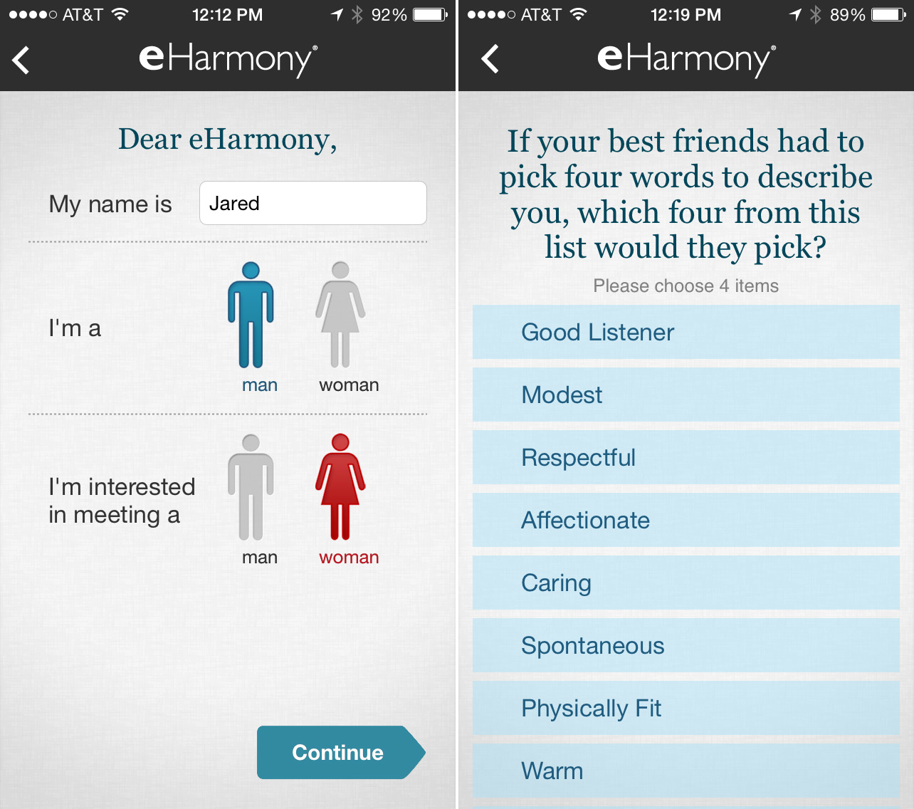
Upon first launch the user is guided through a lengthy questionnaire. There are dozens of questions, presented one at a time in a full-screen view:
Two of many question screens.
Questions are interspersed with section dividers that help break up the monotony of the questions and encourage the user to keep going:
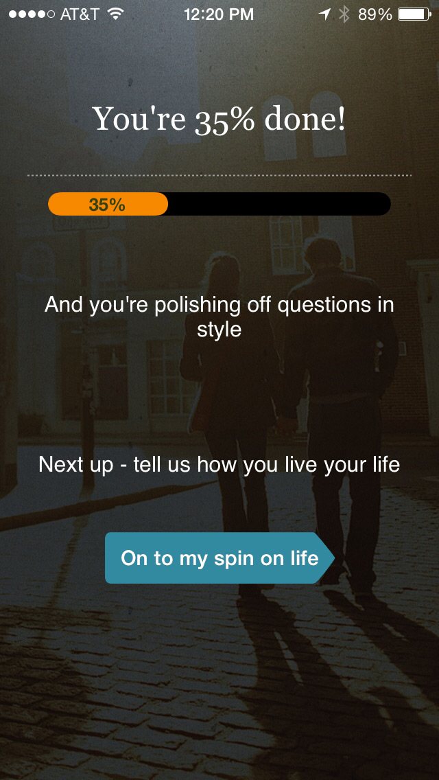
Interstitial screen between sections.
The questionnaire is the mission-critical component of eHarmony’s recommendation engine. The more honestly and thoroughly a user answers these questions, the more compatible her suggested matches will be.
Imagine how difficult a design challenge this must be. In order for your customers to have a happy experience, you must first compel them to take a tedious and potentially embarrassing test. Their long-term satisfaction with your service depends upon the quality of their answers, so there’s a limit to how much sugar you can pile on that pill.
After the completion of the questionnaire, the user is shown what is the eHarmony app proper:
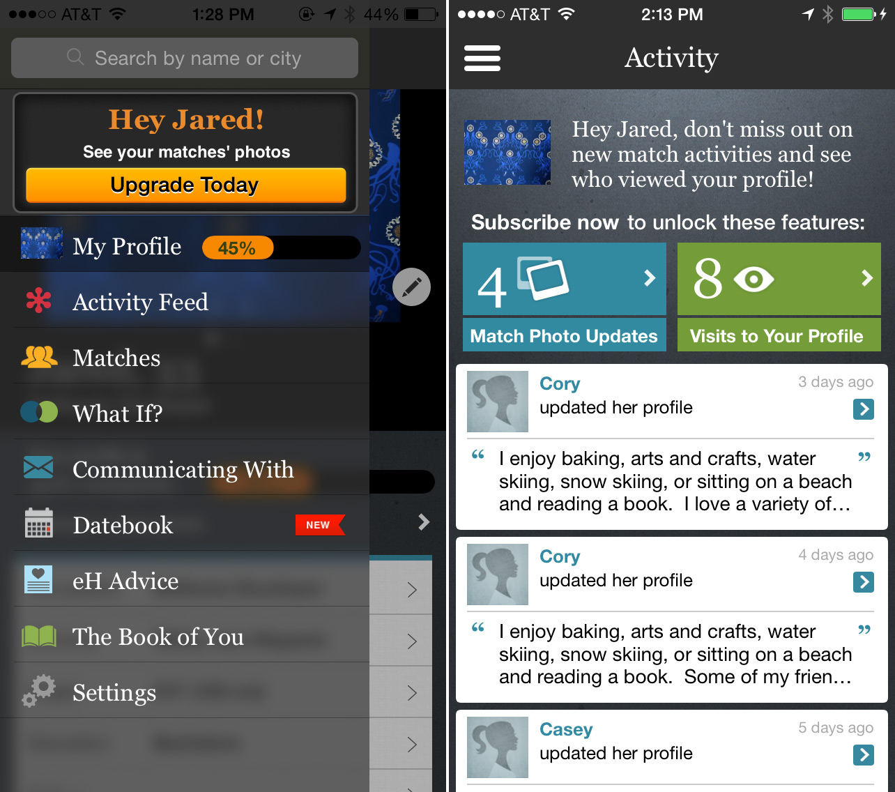
The app proper, with basement menu.
There are many screens in the app – My Profile, Activity, Matches, etc. – all accessible from a super-imposed basement menu that can only be invoked by tapping the hamburger button in the top left corner.
I. Reduce Visual Clutter
Unfortunately, I’m going to have to get a little harsh. In all of the screens of the app, there is simply too much visual activity. There are decorative views and calls-to-action all over the place. The basement menu alone has a banner, a button, a badge, a ribbon, and a progress indicator (see above).
All of these elements might be important, but they can’t be equally important. Some of them must be sacrificed for the sake of the greater good. Strip away at least half of the supplementary elements. It might be painful for the designer, but it will make the app easier for first-time users.
The visual language needs to be consolidated. The current aesthetic is what I call Tower of Babel Design. The app is equal parts flat colors, linen textures, and granite backgrounds. Notice the disorienting mix of iOS 7 and iOS 6 styles in the basement menu screenshot above. An app can’t have two masters. It’s gotta serve somebody, Ive or Forstall.
I think the blurred background of the basement menu is not helpful for either aesthetic. It unnecessarily increases the density of visual information in an area of the app that already has a dense population. I’d love to know what the rationale was for using it. As an unforgiving outsider, it looks like someone was groping for a shortcut to an iOS 7 redesign.
Pick a few constraints – a color palette, a font, a texture or a lack thereof – and enforce them ruthlessly. This has the added benefit of speeding up future design and development iterations. It’s hard to overstate how helpful constraints can be.
Aside from making the app more visually appealing, reducing visual clutter communicates an important message to the user: we care. A spotless, well-stocked bathroom makes you trust your favorite restaurant. In the same way, a tidy aesthetic creates confidence in an app’s capabilities.
II. ABO: Always Be On-Boarding.
When I finished the questionnaire, I felt like I emerged from a long tunnel only to be abandoned in the middle of a vast, complicated app. I was still a newcomer without any idea of where I should go next.
Take a cue from video games. Well-designed contemporary games weave tutorial content seamlessly into the progression of the story. Take a look at Portal 2 for an excellent example.

Portal 2.
Here’s a transcript of my favorite part (paraphrased):
Your character has been in suspended animation for very long time.
WHEATLEY
Let’s make sure you don’t have any brain damage. Now say “Apple.”
TUTORIAL
Press ‘A’ to Say ‘Apple’.
Your character jumps.
WHEATLEY
Umm… Let’s try that again.
TUTORIAL
Press ‘A’ to Say ‘Apple’.
Your character jumps again.
WHEATLEY
Okay, what you’re doing is jumping. You just jumped. Let’s just move on.
That scene elevates what would have been an otherwise frustrating moment of accidental discovery into a hilarious guided tour. The game progresses in a similar fashion, using ambient voice overs and character interactions to subtly teach the gamer basic skills. The next objective is always clear, and the gamer learns new skills without feeling lost or bored.
In eHarmony, when the questionnaire is over, the user lands on the Activity screen with the basement menu waiting in the wings. There are many competing calls-to-action without an obvious order or hierarchy. A better approach would continue to guide the user through the various features of the app. Limit the calls-to-action to just one at a time. Start with the easy stuff, and then get more complex.
One has to be careful when implementing in-app tutorials. It’s easy to over do it. For an example of what not to do, look at this mess that Apple shipped with iPhoto for iPad:
iPhoto for iPad, Version 1.
One of the reasons that iPhoto’s tutorial sucks is that the app launches with every available feature fully unlocked and exposed. It’s too much for the user to take in all at once. If only one or two key features were available at first, those seventeen(!) popovers could be reduced to a handful.
eHarmony has a similar amount of feature complexity. There are ten screens to choose from in the basement menu, and each screen has its own subcategories and sections. It’s difficult to figure out which, if any, is the main screen of the app.
Again, a solution could be to take a cue from video game design. Character abilities are rarely available all at once. They are unlocked as the gamer progresses through an in-game tutorial. New abilities are announced with little moments of fanfare, creating a sense of accomplishment and expertise.
eHarmony could stagger the unveiling of “new” features across multiple launches, perhaps even multiple days. Begin with only one or two essential features, like the Matches screen and the user’s profile. Guide the user through a combination of fun prompts and limited functionality. Even if the user ignores the prompts, she’ll have fewer corners to get lost in. First time users don’t need to see screens like Datebook or eH Advice.
Choose a layout that lends itself to this kind of staggered approach. A basement menu is just one possibility among others. However the app is laid out, bear in mind that newly-unlocked features might not be discoverable if they’re buried in an offscreen menu.
III. Make Messaging the Centerpiece
It should go without saying that a typical eHarmony user is looking for companionship. Whether he or she wants a serious or lighthearted relationship, eHarmony’s private messaging feature is the shortest path for the user to feel less alone when interacting with the app. This feature is difficult to find in the current version of the app.
I’ve had a test account1 for the last two weeks. A few days after I set it up, I received a private message from another (anonymous) user. I learned about this interaction via an automated email. But when I launched the eHarmony iPhone app to respond to the message, it took me several tries to find it. I finally found it buried at the bottom of a long list of generic Activity updates (so-and-so updated her profile, etc.).
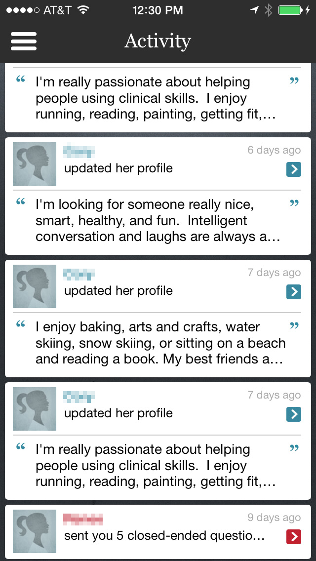
Activity screen, way at the bottom.
Tapping the message summary at the bottom takes me to this screen:
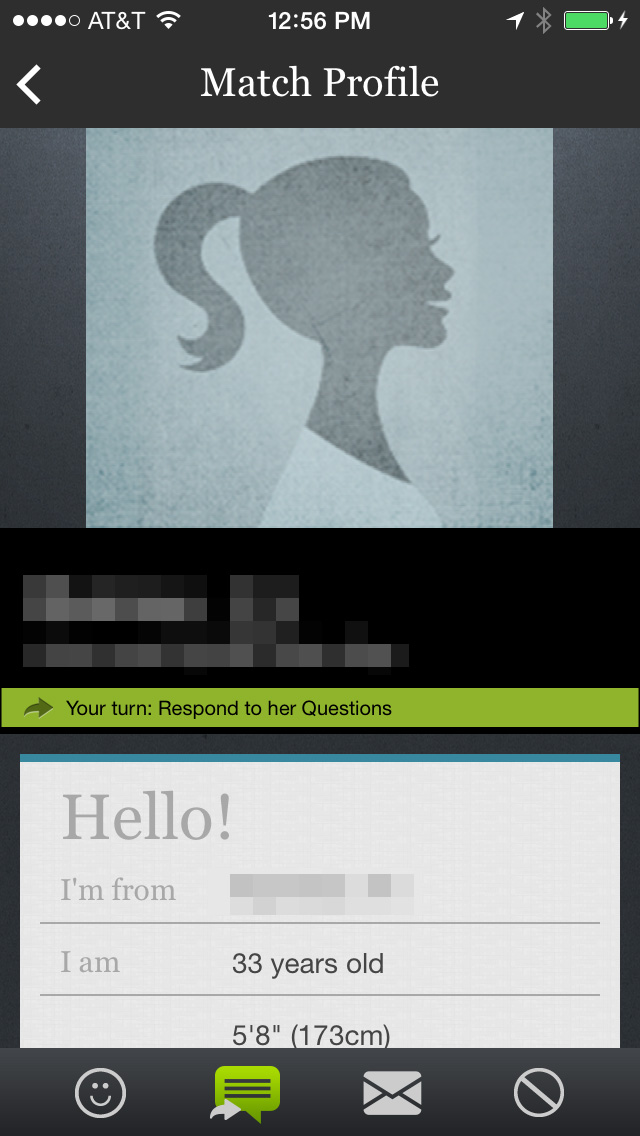
Profile / Messaging Screen.
Can you spot where I’m supposed to tap to respond to her questions? I can tap either the tiny green bar that looks like a section header, or the green chat bubble in the toolbar.
The iconography in that toolbar needs work. Why are there two messaging icons? Is one public and one private? Why is the chat bubble green? Tapping the chat bubble shows another screen. The green highlight is a misuse of the visual language of a UITabBar. It has a selected appearance when it isn’t actually selectable. It’s a button. For several minutes I assumed that I was already viewing that tab, until I tried tapping one of the other items, triggering an unexpected push transition.
But let’s not get lost in the weeds of these minor quibbles. I have a more dramatic suggestion. I think the entire concept of this screen ought to be thrown out and replaced with something more intimate and familiar.
SMS Butterflies in my Stomach
I would style this screen to look like a generic SMS conversation. Visual associations are powerful. We can all remember the thrill of getting a text from a new crush. Build an interface that brings back memories of being a teenager with butterflies in one’s stomach. For some of us, those memories might be fairly recent.
I would consider going even further down this road. Perhaps the basement menu and all its screens should be tossed away. Reduce the app to two sections: private conversations, and a place for finding new matches. There’s no need for a custom calendar or an advice column. Make it easy for people to find a match, and their desire for conversation and companionship should take care of the rest.
Thoreau said it best:
No word is oftener on the lips of men than Friendship, and indeed no thought is more familiar to their aspirations. All men are dreaming of it, and its drama, which is always a tragedy, is enacted daily. It is the secret of the universe. You may thread the town, you may wander the country, and none shall ever speak of it, yet thought is everywhere busy about it, and the idea of what is possible in this respect affects our behavior toward all new men and women, and a great many old ones.
-
Sorry, ladies, I’m happily married. ↩
Giving Up On The iPad
I can’t find a way out of an uncomfortable conclusion. In order for the iPad to fulfill its supposed Post-PC destiny, it has to either become more like an iPhone or more like a Mac. But it can’t do either without losing its raison d’être.
Multiple Purposes, One or Two Uses
Although both the iPhone and the iPad are multi-purpose devices, it seems only the iPhone fills a multi-purpose need in customers’ lives. A typical1 customer’s iPhone is put to work in all its capacity, while her iPad is relegated to only one or two niche uses. An iPhone is a phone, a flashlight, a GPS navigator, a camera, etc. An iPad can be most of those things, but in practice it gets stuck being just one or two of them.
The two devices are nearly identical in their technical specifications. They’re constructed from similar materials. They have the same operating system, chips, and sensors. It seems they differ only in size. The canned rebuttal to this comparison is that the iPad is more than “just a big iPod”. It’s a “Post-PC” device, capable of both content creation and consumption, destined to usurp the PC as the essential tool for getting shit done.
iPad apologists are half right. The iPad isn’t a big iPod, but it isn’t more than that. In a way it’s less. Customers use it for only one or two of several niche purposes:
Private Reading – Books, magazines, and web sites.
Family Entertainment – TV, movies, and gaming.
Productivity – Notepad, calendar, sometimes not much more than a portable typewriter.
Professional Tools – Think of the myriad, mutually-exclusive uses portrayed in the Your Verse series of Apple ads. Unless you’re a tap-dancing molecular biologist filming your latest travel documentary, then your iPad is most likely a single-purpose professional tool.
Education – Substitute for textbooks and handouts.
Every iPad has the latent capacity for many uses, but individual customers don’t have a need for all of them. The iPad over-serves the needs of its typical owner. Elementary school students don’t need surgery guides. Videographers don’t need to play Clash of Clans on the way to Grandma’s.
iPhone vs iPad vs Mac
There are exceptions, areas in which the iPad under-serves customers’ needs. The problem for the iPad is that these are the same areas in which either the iPhone or the Mac are already better-suited to the task at hand.
A Mac is Better Than an iPad for…
Workplace Productivity – The Mac has an exposed file system, physical keyboard, a pixel-accurate pointing device, and multitasking applications, all of which contribute to more efficient workflows.
Power Computing – There are some professional tasks that require powerful processors, expansion ports, large storage devices, multiple displays, etc. These features are only available on a PC.
An iPhone is Better Than an iPad for…
Taking Pictures – The iPhone is more portable and more discreet, which means it takes more and better photographs. It usually has a better lens and sensor, too.
Messaging & Social Media – It’s easier to stay connected to family and friends on the iPhone. Because it’s smaller than the iPad, it’s much more likely to be in your pocket or purse. Because it’s sold with carrier subsidies, it’s far more likely to have a mobile data plan, which ensures you rarely miss an important message.
Way-Finding via GPS – An iPhone is better than an iPad at GPS navigation, for the same reasons as it’s better at messaging: portability and cellular data. This is true even in spite of having a smaller display.
So What’s the Point of the iPad?
The iPad can’t get better at these tasks without becoming either more like an iPhone or more like a Mac. For the iPad to become just as good as the iPhone, it would need to be smaller, equipped with a better camera, and sold with carrier subsidies and mobile data plans. But this would turn it into “just a big iPhone.” So this can’t be iPad’s future.
For the iPad to become just as good as the Mac, it would need to be larger, faster, equipped with expansion ports, and powered by software that supports legacy features like windowed applications and an exposed file system. But this would turn the iPad into a Macbook Pro with a touch screen and a detachable keyboard. This can’t be iPad’s future, either.
I think the future of the iPad is for it to disappear, absorbed at the low end by iPhones with large displays and at the high end by Macs running a more iOS-like flavor of OS X.
-
Anecdotal evidence abounds, but it would be nice if there was publicly-available data to back up my claim. ↩