Friday App Design Review – Code Review, an Inbox for GitHub Pull Requests
Every Friday I will post a detailed design review of an iOS app. If you’d like your app to be considered click here for more information. I am also available to consult privately on your projects.
About Code Review
One of my favorite kinds of apps is the Does One Thing and Does it Well category, especially when such an app is laced with clever and delightful details. Code Review, the subject of this week’s Friday App Design Review, is on the right path to that category. Code Review is currently in beta, so this review is also a sneak peek. Lots of thanks to Jackson Harper, Code Review’s developer, for the invitation.
Code Review has a strong foundation, even in its beta form. It has a simple visual language that strays from stock UIKit in flattering ways. My recommendations are mostly about addressing small infractions that undercut the delightful clarity of the whole.
How it Works
Code Review is a tool for triaging and responding to GitHub pull requests. I’m going to assume that readers of this blog know what a “pull request” is. My apologies if you’ve stumbled into a nerd puddle. Code Review can manage pull requests from any of the projects which you maintain. The work flow is similar to email, in a good way.
Basic Layout
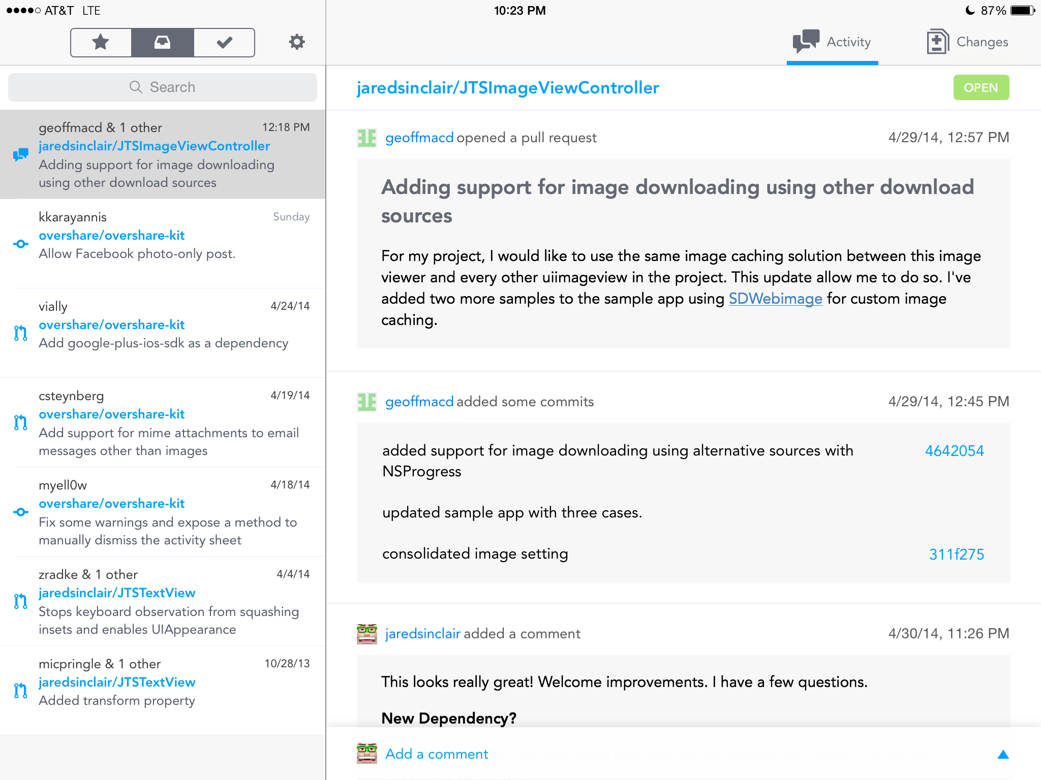
The app uses a split view controller layout familiar to all iPad users.
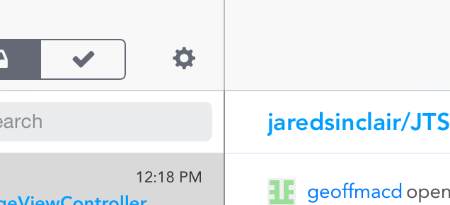
On the left is a list of all open pull requests in a unified inbox. On the right is a detail view. The split view controller’s vertical score between the master and detail pane is lighter in the navigation bar area than it is between the two content areas.
I’d make this one contiguous color, to strengthen the separation of the master pane from the detail pane. This border should always look stronger than the border between the navigation bars and the content below.
Typography
Code Review is set in Avenir. I can’t thank Jackson enough for not using Helvetica Neue. Typographers have known since the 1960s that Helvetica and its ilk are not readable typefaces for body text. I’m bewildered that Apple still insists on it for iOS’ system typeface. Code Review’s use of Avenir is another way it avoids looking like a came-with-the-frame app.
Unfortunately, Code Review’s point sizes are too small. It’s difficult to read the text in many areas, especially on an iPad mini. Even if there are plans to make the font size user adjustable, the default font size should be at least 1.5 times larger. A default font size should be comfortably legible to someone with below-average near-field vision.
Unified Inbox
Items in the inbox can be starred them to remember them later, or archived to remove them from the inbox view. A segmented control at the top of the list toggles between the three states: starred, inbox, and archived. Sliding an item in the list to the left or right triggers starring or archiving, respectively.
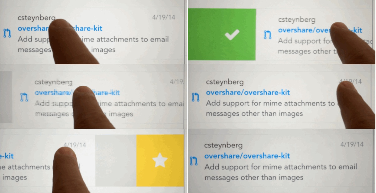
Sliding gesture to trigger actions.
A minor gripe: the star icon should travel with the swipe the same way that the checkmark currently does.
I love that I can star or archive pull requests so they’re not always visible in my inbox. This is, I think, the killer feature of Code Review. That and the fact that it’s a unified inbox, combining pull requests from all the repos I manage into one list.
It’s too bad that the starring and archiving features are not backed by an official GitHub API, but I appreciate the features too much to suggest not including them.
I like that when I tap the segmented control at the top, the master list animates in the direction of the selected tab. It creates a strong spatial memory, an important component of a comfortable app.
I don’t understand why the starring and archiving gestures are placed on the opposite positions from their counterparts in the segmented control above. This inconsistency confuses me. I would swap their positions.
Iconography
The iconography is clean and a little chunky, in a good way. This is one example of how Code Review strays from a stock UIKit aesthetic in a flattering manner.
These icons are easier to read and look more tappable. It doesn’t hurt that they’re pretty, either.
Icon design is difficult. How do you represent “archiving” with an image? This is even harder when you also need an icon to represent an inbox. The current archiving checkmark icon is not self-explanatory. I assumed activating the checkmark gesture would auto-merge the pull request. So I didn’t bother to use it until I had a chance to ask Jackson what it did. Perhaps there’s a better way?
Colors
The master list has pleasant colors. Each of the three sections has its own theme color: yellow, gray, or green. I’d prefer if the titles of the cells in the master list changed color based on which tab is the active tab. Right now they’re always blue.

Yellow on white is hard to read.
Yellow on white is a challenging combination. I suggest using a warmer, darker yellow, for legibility. There are hues and shades that are stronger than the current one which are no less yellow in spirit.
Detail View
In the detail view you can read all the comments and commits from a request in a unified timeline. New items appear at the bottom of the timeline.
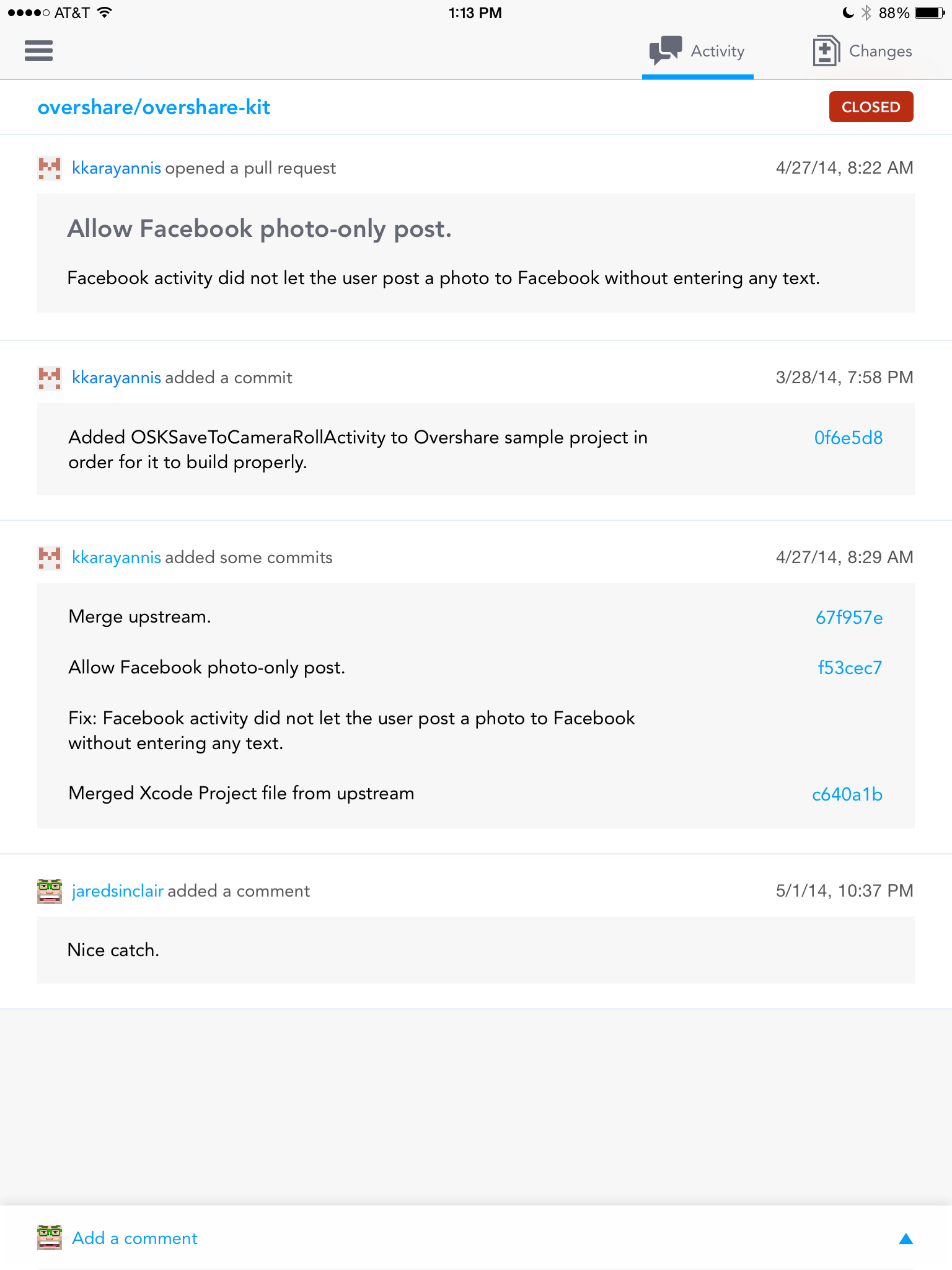
Detail view, in portrait mode.
Tapping on a commit hash will display a full-screen modal view of the code changes (more on that below). Merge the commit with a few taps, starting with the “Merge Pull Request” button at the bottom of the timeline.
Comments vs Commits
Comments should look like speech bubbles. Commits should look like events or points in time. Right now they comments and commits look like each other. Every item in the unified timeline is wrapped in a big grey rectangle. The rectangles communicate that each item is a separate entity, but they don’t communicate in which way the items are different. I would look to the Path iOS apps as inspiration: they have unified timelines with mixed item types. Jackson should borrow or create a visual language that makes each item type instantly identifiable. I wouldn’t mind if it looked just like GitHub’s own implementation.
Merge Button
Merging is potentially destructive. The merge button should be more clearly delineated. It doesn’t look very much like a button. It has the same visual treatment as a commit or a message, which is hard to excuse.

Merge button doesn’t look like a button.
I would make it smaller (not the width of the whole timeline), bolder (white text on a color field), and have an obvious border. The current visual treatment makes me feel anxious that I’ll accidentally merge a pull request.
In fact, lots of elements in Code Review either look tappable but aren’t, or are tappable but look like plain text. I will always argue that the essential quality of a button is its border. Whether real or implied, buttons are easiest to recognize if they have a border.
If Jackson must use borderless buttons, then I suggest that only tappable text be set in an accent color. Static text should always have a non-accent color.
My Avatar
The placement of the avatar next to the “Add a comment” button is a nice touch.
![]()
Clever placement of my avatar.
Imagine if it were elsewhere, such as way up in the top corner of the navigation bar. That might work on an iPhone, but not on an iPad. The current placement anticipates my concern when writing a new comment: which account am I using? I wish all app designers were this perceptive.
Profile Views
Code Review has user profiles that appear when you tap on a username. These profiles have one of the cleverest details I’ve seen in an iOS app. Some rows only display data (they don’t have disclosure indicators). Tapping on such a row causes it to wiggle a little bit, providing feedback that you tapped something that isn’t intended to be interactive. Such a delightful detail.
Diff View
The diff view is similar to the one used on GitHub’s web site, and is surprisingly usable, even on an iPad mini. The text could be larger, as I mentioned above.
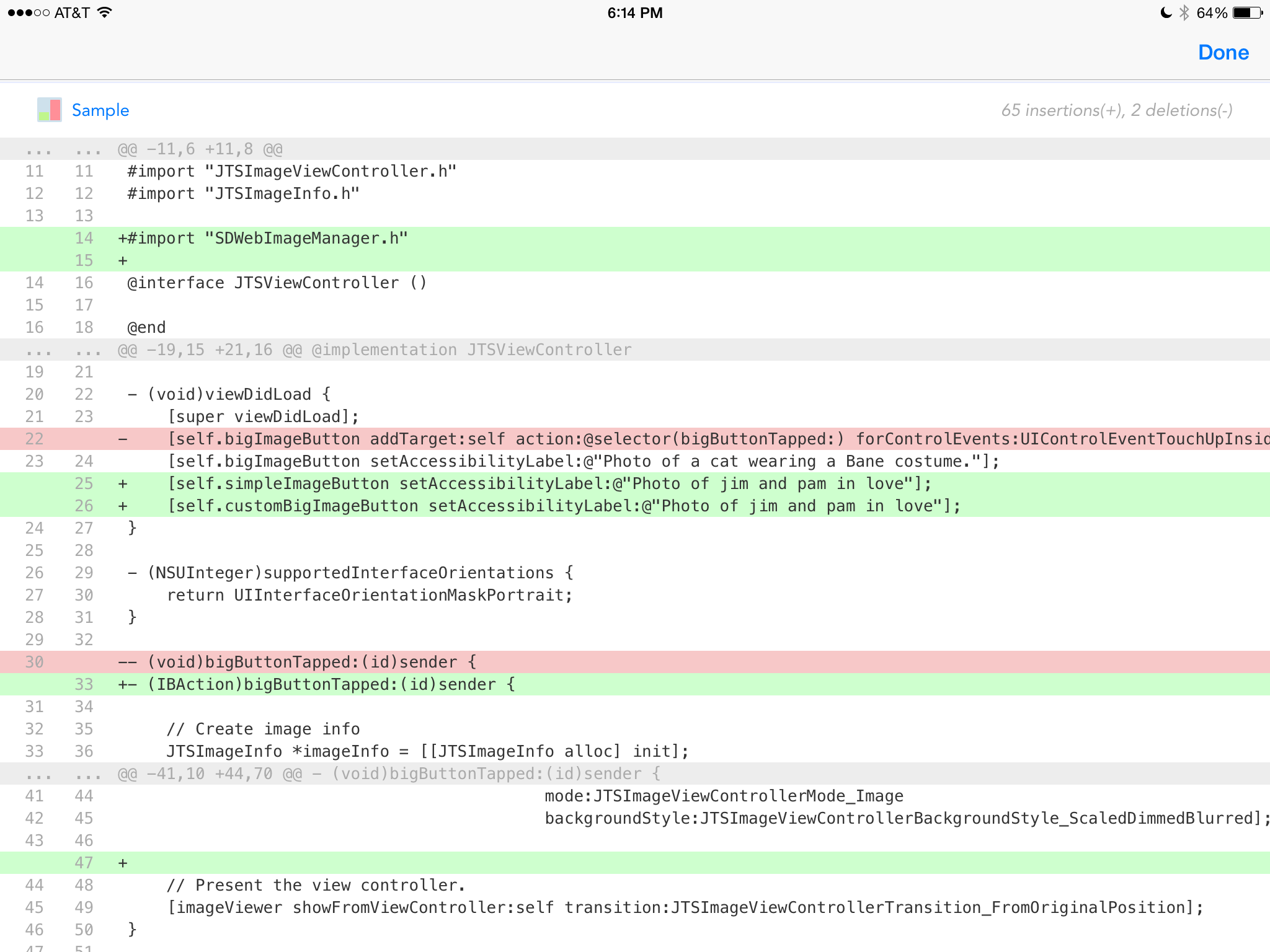
Diff view is spare but useful.
Notifications
In app notifications are overlaid on top of the status bar. The notification bar is black on white, the same as the status bar, making it nearly impossible to notice.

Notification bar is barely perceptible.
I recommend giving it a different background color, perhaps using white text on a colored background. You could also use a different color for the “mood” of the message (neutral, success, failure). Currently, all three moods are presented in black text on a white background – much too subtle.
Conclusion
In all, Code Review is off to a strong start. I wish Jackson all the best. I’ll post a link to his app here on this blog when it’s available on the App Store.
