Basement Menus and Breaking the “Rules” of App Design
Luis Abreu has an interesting breakdown of basement menus in his recent post: Why and How to avoid Hamburger Menus. It has some great points and is certainly worth a read, but it got me thinking about when to break the “rules” of UI design.
During the course of my design critique of Glassboard for iPhone, I listed the questions I ask myself when considering whether to use a basement menu in an app:
Is there a single screen where the user spends most of her time?
Is there a dynamic number of equally-weighted menu items?
Are the contents of the menu easy to memorize?
Are hard-to-memorize items used infrequently?
Are the number of items kept to a minimum?
It’s important to note that this is a list of questions, not a list of reasons. There are times when a basement menu is a bad choice, and there times when it is a great choice. Every app has a unique set of goals and constraints. It’s up to the designer to find a good solution. Don’t limit your choices prematurely by assuming some options are off-limits.
As I’m discovering with Unread for iPad, even design patterns that are almost universally maligned can sometimes be the best choice. Apple, via moments like an on-stage presentation by Phil Schiller1, taught us all how much better iPad apps are than most Android tablet apps. The latter are typically just scaled-up versions of their phone-form cousins, whereas iPad apps are designed to take advantage of the iPad’s display. I don’t know about you, but I found myself immediately agreeing with Schiller’s comment that day. From then on, I took it as a given that no self-respecting app designer would design an iPad app that is just a blown-up form of its iPhone version.
But a scaled-up iPhone layout turned out to be the best choice for Unread on the iPad. As I describe in detail here, a full-screen iPad layout is more faithful to Unread’s goal of a relaxed, focused reading experience. It also makes it possible to navigate almost anywhere in the app without having to reposition your hands from the edges of the device.
The fun and the frustration of creative work are two sides of the same coin. Treat every project like it’s your first. Marc Edwards shared a fantastic anecdote about this recently. He recalls what it was like to work with a lead designer who, from the outside, appeared to be an indecisive flake:
Then it clicked.
He’d intentionally try different and crazy things, knowing that most wouldn’t work. He didn’t care. He didn’t care and it didn’t matter — we’d end up in places we never would have if we over thought the layout. The question wasn’t “what is the best way?”, but “what are the many ways?”, deferring judgement until the last possible moment. Judgement may feel good, but it has no value. The value is in the outcome.
And the outcome was often solid, stunning designs that were unconventional. Non-obvious solutions. From the outside and to other art directors, it appeared magical. But, from within the process, far less nuanced and intentional.
No Friday App Design Review This Week
I meant to post this yesterday, but there will be no Friday App Design Review this week. Family is visiting us. I’m working on a special post for iOS devs next week, though.
AutoLayout Myths, Table View Performance, and Side-by-Side iPad App Multi-tasking
With the prospect of a new iPhone form factor and/or side-by-side iPad app multi-tasking on the horizon, iOS app designers and developers are likely to face new challenges when building their apps. Since it was introduced, a lot of people have championed AutoLayout as the cure for these challenges. This post is going to debunk that myth. Or more fairly, this post will show the limits of what problems AutoLayout is able to solve.
Multiple Layouts
For the purposes of this post, let’s assume you’re an iOS app developer planning the architecture for an app like Unread. We have to plan for scrollable table views with as many as 20,000 rows. Each row has a dynamic height based on several factors:
- The length of the title, blog name, and article summary.
- The presence or absence of an image thumbnail.
- The user’s chosen font size.
So, given a container with width w, how should we layout our elements?
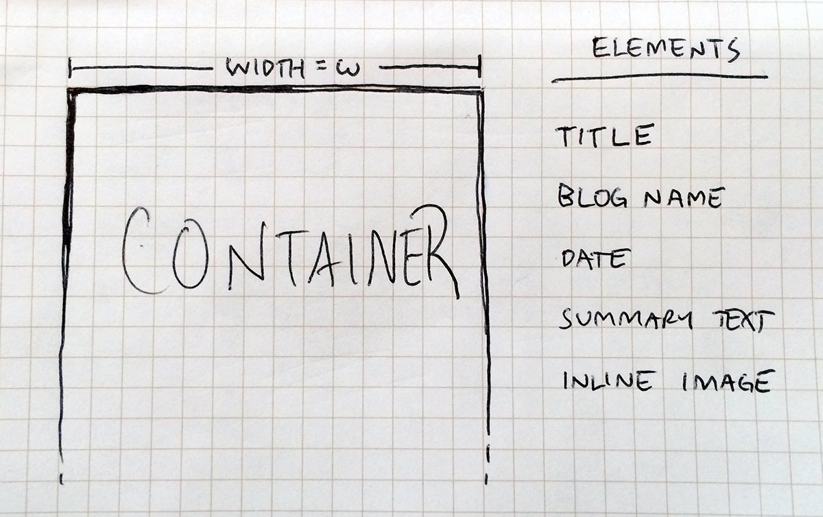
As the developer, we’ve been handed some design mockups which we’ll use to write code that calculates the size and position of all our elements. Given a container with width w1, our layout might look like this:
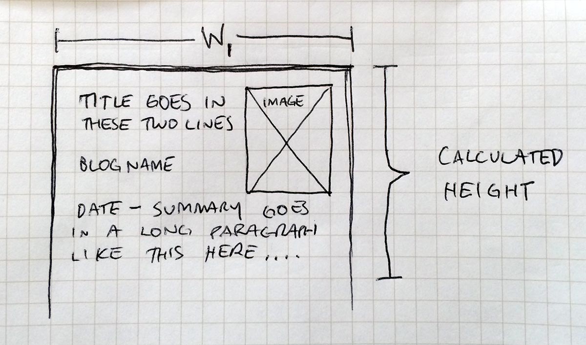
The math and logic required to calculate the position of all these interface elements can potentially become very complex. It is this problem that AutoLayout is designed to solve. AutoLayout makes it easier to write and debug code that calculates the layout of a set of interface elements for a given container size.
It’s important to note that you can’t assume that the container width will always be equal to w1. Apps might have to handle at least two possible container widths: portrait and landscape. So what does our layout look like for a second width w2?
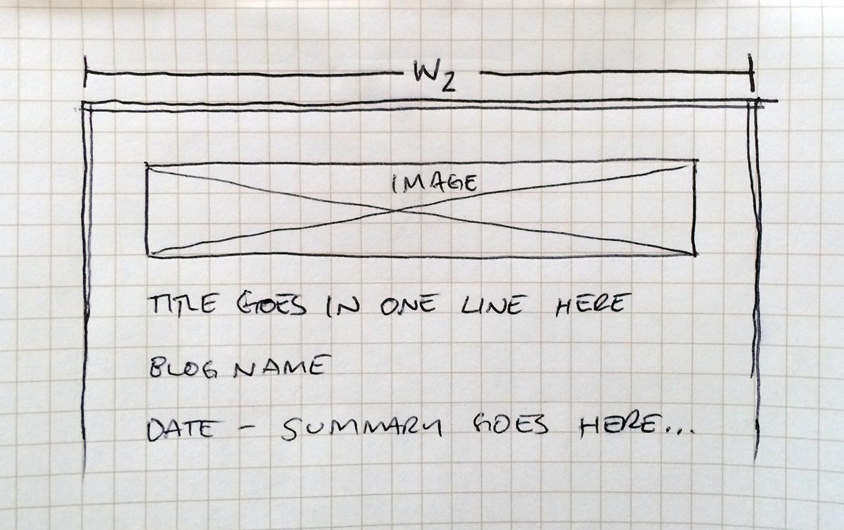
This layout is much different from the first one. AutoLayout makes it easier to calculate the correct positions of all these elements. But as the app developer, your problems are much bigger than just calculating a layout for a given container. You also have to deal with extrapolating that calculation across thousands of model objects and many possible containers. This problem is much more difficult and is beyond the scope of AutoLayout.
Cell Heights and Performance
Notice that the second layout above produces a different total height than the first. What are the implications now that your app has two layouts with two different heights?
When a table view is loading, it needs to know how many rows it will display and how tall each individual row will be. For designs that produce dynamic row heights (as the design above does), these metrics can be very expensive to calculate. You don’t want your app to pause for several seconds while calculating these heights. So what are your options?
Use the new estimated row height API. – On first blush this seems like the best answer. The problem is that
estimatedHeightForRowAtIndexPathhas many bugs. I’ve gone into greater detail on them in another blog post, but the short version is that any app feature that requires accuracy (such as tapping the status bar to scroll to the top of a list) simply won’t work with a table view that implements that method. So this is not a good solution.Pre-calculate and cache all row heights. – Using iOS’ ability to perform work in the background, your app can calculate the height of every table view row ahead of time. Then your table view will load “immediately,” without pausing the execution of the main queue.
Pre-calculation is a better solution, if you can pull it off. It’s difficult to do correctly. There are many factors to consider:
- How many layouts must you pre-calculate for? Portrait and Landscape? Are there others? Every new layout multiplies the total amount of pre-calculation that must be performed.
- What if the user changes themes or font sizes while a long-running pre-calculation is underway on a background queue?
- If you’re caching the results of the background calculation, what kinds of events would invalidate that cache? Date changes? Content changes?
- What if a table view will have 20,000 items in a single list? Is it possible to perform all that work on an older device like an iPad 2, even on a background queue? It could take 15 to 30 seconds to do all that work on an older device. Will you then have to re-write your model collections to support paging in new content as needed?
iPad Multi-tasking & Performance
In the example above, your app was already strained to achieve good performance with only two layouts of static widths. If iOS 8 allows iPad apps to enter a multi-tasking mode with dynamic widths, this would exponentially increase the difficulty of achieving good table view performance. Pre-calculation would be practically impossible.
Assuming the estimated row height API is still buggy and pre-calculation is impossible, the only other alternative would be for devs to start over from the beginning with a design plan that doesn’t allow elements with dynamic heights to also have dynamic widths. This would make good performance achievable, but it would defeat the purpose of a flexible app container. It is for this reason that I think if Apple adds iPad app multitasking, it will only be by scaling app containers without changing the underlying logical widths (768 or 1024 points for portrait or landscape respectively).
The Point
The point to remember is this: AutoLayout makes it easier to calculate a single layout for a single container, but it is irrelevant to the challenge of efficiently calculating a large number of layouts for multiple possible containers.
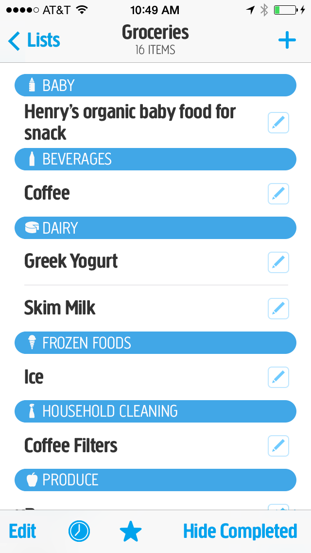
Friday App Design Review – AnyList, Shared Grocery Lists
Every Friday I will post a detailed design review of an iOS app. If you’d like your app to be considered click here for more information. I am also available to consult privately on your projects.
This week’s Friday App Design Review is AnyList for iPhone, from the service of the same name. AnyList makes it easy to create grocery and shopping lists shared between you and and other members of your household.
My wife and I have been using AnyList for the last week and it works as advertised with fast, reliable syncing. We really like how it automatically sorts new grocery items by category. For the most part, we’ve been very pleased. It’s probably going to be our go-to app for grocery shopping from now on. I do have some qualms about the design, however, which I’ll address in this post.
AnyList is a freemium app, so rather than spend half of this post documenting how the app works, you should just download it now and try it for yourself. There are lots of extras and features peppered throughout the app, like built-in recipe storage, but this review is going to focus on just the list screen. My comments are applicable to the app as a whole, so hopefully this narrow focus will help clarify my points.
TL/DR
- Avoid fuzzy implied borders.
- Push beyond a stock aesthetic.
I. Avoid Fuzzy Implied Borders
There are two kinds of borders in an iOS app: real and implied. A real border should be self-explanatory. An implied border is obvious in context, even though it isn’t represented by a concrete visual border.

Most iOS toolbar icons have implied borders.
Implied borders are accomplished through the visual rhythm of multiple elements, identical in size and proportion, spaced at regular intervals. Elements of different sizes or shapes, or with an irregular arrangement, result in fuzzy implied borders. In an iOS app, fuzzy borders should be avoided, especially when arranging tappable elements.
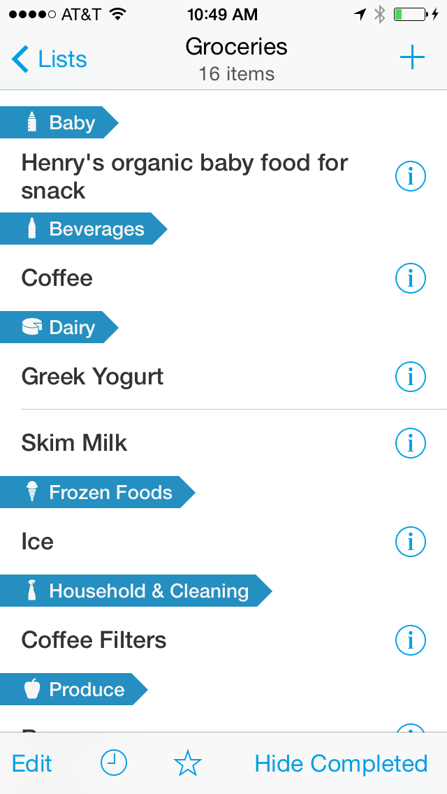
The current AnyList list screen.
AnyList’s list screens suffer from numerous fuzzy borders. Because section headers don’t span the width of the screen, and because sections with only row don’t have any row separators, it is often difficult to tell where one tappable area ends and another begins.
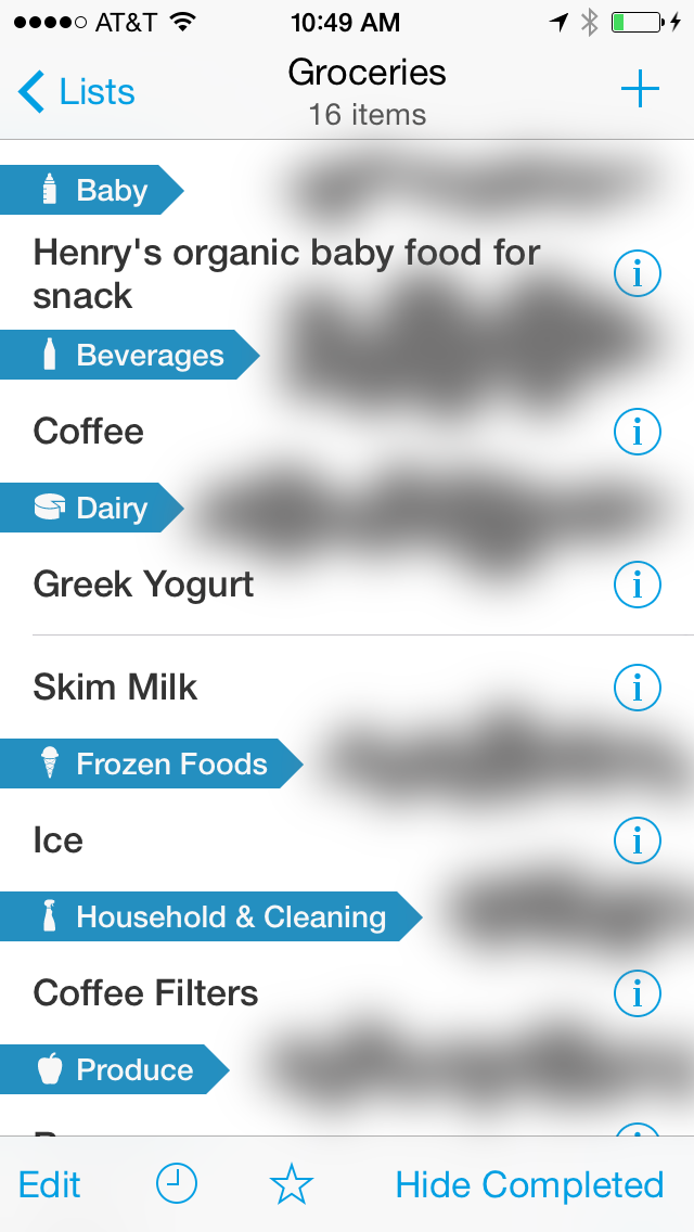
Dark areas are the most visually confusing.
To sharpen these implied borders, the section headers would need to span the width of the screen:
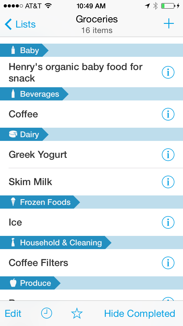
By extending the section headers, the tappable areas of both the rows and the detail buttons becomes more obvious. Your eye would perceive the implied borders more easily:
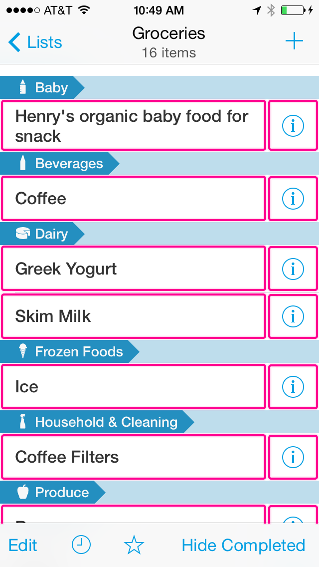
While this is easier to use, it isn’t visually interesting. Perhaps there is a way to sharpen the fuzzy implied borders while also adding tasteful visual interest.
II. Push Beyond the Stock Aesthetic
AnyList adheres almost exclusively to the stock visual language of iOS 7. Buttons and icons are thin and wispy. A predominantly solid white background color is interrupted only by occasional horizontal borders. Unadorned text abounds, except where a single accent color is in use. With few exceptions, every interface element looks the way it would if you had just dragged it from the new object panel in Interface Builder.
This stock look doesn’t do AnyList any favors. As a subscription service, AnyList aspires to build a long-term relationship with its customers. Just like a dating relationship, this story will begin with visual attraction. AnyList needs a strong personality to draw in new customers and to help create an emotional bond with them as they grow familiar with the service. The current stock aesthetic feels too utilitarian.
The outliers in the current aesthetic are the AnyList logo and word mark:
The rounded, perky logo is fantastic. I love the movement it suggests. It looks almost anthropomorphic, like the Pixar lamp bouncing on a ball. What would AnyList for iPhone look like if the character of the logo were applied throughout the app? I’ve made a mockup of one possible approach:
My rough sketch of an alternate design.
Here’s the rationale for my suggested changes:
Get rid of Helvetica.
I’ve changed Helvetica to Creighton Pro. Helvetica is not only stock, it’s a poor choice for body text. AnyList is a predominantly text-based app. The font choice has the greatest influence on the look and feel of the app. Creighton Pro is just one of many possible alternatives. It echoes the rounded corners of the AnyList logo and word mark. It’s readable, stout, and casual.
Make the toolbar icons meaty.
While I’d argue that iOS 7’s wispy icons are terrible in general, in AnyList’s case they’re also not brand-appropriate. In this mockup I’ve made the toolbar iconography meatier and more rounded, like the logo.
Improve the section headers and row separators.
The pointed arrow section headers don’t fit within the aesthetic suggested by the AnyList logo. I replaced them with the full-width roundrects, which echo the similar shapes found in the AnyList logo. The repetition of these shapes makes the logo feel inevitable in hindsight. It creates a strong visual association between the layout of the app and the AnyList brand. This look also has the extra benefit of solving the fuzzy implied border problem described above. I’ve added negative space to the right margin. Horizontal row separators no longer touch the either edge of the screen. This subtle choice is suggested by the AnyList logo itself. It also helps visually separate the scrollable content from the navigation bar and toolbar.
Friday App Design Review – Code Review, an Inbox for GitHub Pull Requests
Every Friday I will post a detailed design review of an iOS app. If you’d like your app to be considered click here for more information. I am also available to consult privately on your projects.
About Code Review
One of my favorite kinds of apps is the Does One Thing and Does it Well category, especially when such an app is laced with clever and delightful details. Code Review, the subject of this week’s Friday App Design Review, is on the right path to that category. Code Review is currently in beta, so this review is also a sneak peek. Lots of thanks to Jackson Harper, Code Review’s developer, for the invitation.
Code Review has a strong foundation, even in its beta form. It has a simple visual language that strays from stock UIKit in flattering ways. My recommendations are mostly about addressing small infractions that undercut the delightful clarity of the whole.
How it Works
Code Review is a tool for triaging and responding to GitHub pull requests. I’m going to assume that readers of this blog know what a “pull request” is. My apologies if you’ve stumbled into a nerd puddle. Code Review can manage pull requests from any of the projects which you maintain. The work flow is similar to email, in a good way.
Basic Layout
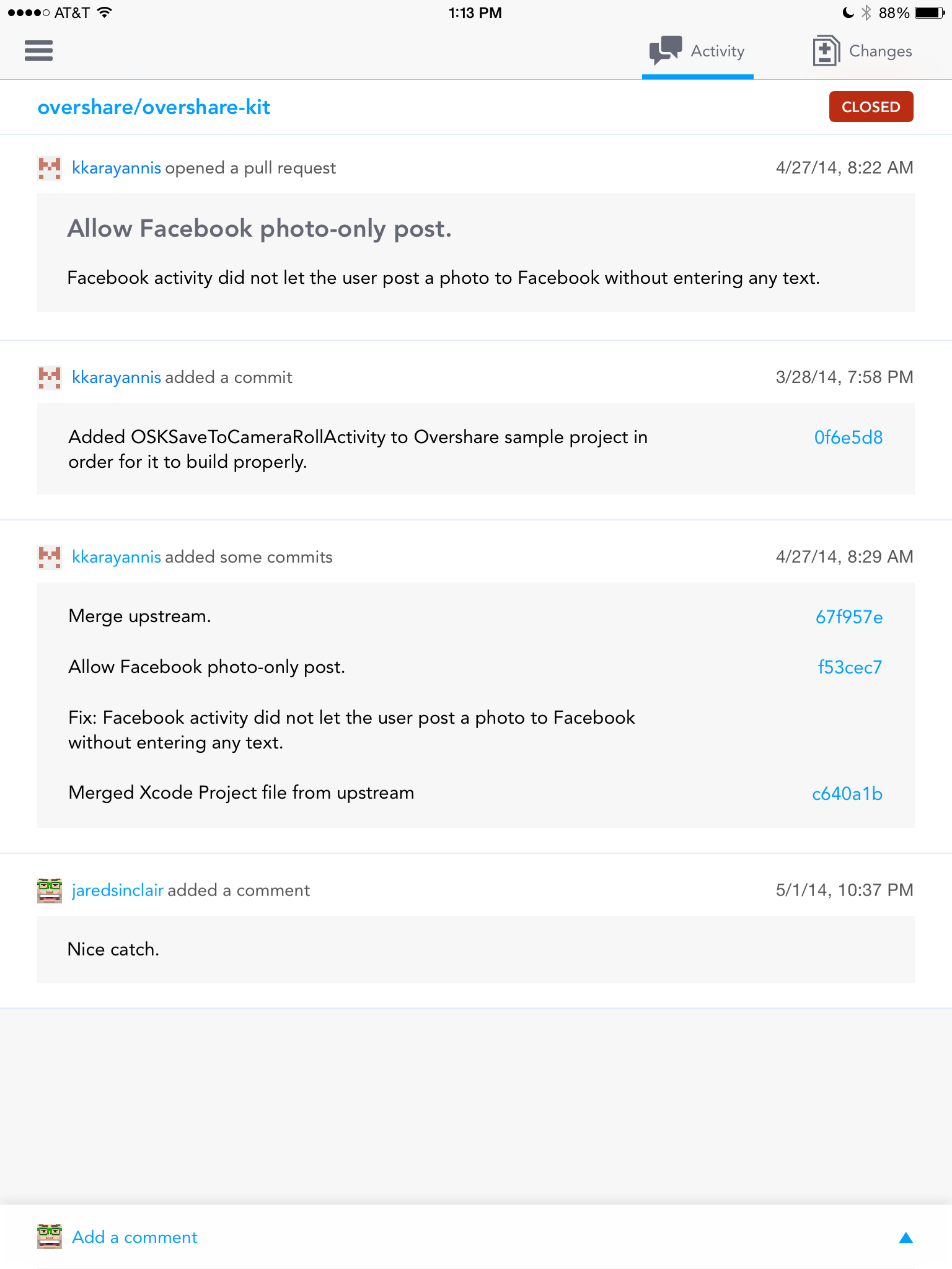
The app uses a split view controller layout familiar to all iPad users.
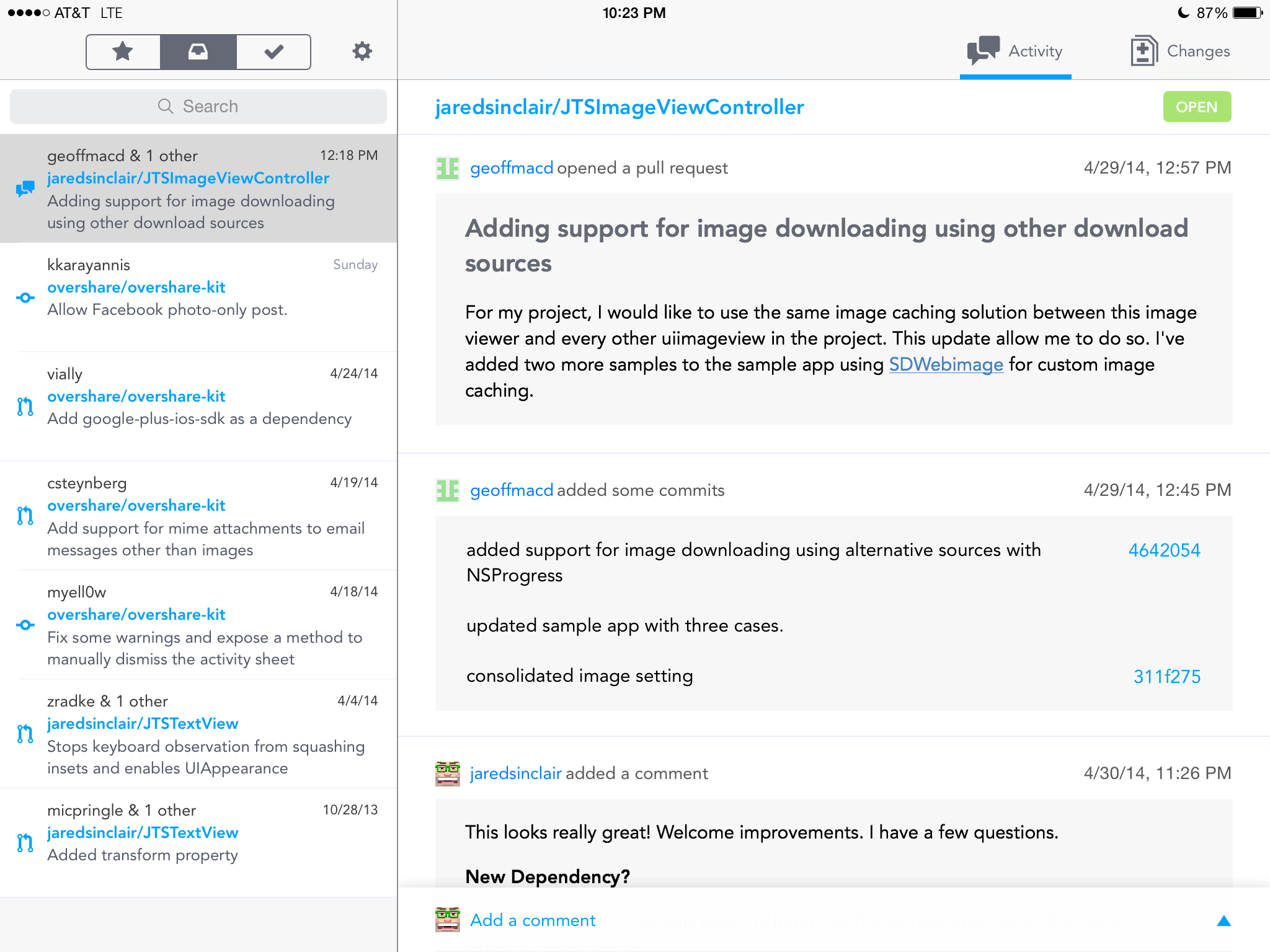
Split view controller layout.
On the left is a list of all open pull requests in a unified inbox. On the right is a detail view. The split view controller’s vertical score between the master and detail pane is lighter in the navigation bar area than it is between the two content areas.
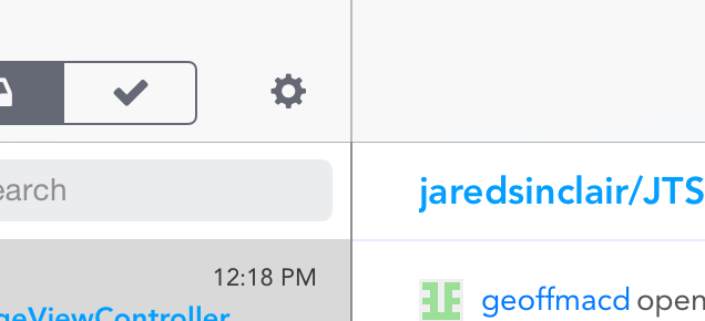
Vertical score between panes.
I’d make this one contiguous color, to strengthen the separation of the master pane from the detail pane. This border should always look stronger than the border between the navigation bars and the content below.
Typography
Code Review is set in Avenir. I can’t thank Jackson enough for not using Helvetica Neue. Typographers have known since the 1960s that Helvetica and its ilk are not readable typefaces for body text. I’m bewildered that Apple still insists on it for iOS’ system typeface. Code Review’s use of Avenir is another way it avoids looking like a came-with-the-frame app.
Unfortunately, Code Review’s point sizes are too small. It’s difficult to read the text in many areas, especially on an iPad mini. Even if there are plans to make the font size user adjustable, the default font size should be at least 1.5 times larger. A default font size should be comfortably legible to someone with below-average near-field vision.
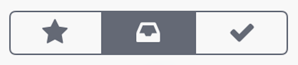
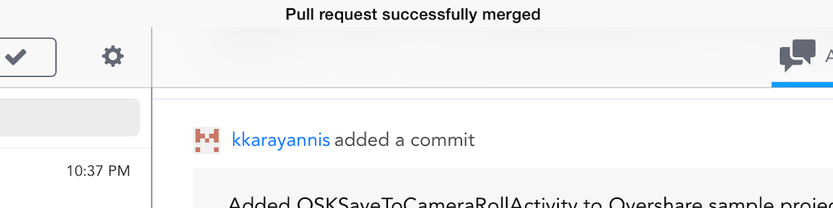
Unified Inbox
Items in the inbox can be starred them to remember them later, or archived to remove them from the inbox view. A segmented control at the top of the list toggles between the three states: starred, inbox, and archived. Sliding an item in the list to the left or right triggers starring or archiving, respectively.
Sliding gesture to trigger actions.
A minor gripe: the star icon should travel with the swipe the same way that the checkmark currently does.
I love that I can star or archive pull requests so they’re not always visible in my inbox. This is, I think, the killer feature of Code Review. That and the fact that it’s a unified inbox, combining pull requests from all the repos I manage into one list.
It’s too bad that the starring and archiving features are not backed by an official GitHub API, but I appreciate the features too much to suggest not including them.
I like that when I tap the segmented control at the top, the master list animates in the direction of the selected tab. It creates a strong spatial memory, an important component of a comfortable app.
I don’t understand why the starring and archiving gestures are placed on the opposite positions from their counterparts in the segmented control above. This inconsistency confuses me. I would swap their positions.
Iconography
The iconography is clean and a little chunky, in a good way. This is one example of how Code Review strays from a stock UIKit aesthetic in a flattering manner.
Pleasant iconography.
These icons are easier to read and look more tappable. It doesn’t hurt that they’re pretty, either.
Icon design is difficult. How do you represent “archiving” with an image? This is even harder when you also need an icon to represent an inbox. The current archiving checkmark icon is not self-explanatory. I assumed activating the checkmark gesture would auto-merge the pull request. So I didn’t bother to use it until I had a chance to ask Jackson what it did. Perhaps there’s a better way?
Colors
The master list has pleasant colors. Each of the three sections has its own theme color: yellow, gray, or green. I’d prefer if the titles of the cells in the master list changed color based on which tab is the active tab. Right now they’re always blue.

Yellow on white is hard to read.
Yellow on white is a challenging combination. I suggest using a warmer, darker yellow, for legibility. There are hues and shades that are stronger than the current one which are no less yellow in spirit.
Detail View
In the detail view you can read all the comments and commits from a request in a unified timeline. New items appear at the bottom of the timeline.
Detail view, in portrait mode.
Tapping on a commit hash will display a full-screen modal view of the code changes (more on that below). Merge the commit with a few taps, starting with the “Merge Pull Request” button at the bottom of the timeline.
Comments vs Commits
Comments should look like speech bubbles. Commits should look like events or points in time. Right now they comments and commits look like each other. Every item in the unified timeline is wrapped in a big grey rectangle. The rectangles communicate that each item is a separate entity, but they don’t communicate in which way the items are different. I would look to the Path iOS apps as inspiration: they have unified timelines with mixed item types. Jackson should borrow or create a visual language that makes each item type instantly identifiable. I wouldn’t mind if it looked just like GitHub’s own implementation.
Merge Button
Merging is potentially destructive. The merge button should be more clearly delineated. It doesn’t look very much like a button. It has the same visual treatment as a commit or a message, which is hard to excuse.
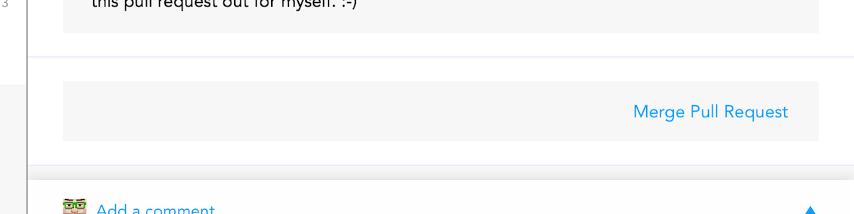
Merge button doesn’t look like a button.
I would make it smaller (not the width of the whole timeline), bolder (white text on a color field), and have an obvious border. The current visual treatment makes me feel anxious that I’ll accidentally merge a pull request.
In fact, lots of elements in Code Review either look tappable but aren’t, or are tappable but look like plain text. I will always argue that the essential quality of a button is its border. Whether real or implied, buttons are easiest to recognize if they have a border.
If Jackson must use borderless buttons, then I suggest that only tappable text be set in an accent color. Static text should always have a non-accent color.
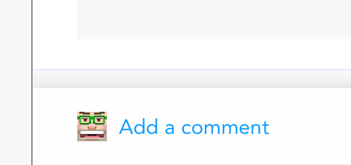
My Avatar
The placement of the avatar next to the “Add a comment” button is a nice touch.
Clever placement of my avatar.
Imagine if it were elsewhere, such as way up in the top corner of the navigation bar. That might work on an iPhone, but not on an iPad. The current placement anticipates my concern when writing a new comment: which account am I using? I wish all app designers were this perceptive.
Profile Views
Code Review has user profiles that appear when you tap on a username. These profiles have one of the cleverest details I’ve seen in an iOS app. Some rows only display data (they don’t have disclosure indicators). Tapping on such a row causes it to wiggle a little bit, providing feedback that you tapped something that isn’t intended to be interactive. Such a delightful detail.
Diff View
The diff view is similar to the one used on GitHub’s web site, and is surprisingly usable, even on an iPad mini. The text could be larger, as I mentioned above.
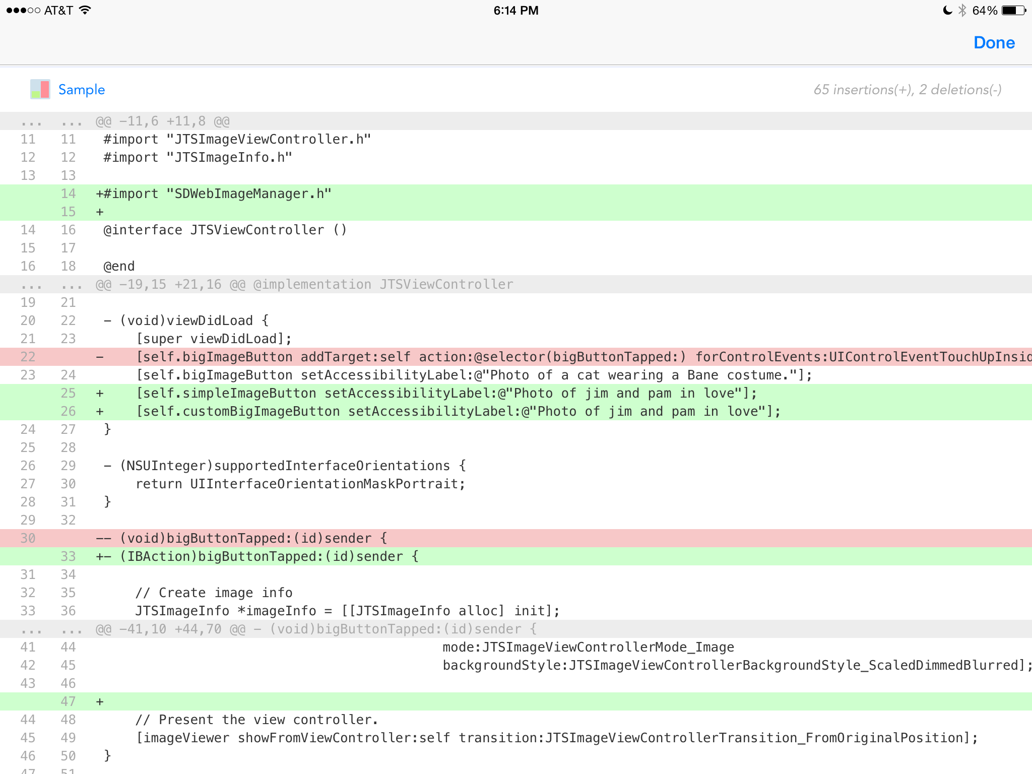
Diff view is spare but useful.
Notifications
In app notifications are overlaid on top of the status bar. The notification bar is black on white, the same as the status bar, making it nearly impossible to notice.
Notification bar is barely perceptible.
I recommend giving it a different background color, perhaps using white text on a colored background. You could also use a different color for the “mood” of the message (neutral, success, failure). Currently, all three moods are presented in black text on a white background – much too subtle.
Conclusion
In all, Code Review is off to a strong start. I wish Jackson all the best. I’ll post a link to his app here on this blog when it’s available on the App Store.