Unread for iPad
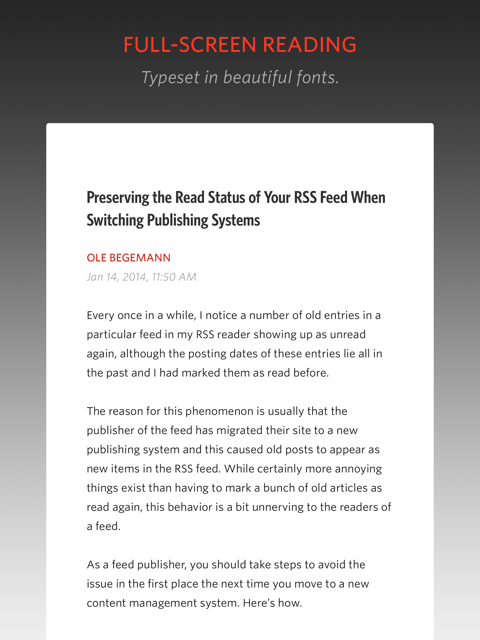
Unread for iPad is available on the App Store today. It’s a brand new app with a clean, distraction-free reading experience. It has all the sharing features you’ve come to expect from the iPhone version, as well as the full set of syncing services: FeedWrangler, Feedly, NewsBlur, Feedbin, and Fever.
I’m proud of the way this app came together. Compared to the iPhone, designing for the iPad is especially difficult. The iPad presents a challenging mixture of established interface patterns, awkward display dimensions, and a comparatively infinite canvas of pixels. Unread for iPad balances all these constraints against an overarching goal of mental and physical comfort.
You can navigate anywhere in the app from the edges of the screen. There’s no need to constantly reposition your hands. Just sit back and read your favorite online writers wherever you’re most comfortable.
Unread for iPad is $4.99 (USD) on the App Store. Also, in case you missed it: Version 1.3 of Unread for iPhone was released to the App Store last week. It has lots of bug fixes and performance improvements, especially for older iOS devices. Two new hidden themes, too.
Smartphones, the Internet of Things, and the Death of Software
Inventions that change our lives are magical. They pry us free from physical laws. The printing press enabled the thoughts of a distant writer to multiply, spread, and live forever. The telephone stretched casual conversations – conversations that would have barely crossed a dining room table – until they spanned the globe. Remember what Steve Jobs called the personal computer? A bicycle for your mind.
For the next big thing to be the Next Big Thing, it must be magical. It must free us from some constraint that seemed immovable the day before. In what ways are we still bound to a technological or mechanical necessity?
The Internet in Your Pocket
What is it about the smartphone that has made it so influential? At a tangible level, the smartphone is a combination of technologies: a touch screen, user-friendly software, mobile chips, compact batteries. But at a more abstract level, the smartphone is The Internet in Your Pocket. Of all its contributions, I think it’s the always-on, always-connected, and always-with-you nature of the smartphone that has been its defining trait. The smartphone connects us to the teeming whole of human ideas, at all times and everywhere.
The untethered freedom of the Internet in Your Pocket has had both quantitative and qualitative effects on how we use the Internet. We spend more time on it than ever, and we also spend that time in new ways: messaging, social media, sharing photos, watching TV and movies, etc. Almost every app of consequence on my iPhone is backed by some kind of Internet-based API. My iPhone is pretty boring when it’s in Airplane Mode.
The smartphone transformed the Internet from a thing we use in one place into a thing we use anyplace. The difference between the corner of your kitchen and everywhere is hard to overstate. It’s for this reason that I respond to some people’s exuberance about the Internet of Things with a smirk. The Internet in Your Pocket is way more interesting than the Internet in Your Toaster. The latter is an incremental change that builds upon what the smartphone has begun. I don’t expect web-connected home appliances to change the lives of the people who buy them, certainly not at the magnitude that the smartphone has changed them.
The Death of Software
Rather than an Internet of Things, I like to imagine that a truly intelligent, ubiquitous artificial intelligence would change our lives to a similar degree that the smartphone has.
Through the present day, our concept of software has been a more-or-less static arrangement of logic and design. The user has a goal (manage her tasks, be entertained, etc.). The app is built to help her meet that goal. But the user has to squeeze her life into a shape that conforms to the software. If she’s lucky, there’s at least one app that fits her well enough to get the job done. But even the best piece of software still has rough edges. It’s indirect. It has a learning curve. It’s unaware of her context, and unwilling or unable to act in concert with other apps the user needs.
A truly intelligent artificial entity, as I envision it, would turn this situation upside down. Instead of the user conforming to the software, the software would conform to the user – a deceptively simple change that would have vast implications.
Software concepts that have been with us since the beginning of the personal computer would no longer be relevant. For example, apps as discreet experiences would be obsolete. There would no longer be any need for a web browser, a messaging app, a todo list app, etc. There would only be one app: the interaction between the user and the AI. Everything else would be built on an ad-hoc basis, in real-time, then thrown away:
"What do I have to do today?" – The AI constructs a todo list, artfully typeset and formatted to compliment the tastes of the user.
"My kid won’t stop crying. Can you make him a game?" – The AI constructs a simple game pitting the child’s dog as a hero versus his villainous school teachers. The levels progress according to patterns established by well-designed games of yesteryear.
"Where should we eat?" – The AI presents what amounts to a Yelp-like interface, built from scratch using everything it knows about your family, what you eat in general, food allergies, what food you haven’t had lately, how long it takes to arrive and order food, etc. It’s not a startup’s MVP. It’s just for you.
And these are just the effects that such an AI might have on a personal electronic device. One can easily imagine the huge changes that such an entity could bring to medical care documentation, scientific research, and more. For every stereotypical bit of AI science fiction, there are dozens of life-changing applications that would be too boring to put in a film, even if they’d make a fortune.
Software, instead of feeling like a sea of half-baked ideas with a few rare gems, would feel like the bicycle of the mind you’ve always wanted but never thought possible.
I like to imagine this kind of AI growing out of an industry like video games. It’s not hard to imagine a time when gaming hardware is so powerful that there aren’t enough artists to create objects at the full level of detail that the hardware is able to render. To keep pushing the level of realism, a team of game developers would undertake the task of creating an AI with intuition and taste. Level designers would interact with the AI in loose, human terms:
"Make it gloomier."
"Put a neighborhood here with two story houses. Wait, three stories. These four need flood damage."
"The guy who lives here reads comics and he’s been on vacation for a few months."
The AI level designer would respond to comments like these by assembling realistic worlds and objects – not procedurally generated stuff, which would look intentionally random, but realistically generated stuff: a tarp covering a leaky roof; dog’s nose prints on a storm door; soggy U-Haul boxes; a stack of mail. The game developers will think they’ve built a design tool, but what they’ll actually have built is the death of software as we know it.
The question that makes me uncomfortable with this idea: if this were to happen, what would happen to software developers?
Friday App Design Review – Castro for iPhone
Every Friday I will post a detailed design review of an iOS app. If you’d like your app to be considered click here for more information. I am also available to consult privately on your projects.
This week’s Friday App Design Review is Castro, the podcast app from Supertop. There’s a lot to like about Castro. I like how well Castro balances the constraints of iOS 7, the need for visual affordances, and Supertop’s creative impulse for originality. I especially like how thoughtfully it uses borders.
As I have said many times, few things are as important in iOS app design as borders. Borders aren’t necessarily literal borders drawn around an element. A border is any area where two or more edges meet. A border can be literal, as in the case of a one-pixel horizontal score between rows. A border can also be implied, like the invisible borders around the square margins of toolbar icon buttons.
iOS 7’s confusing visual language has made it harder for third-party apps to handle borders. There are mixed messages suggested by Apple’s stock apps. iOS 7 insists on text-only buttons, yet not for certain glaring cases. It has a general tendency toward unclear borders between logical sections, though it sometimes uses them with abandon. There isn’t yet a clear pattern for us to imitate. In the absence of best practices, each app seems to strike out into its own unique territory, often with awkward results.
Castro’s particular mixture of literal and implied borders is fantastic. It’s always easy to know where one tappable area ends and the next one begins. Literal borders break up the screen in logical ways, reinforcing the navigation hierarchy. Most impressively, Castro manages to do all this within the aesthetic constraints of iOS 7. Let’s look at some of the ways Castro uses borders, and explore ways to make them even better.
Episodes List
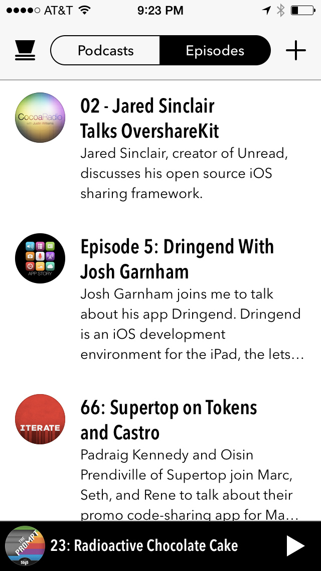
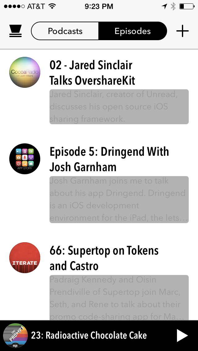
One of the biggest risks in Castro is the absence of literal borders between rows of episodes. Without careful planning, one row could easily blur into the next. Castro uses several techniques to solve this problem.
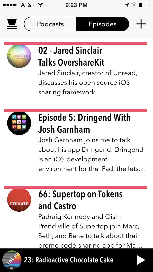
The bold episode titles create a strong implied border at the top of each row.
The alternating rhythm of the large bold titles and small light body text helps break up the content, too.
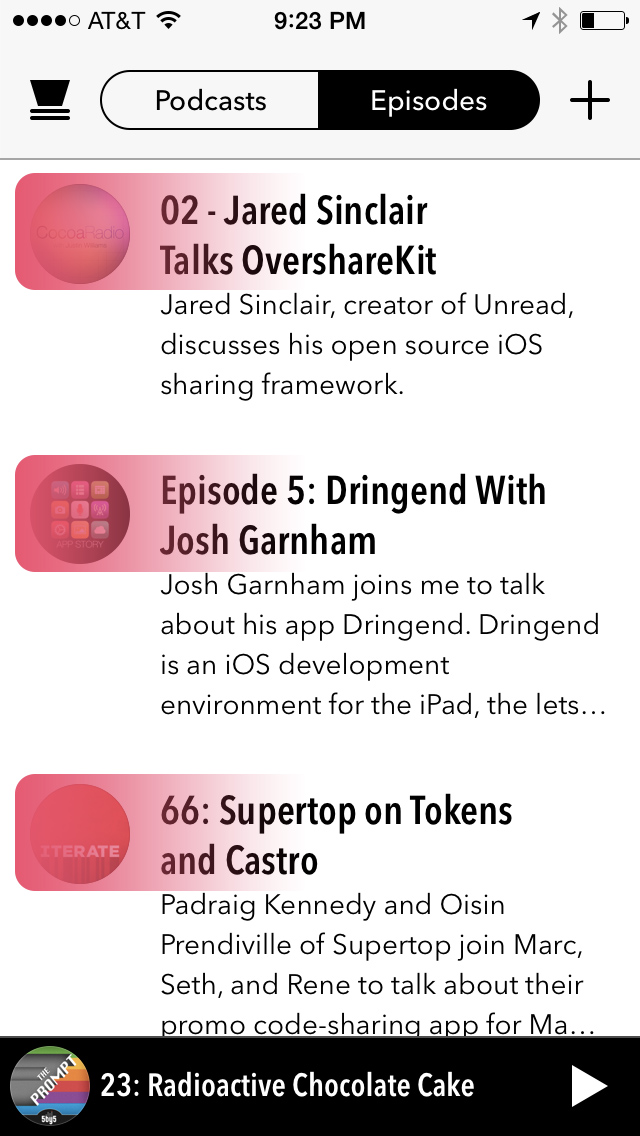
The wide left margins are broken up only by podcast artwork, like tabs peeking out of the top of a Rolodex. These thumbnails accentuate the rhythm created by the episode titles.
Notice how the episode summaries are allowed to run into four lines. Your eyes subconsciously parse a summary paragraph as if it’s a big rectangle.
This suggests a strong implied border along the bottom of the row. The large paragraph also counterbalances the concentrated heaviness of the artwork on the far left. The weight of visual elements looks balanced across the width of the row. In a list like this, each cell should feel like an iPad with its center of gravity squarely in the middle.
Individually these elements might not be enough to create strong implied borders. But together the implied borders are unmistakable. The user never doubts where she can tap in order to select an episode. The strength of the implied borders has another benefit: it makes it possible for section headers to have literal bottom borders without blurring the separation of adjacent rows.

Section headers group by date.
Podcasts List
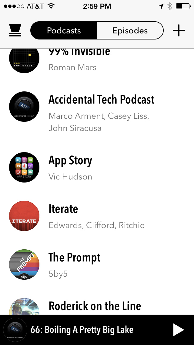
The podcasts list employs most of the techniques as the episodes list. But notice how the absence of long summary paragraphs diminishes the strength of the implied borders. Each row also feels lopsidedly heavy on the left. It’s as if the artwork is a bowling ball near the edge of a plank.
Both the episodes list and podcasts list have variable row heights. Variable row heights can obscure the visual rhythm of implied borders. This effect is more noticeable in the podcasts list because the average row height is shorter. I would suggest adding an additional line or two of metadata to each row, perhaps the date of latest episode. This would increase the average row height thus strengthening the rhythm of the implied borders. It would also distribute visual weight more evenly across the row.
Navigation Bar Border
Castro’s navigation bar has a literal border separating it from the main content. It’s more bold than what is typical on iOS 7, which is laudable. But I think there’s room for improvement.
Here’s a detail view of the navigation bar’s bottom border:
It’s an opaque grey color, most likely:
[UIColor colorWithWhite:0.65 alpha:1.0]
When viewed at a natural distance, it looks like a thin dark line between two white areas. But there’s a problem whenever dark content is scrolled underneath the border. Against the dark content, the border looks like a light gray color. In the detail view above, you can see this in the portion of the border that overlaps the 99% Invisible artwork. At a natural viewing distance, the border loses it’s crispness. An alternative that works well against any kind of content would be to use a translucent black color:
[UIColor colorWithWhite:0.0 alpha:0.33]
I would use this color and have the border overlap the scrollable content. Here’s a mocked up detail view with this alternate color:
At a natural viewing distance, this border would look crisp against any kind of content.
Playback Toolbar Border
The playback toolbar also has a strong border. The toolbar’s background is solid black, which would otherwise disappear against the predominantly dark episode content during playback:
The toolbar has a border which, like the navigation bar, is also an opaque gray:
[UIColor colorWithWhite:0.3 alpha:1.0]
While this border looks okay against the dark episode content, it doesn’t look crisp when the toolbar overlaps the predominant white of the episodes list:
At a natural viewing distance, this grey border looks more like misaligned pixels than a border. The toolbar would look better if it the black extended all the way to the edge:
But wouldn’t this undermine the purpose of the grey border when viewing the episode details? Yes, but there’s another way to draw the border which would look crisp in both contexts. First, here’s what the existing border looks like when scrolling between the episodes list and the episode details:
Instead of the opaque grey color, I suggest using a translucent white color:
[UIColor colorWithWhite:1.0 alpha:0.12]
Using this color, I’d extend the border so it overlaps the content above the toolbar. This would both accentuate the crisp dark edge of the toolbar when set against white content and form a strong border when set against dark content.
This has the added benefit of letting the color of the episode details seep into the border, which is in keeping with the aesthetics of the rest of the details screen.
Seeking Advice for a Right-to-Left Language Bug in Unread
This is cross-posted from this Stack Overflow question. If you know the answer I’d appreciate your help.
In Unread, I’m using the NSAttributedString UIKit Additions to draw attributed strings for article summaries in a UIView subclass. The problem I have is that despite using a value of NSWritingDirectionNatural for the baseWritingDirection property of my paragraph style, text always defaults to left-to-right.
Here’s how I form the attributed string (simplified example):
NSString *arabic = @"العاصمة الليبية لتأمينها تنفيذا لقرار المؤتمر الوطني العام. يأتي ذلك بعدما أعلن اللواء الليبي المتقاعد خليفة حفتر أنه طلب من المجلس الأعلى للقض الدولة حتى الانتخابات النيابية القادمة";

NSMutableParagraphStyle *paragraph = [[NSMutableParagraphStyle alloc] init];
paragraph.baseWritingDirection = NSWritingDirectionNatural;
paragraph.lineBreakMode = NSLineBreakByWordWrapping;

NSMutableDictionary *attributes = [[NSMutableDictionary alloc] init];
attributes[NSParagraphStyleAttributeName] = paragraph;

NSAttributedString *string = [[NSAttributedString alloc]
                             initWithString:arabic
                             attributes:attributes];
And here’s how I draw the text:
- (void)drawRect:(CGRect)rect {
    [self.attributedText drawWithRect:rect
                              options:NSStringDrawingUsesLineFragmentOrigin
                              context:nil];
}
And yet it still flows from left to right:
What am I missing?
My Reasonable iPhone 6 Prediction
Since a larger iPhone is all but a given at this point, the interesting question is how will Apple do it? There are several directions Apple could take. Before I delve into speculation, let’s rally around some terms.
Logical Size – The size of a display measured in points, not pixels. An iPad 2 and an iPad 4 have the same logical size (768x1024), even though they have different scales.
Resolution – The size of a display measured in actual pixels.
Scale – The multiplication factor applied (by software) to a display’s logical size. Up until now, Apple’s retina displays have used a scale factor of 2 – or “@2x” in common parlance. With the scale factored in, the iPad 4 has a scaled size of 1536x2048 compared to 768x1024 for the iPad 2.
Pixel Density – Independent of logical size or scale, pixel density is a measure of how many physical pixels occupy a given area of a display panel. The iPhone 5s and the iPad mini with Retina Display have the same pixel density, 326 pixels per inch (PPI). The mini’s display is logically and physically larger, but both displays are “cut” from the same materials.
Now for some fun speculation.
@3x Scale, Same Logical Size
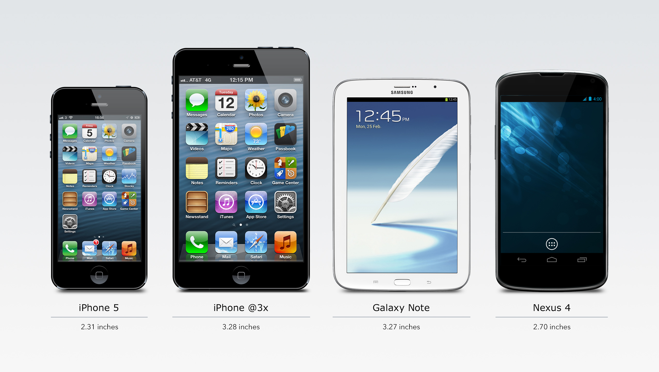
Apple could increase the iPhone’s scale from @2x to @3x, re-using an existing logical size (either 320x480 or 320x568). This would allow them to use the same display panel already in use in the iPhone 5s, but cut it into a larger shape. This is more or less what Apple did with the first iPad mini; its display panel was the same as that of the iPhone 3G, just larger. The problem with this approach is that it would result in a phone that seems comically large for an Apple product:
This would look even more ridiculous if I’d mocked up a 320x568 point ratio at an @3x scale.
Historically, Apple’s designers opt for modest differences in the physical sizes of a given product range (for example, 13-, 15-, and 17-inch MacBooks Pro). So if Apple chose to bump the scale to @3x, I would expect them to also use a higher pixel density than 326 PPI. This would require a new LCD panel, which might be prohibitively challenging. From what I understand, shipping LCDs with a new pixel density would require significant engineering and infrastructure resources, as compared to merely cutting existing panels to a larger size.
@2x Scale, New Logical Size
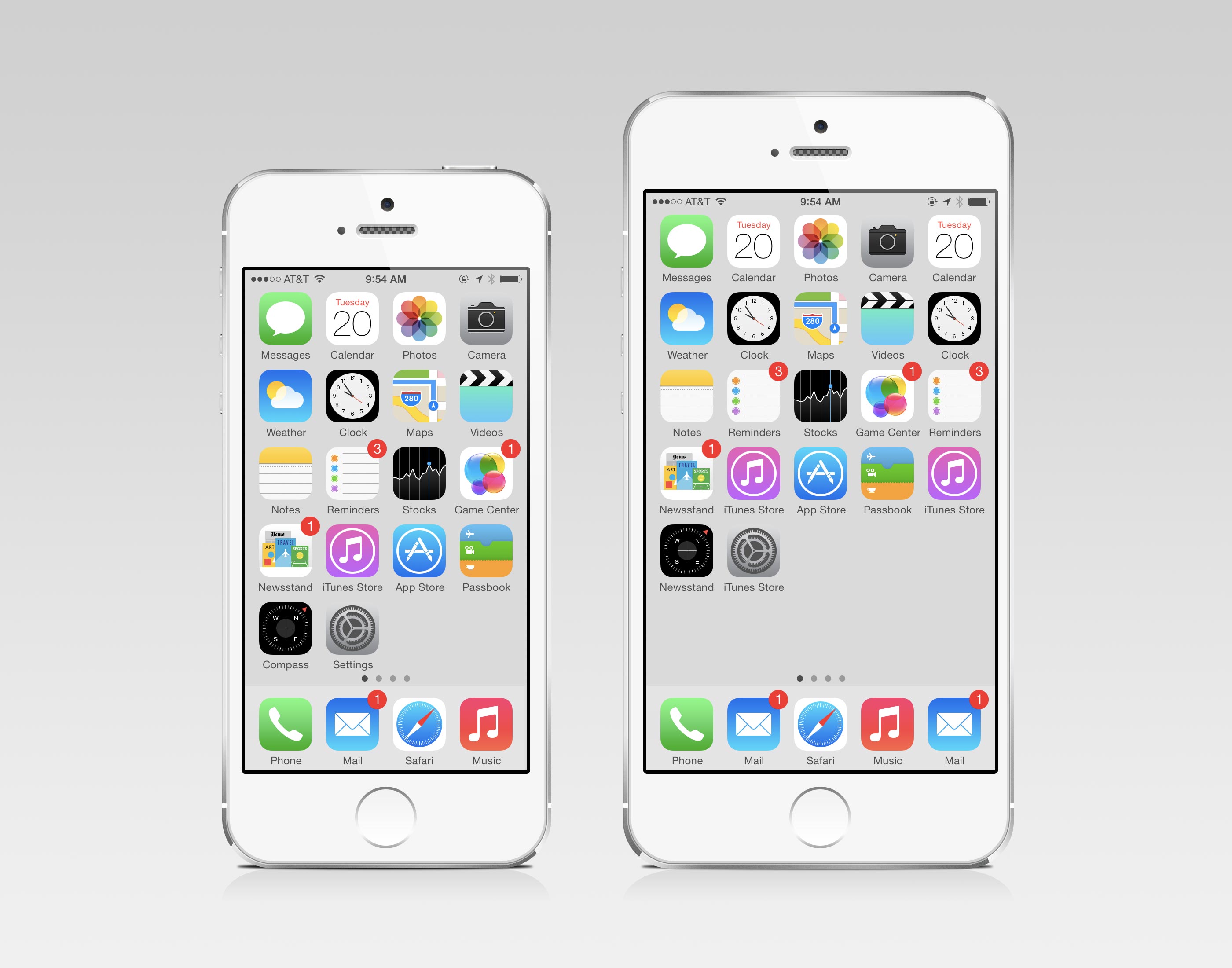
Alternatively, Apple could re-use the current retina iPhone LCDs, but cut them to fit into a new logical size. I think a logical resolution of 396x656 would be an interesting choice. This would increase the home screen layout by one row and one column:
To my eyes, this looks like a more sensible size increase and a better use of the larger display. It also has the benefit of re-using the same 326 PPI display panel technology already being manufactured.
My Bet
For all these reasons, I think Apple is much more likely to ship an iPhone 6 with a new logical resolution at an @2x scale than an existing logical resolution at an @3x scale.
