Friday App Design Review – Castro for iPhone
Every Friday I will post a detailed design review of an iOS app. If you’d like your app to be considered click here for more information. I am also available to consult privately on your projects.
This week’s Friday App Design Review is Castro, the podcast app from Supertop. There’s a lot to like about Castro. I like how well Castro balances the constraints of iOS 7, the need for visual affordances, and Supertop’s creative impulse for originality. I especially like how thoughtfully it uses borders.
As I have said many times, few things are as important in iOS app design as borders. Borders aren’t necessarily literal borders drawn around an element. A border is any area where two or more edges meet. A border can be literal, as in the case of a one-pixel horizontal score between rows. A border can also be implied, like the invisible borders around the square margins of toolbar icon buttons.
iOS 7’s confusing visual language has made it harder for third-party apps to handle borders. There are mixed messages suggested by Apple’s stock apps. iOS 7 insists on text-only buttons, yet not for certain glaring cases. It has a general tendency toward unclear borders between logical sections, though it sometimes uses them with abandon. There isn’t yet a clear pattern for us to imitate. In the absence of best practices, each app seems to strike out into its own unique territory, often with awkward results.
Castro’s particular mixture of literal and implied borders is fantastic. It’s always easy to know where one tappable area ends and the next one begins. Literal borders break up the screen in logical ways, reinforcing the navigation hierarchy. Most impressively, Castro manages to do all this within the aesthetic constraints of iOS 7. Let’s look at some of the ways Castro uses borders, and explore ways to make them even better.
Episodes List
One of the biggest risks in Castro is the absence of literal borders between rows of episodes. Without careful planning, one row could easily blur into the next. Castro uses several techniques to solve this problem.
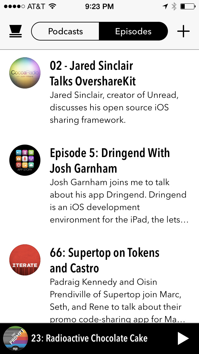
Episodes List
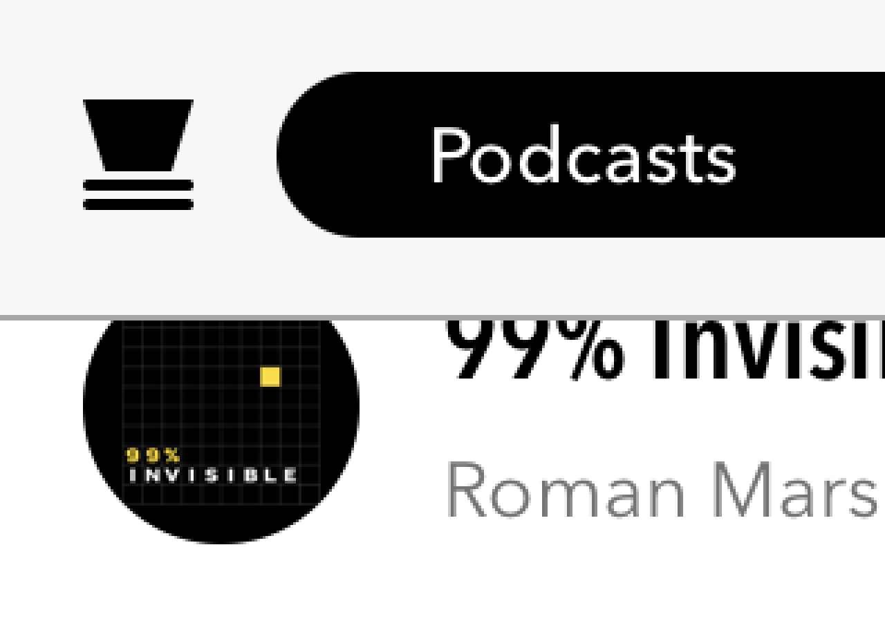
The bold episode titles create a strong implied border at the top of each row.
Implied top borders
The alternating rhythm of the large bold titles and small light body text helps break up the content, too.
The wide left margins are broken up only by podcast artwork, like tabs peeking out of the top of a Rolodex. These thumbnails accentuate the rhythm created by the episode titles.
Artwork folder tab effect.
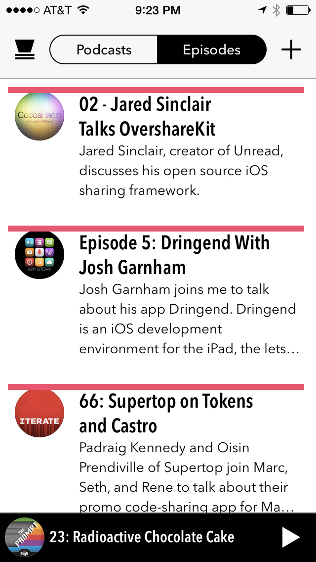
Notice how the episode summaries are allowed to run into four lines. Your eyes subconsciously parse a summary paragraph as if it’s a big rectangle.
Large summary paragraphs
This suggests a strong implied border along the bottom of the row. The large paragraph also counterbalances the concentrated heaviness of the artwork on the far left. The weight of visual elements looks balanced across the width of the row. In a list like this, each cell should feel like an iPad with its center of gravity squarely in the middle.
Individually these elements might not be enough to create strong implied borders. But together the implied borders are unmistakable. The user never doubts where she can tap in order to select an episode. The strength of the implied borders has another benefit: it makes it possible for section headers to have literal bottom borders without blurring the separation of adjacent rows.

Section headers group by date.
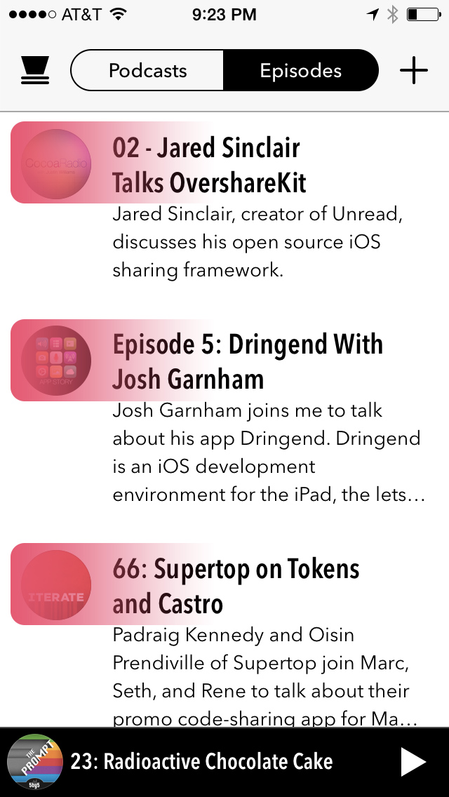
Podcasts List
The podcasts list employs most of the techniques as the episodes list. But notice how the absence of long summary paragraphs diminishes the strength of the implied borders. Each row also feels lopsidedly heavy on the left. It’s as if the artwork is a bowling ball near the edge of a plank.
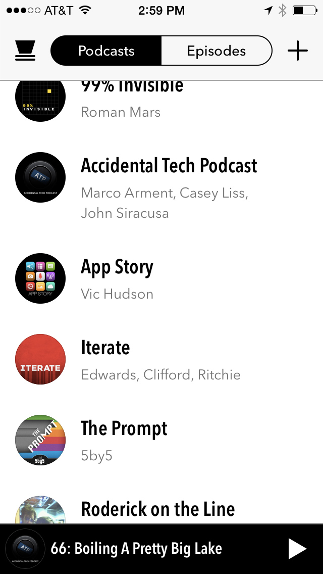
Podcasts List
Both the episodes list and podcasts list have variable row heights. Variable row heights can obscure the visual rhythm of implied borders. This effect is more noticeable in the podcasts list because the average row height is shorter. I would suggest adding an additional line or two of metadata to each row, perhaps the date of latest episode. This would increase the average row height thus strengthening the rhythm of the implied borders. It would also distribute visual weight more evenly across the row.
Navigation Bar Border
Castro’s navigation bar has a literal border separating it from the main content. It’s more bold than what is typical on iOS 7, which is laudable. But I think there’s room for improvement.
Here’s a detail view of the navigation bar’s bottom border:
It’s an opaque grey color, most likely:
[UIColor colorWithWhite:0.65 alpha:1.0]
When viewed at a natural distance, it looks like a thin dark line between two white areas. But there’s a problem whenever dark content is scrolled underneath the border. Against the dark content, the border looks like a light gray color. In the detail view above, you can see this in the portion of the border that overlaps the 99% Invisible artwork. At a natural viewing distance, the border loses it’s crispness. An alternative that works well against any kind of content would be to use a translucent black color:
[UIColor colorWithWhite:0.0 alpha:0.33]
I would use this color and have the border overlap the scrollable content. Here’s a mocked up detail view with this alternate color:

At a natural viewing distance, this border would look crisp against any kind of content.
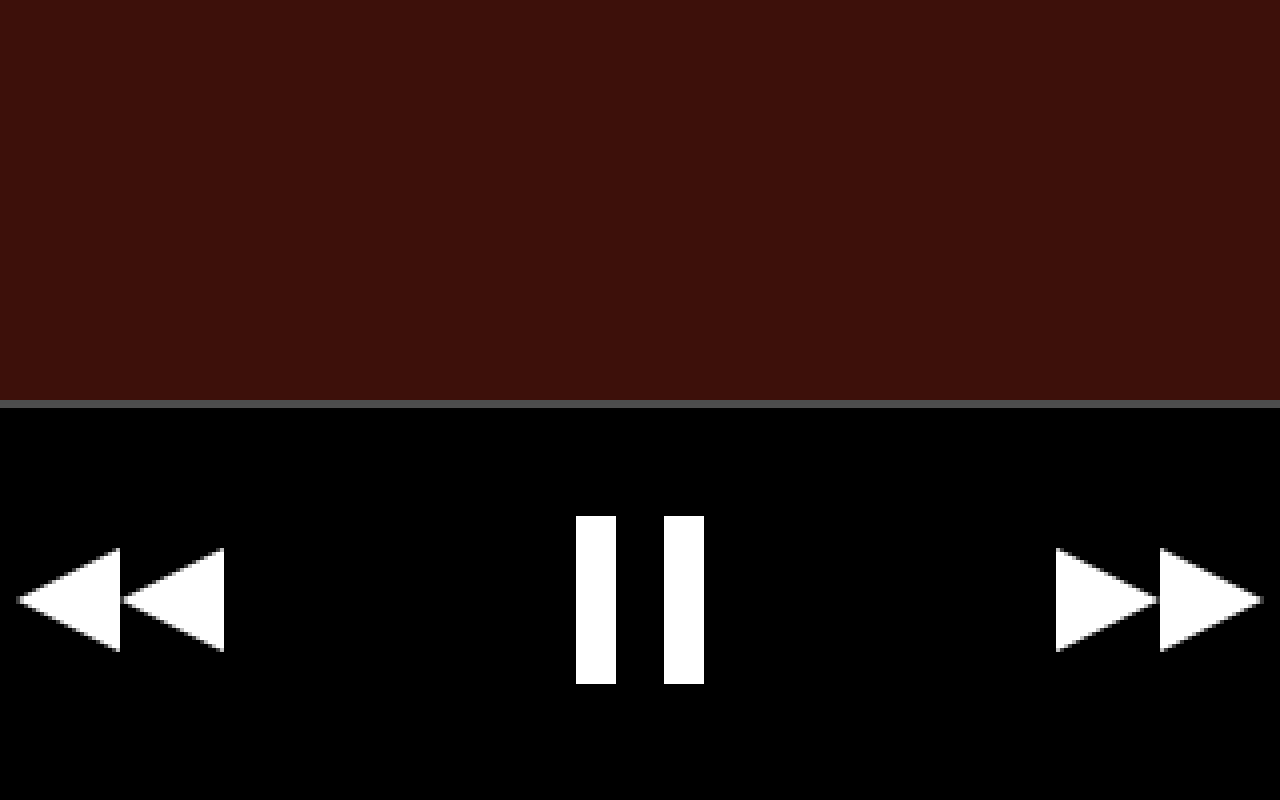
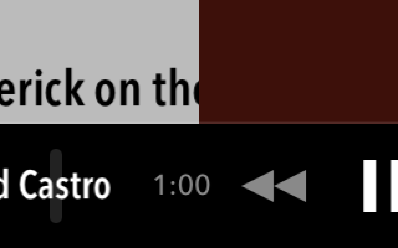
Playback Toolbar Border
The playback toolbar also has a strong border. The toolbar’s background is solid black, which would otherwise disappear against the predominantly dark episode content during playback:
The toolbar has a border which, like the navigation bar, is also an opaque gray:
[UIColor colorWithWhite:0.3 alpha:1.0]
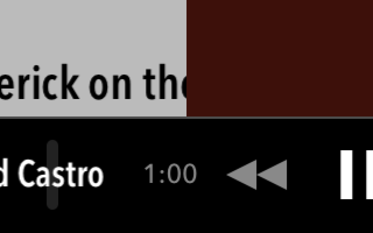
While this border looks okay against the dark episode content, it doesn’t look crisp when the toolbar overlaps the predominant white of the episodes list:

Click to see enlarged version
At a natural viewing distance, this grey border looks more like misaligned pixels than a border. The toolbar would look better if it the black extended all the way to the edge:

Click to see enlarged version
But wouldn’t this undermine the purpose of the grey border when viewing the episode details? Yes, but there’s another way to draw the border which would look crisp in both contexts. First, here’s what the existing border looks like when scrolling between the episodes list and the episode details:
Instead of the opaque grey color, I suggest using a translucent white color:
[UIColor colorWithWhite:1.0 alpha:0.12]
Using this color, I’d extend the border so it overlaps the content above the toolbar. This would both accentuate the crisp dark edge of the toolbar when set against white content and form a strong border when set against dark content.
This has the added benefit of letting the color of the episode details seep into the border, which is in keeping with the aesthetics of the rest of the details screen.