A Practical Introduction to Photoshop for iOS Developers
What follows is a crash course in Photoshop for iOS developers. I’m going to take a very nuts-and-bolts approach. I hope to demystify what it is that an iOS app designer means she says things like “working in vector” or “pushing pixels.” Beware the following caveat: this is an article about tools, not design. If this were an article about ice sculpture, it would teach you how to turn on the chainsaw. It’s up to you to sculpt an angel without losing a limb.
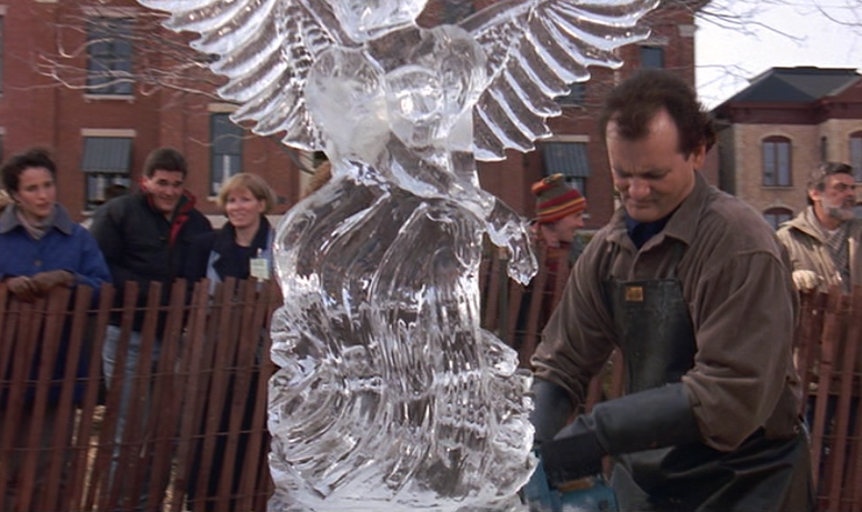
I’ll give you a winter prediction: it’s gonna be cold, it’s gonna be grey, and it’s gonna last you for the rest of your life.
Photoshop is a big beast. In some places its interface design capabilities feel tacked-on as an afterthought. When mocking up an iOS app in Photoshop, you’ll find that you only need a fraction of the available features. The unused features make it hard for newcomers to know where to begin. It helps to find your bearings before opening your first document.
A Stack of Layers
A photoshop document is a stack of layers that are composited in real time down to a single two-dimensional image. Every layer has several components:
1. Layer Content
Setting aside any other effects or styles that may be applied, a layer’s content is its most basic component. There are four main layer types, each with it’s own kind of content: raster, fill, shape, and smart object.
Raster – Raster layers are a (virtually) infinite canvas of bitmapped pixels. Photographers typically work with raster layers.
Fill – Fill layers fill the document canvas with either a color, a gradient, or a pattern. When designing an iOS app, you’ll almost exclusively be working with both shape layers and fill layers (more on this below).
Shape – Shape layers are vector paths filled with a solid color. Technically, a shape layer is just a fill layer with a vector mask. But it’s helpful to think of them as a separate type, since you’ll use them much differently.
Smart Object – Smart Objects are akin to blocks in Objective-C. Much like a block is both executable code and an object, a Smart Object is both a layer and link to another Photoshop document. Smart Objects are useful when mocking up new screens, but you’ll want to avoid them when creating image resources for production use.
2. Layer Masks
Every layer has an optional set of masks, which function like stencils. An individual layer can have up to two masks: a raster mask and vector mask (except shape layers, which can only have a raster mask, since they already have a vector mask by definition). For example, a raster layer could have a heart-shaped vector mask:

Masked Crusader
3. Layer Styles
Each layer has an array of options that apply styles to the inner and outer regions of its content. Layer styles include things like drawing a border around the visible edges of layer content (a stroke), or adding a drop shadow that casts a shadow on layers underneath.

Layer Styles Window
There are lots of layer styles, each with its own suitable purposes and range of possible effects. I’ll go into detail about some of them later on.
4. Blend Modes and Opacities
Non-opaque areas of layer content are composited with underlying layers according to the selected blend mode for that layer. The blend mode selector defaults to “Normal”, but there are many other choices. Many of the blend modes have exaggerated photographic effects, as you can see here:
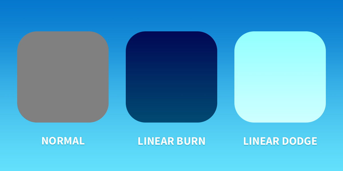
Three blend modes, same shape and color.
Except for certain specific cases, you should always set each layer’s blend mode to “Normal.” When it comes time to save image slices as PNGs to use in your app, Photoshop will blend non-opaque areas with an empty translucent background, thus losing the information produced by a dynamic blend mode.
There are also two opacity sliders for each layer. The one officially dubbed opacity adjusts the opacity for the entire layer, including any layer styles that have been applied. The other opacity slider is called fill. The fill slider adjusts the opacity of the layer’s contents without affecting the opacity of the styles. The difference between opacity and fill is easier to understand with a visual example:
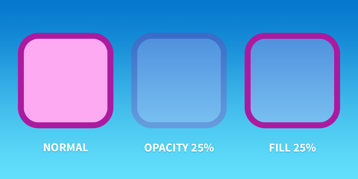
Opacity versus Fill
5. Layer Groups
Layers can be organized into a group, which looks like a folder in the the layer panel. Since Photoshop CS6, layer groups have their own layer styles and masks, as well as opacities and blend modes. This can be difficult to wrap your head around in the beginning, but it comes in handy when mocking up complex layouts.
Working in Vector
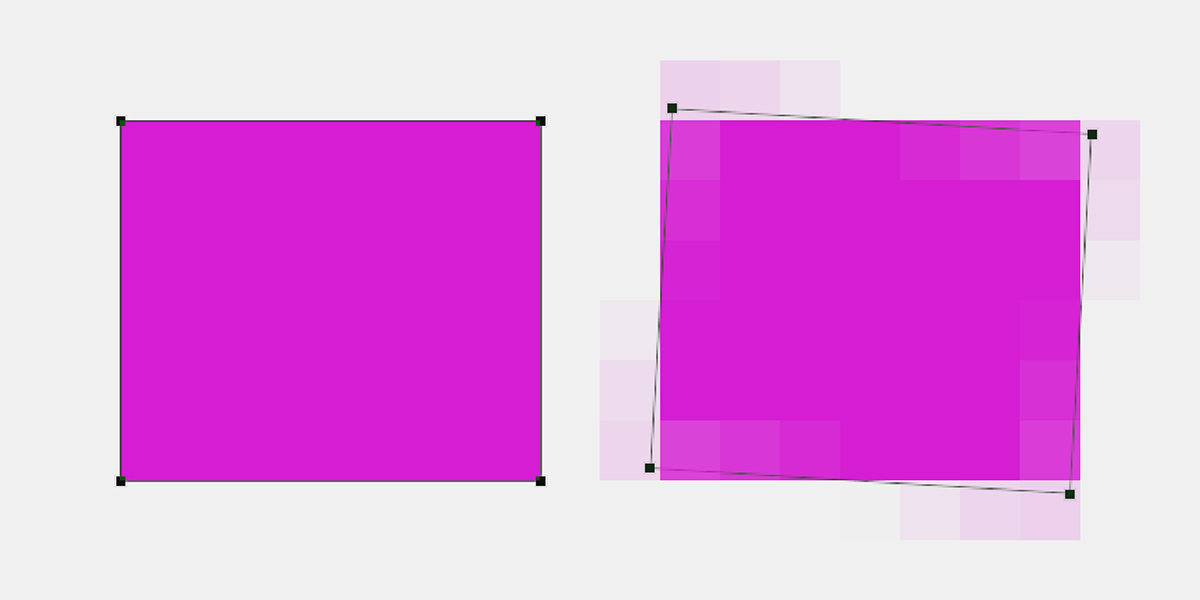
With new device form factors always on the horizon, it’s important for iOS designers to build mockups and image resources in ways that are easy to scale up or down as needed. The recommended approach is called “working in vector,” which is not necessarily a reference to working with SVGs. Most iOS app image resources are loaded as PNG files. But that doesn’t mean the Photoshop documents that generated them aren’t vector-based.
A vector-based Photoshop document is composed entirely of shape layers and fill layers. It is trivial to scale a non-retina @1x resolution document up to an @2x document, as long as it’s entirely composed of these two layer types. It’s often as simple as using the “Image Size…” menu item.
Some designers do all their mockups at non-retina scale and then scale up to retina for final processing. I prefer the opposite. Others make large sprite sheet documents that have both normal and retina scale images for app resources, side-by-side, sliced up for easy exporting. Whatever your approach, the most important thing is to avoid using raster layers at all costs. Scaling up a raster layer to a higher resolution will make your hard work look terrible:
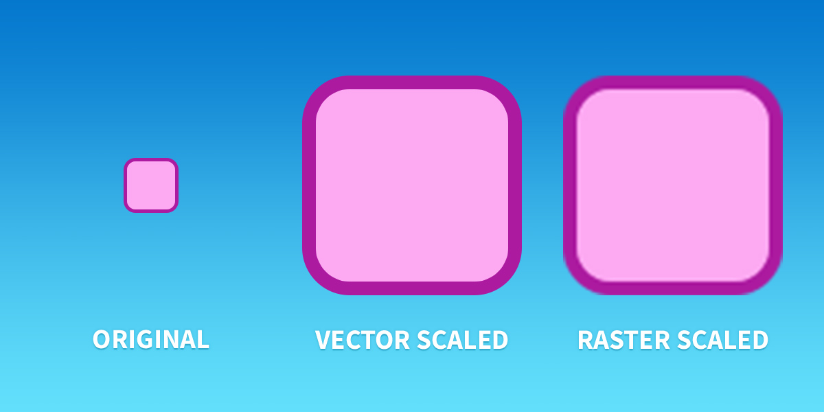
Vector versus Raster
Sample Project: A Classic Button
Let’s put together everything discussed above in a sample project. It may not be in-fashion these days, but a classic iOS button is a great learning project for experimenting with shape layers, layer styles, and vector-based documents.
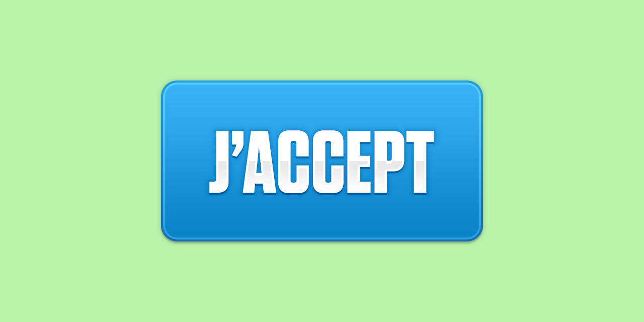
“Gee, our old LaSalle ran great…”
1. Create a New Document
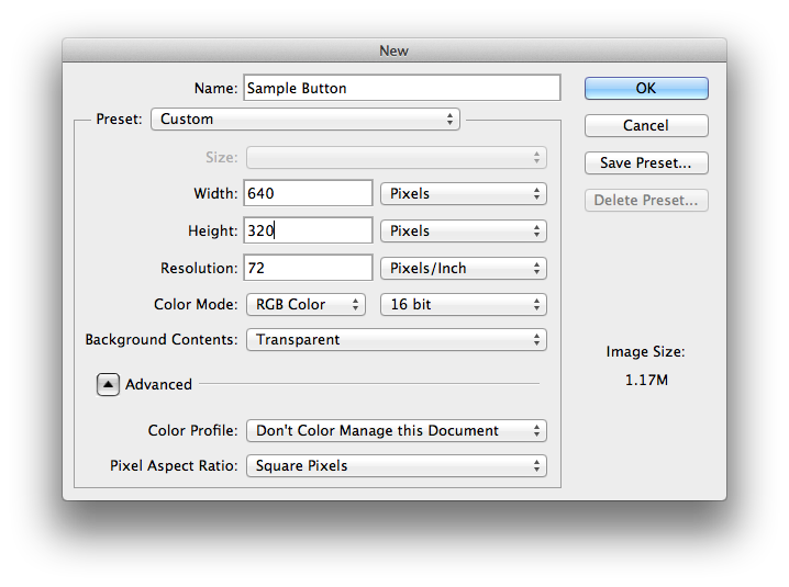
New Document Modal
A document for mocking up an iOS app should be in the RGB color space with a resolution of 72 pixels per inch. I usually work in a 16 bit color depth since it produces smoother gradients. If you plan on exporting PNGs for use in an actual app (say, for button states), be sure to have a transparent background.
2. Disable Color Management
Notice in the screenshot above that I selected “Don’t Color Manage This Document.” Photoshop processes color differently than other OS X apps. When you’re designing for mobile apps or for the web, you’ll want to disable all forms of Photoshop’s color management. In addition to disabling color management for all new documents, you’ll also want to select “Monitor RGB – Display” for “RGB Working Space” under the “Color Settings…” menu item:
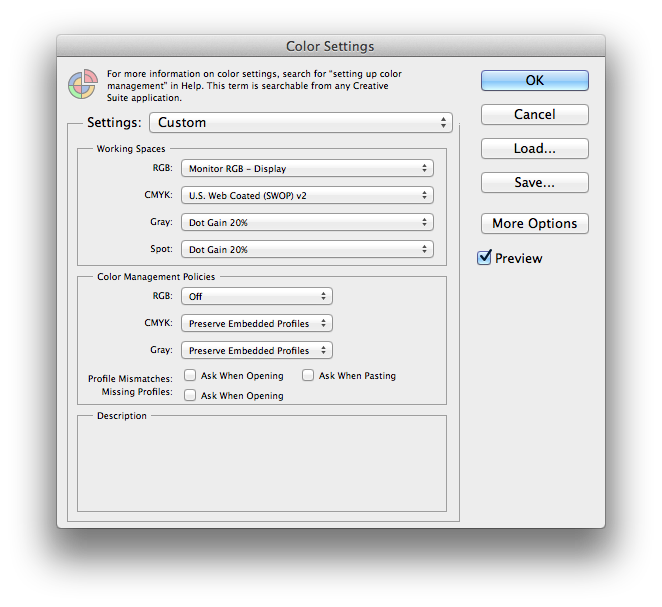
Color Settings
Using the native RGB space of your Mac’s display, your Photoshop document will look similar to what you’ll see on a device. But there’s no substitute for using something like Skala Preview to preview your designs in situ on an iPhone or iPad. Marc Edwards from Bjango has an excellent article that goes into detail on color management and Photoshop.
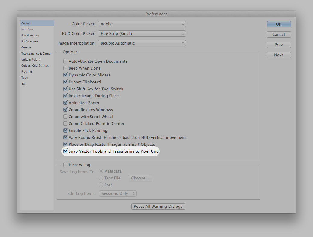
3. Enable Pixel-Snapping
All vertical and horizontal edges in your mockup should be aligned to whole integer pixel margins. It’s possible for shape layers to have path segments that are out of alignment with whole pixel margins. When this happens it makes the edges of your shapes look fuzzy:
Pixel snapping is crucial.
There is an option in Photoshop’s general preferences screen called “Snap Vector Tools and Transforms to Pixel Grid” which, when enabled, makes this much easier to manage.
This button toggles pixel snapping.
If you’re working on a retina resolution document (1536 by 2048 pixels for a portrait iPad), try to make all horizontal and vertical edges line up with even-numbered pixel margins. That way when you scale the document down for a non-retina screen, your edges won’t fall on sub pixel boundaries (which leads to fuzzy edges).
4. Add a Solid Color Fill Layer
Using a fill layer makes it easy to non-destructively tweak the background color of the document whenever you wish. To speed up my work, I use John Gruber’s system keyboard shortcut for the Help menu search box. I just start typing N-E-W F-I-L-L until the desired item appears in the drop-down.
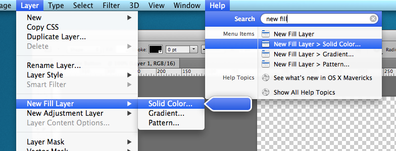
New Fill Layer
After picking a color, your document will have a backdrop to go behind the button.

Fill layer in action.
5. Add the Button Shape Layer
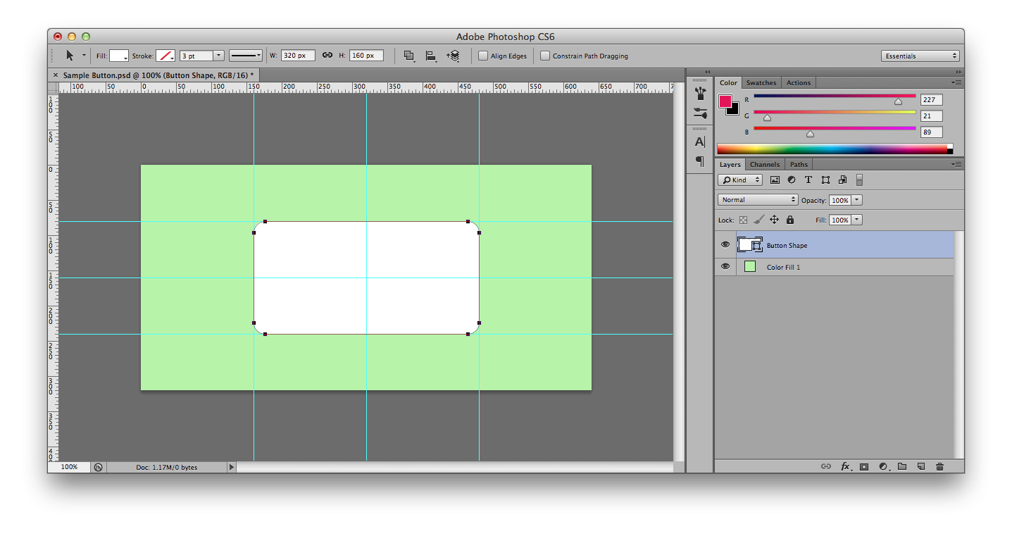
First put up some guides (either with the menu item or manually by dragging inward from the rulers) to get the size and position of the button the way you want.
Measure twice, draw once.
Next, choose the rounded rectangle shape tool from the tools panel. You may need to click and hold to switch between the shape tools from the sub-menu.
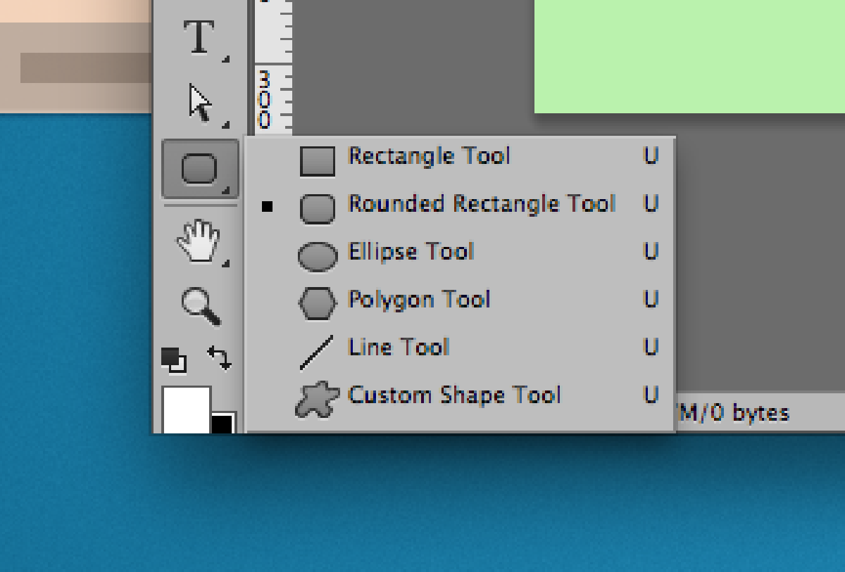
Shape Tool (click and hold)
When you’ve selected the rounded rectangle tool, the options toolbar changes to show the options for this tool, including a corner radius:
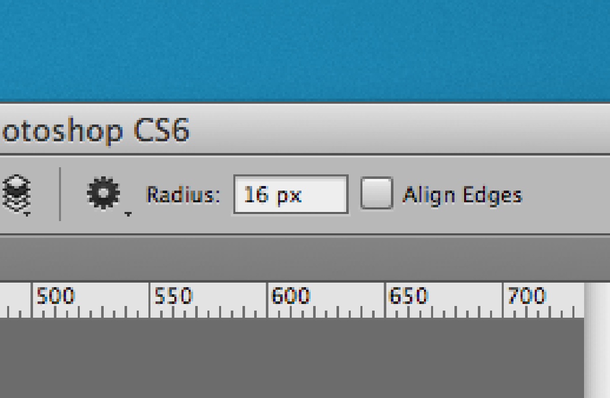
Corner radius option
If you can’t see the options menu, toggle it’s visibility under the “Window” menu item.
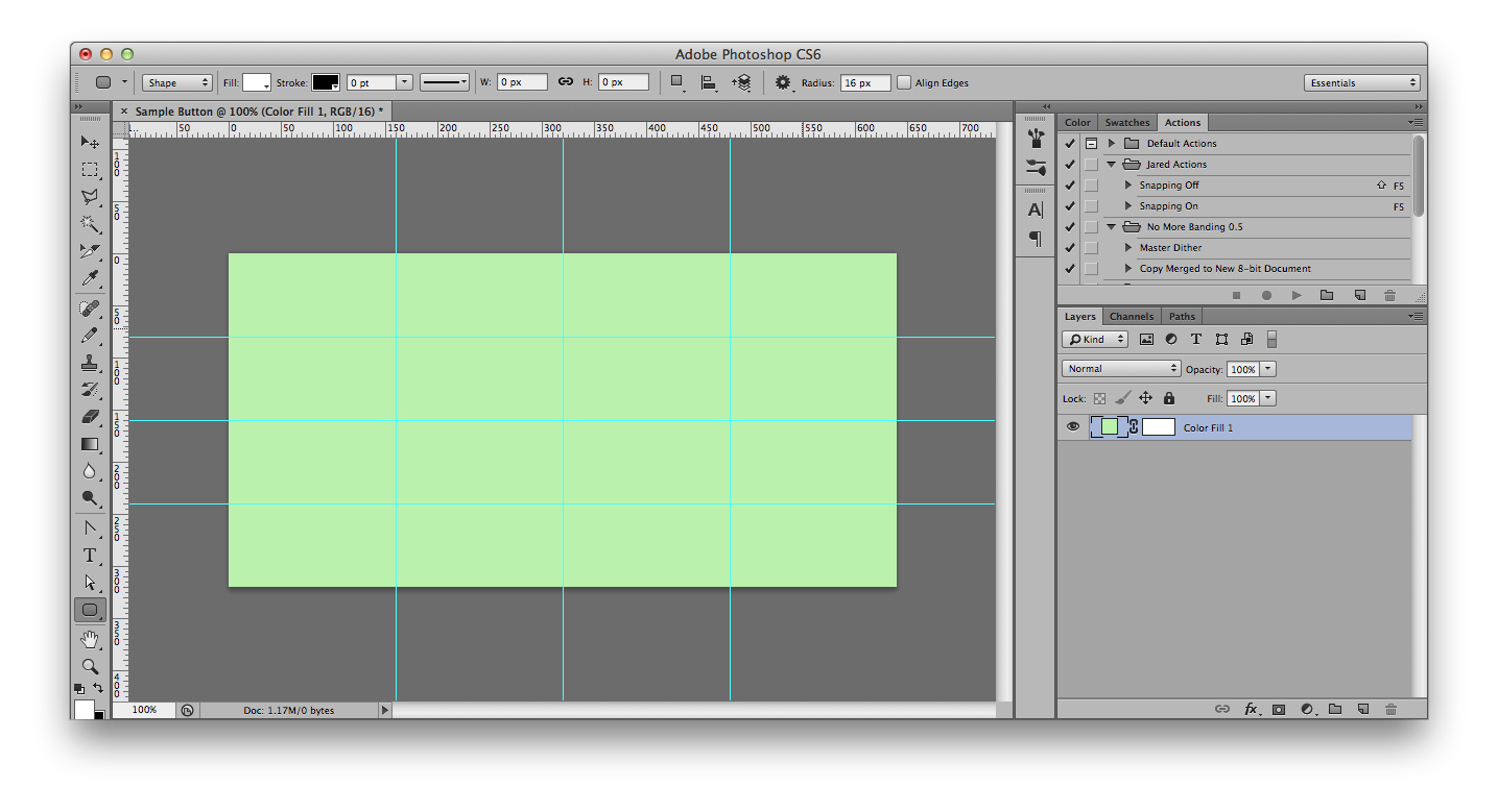
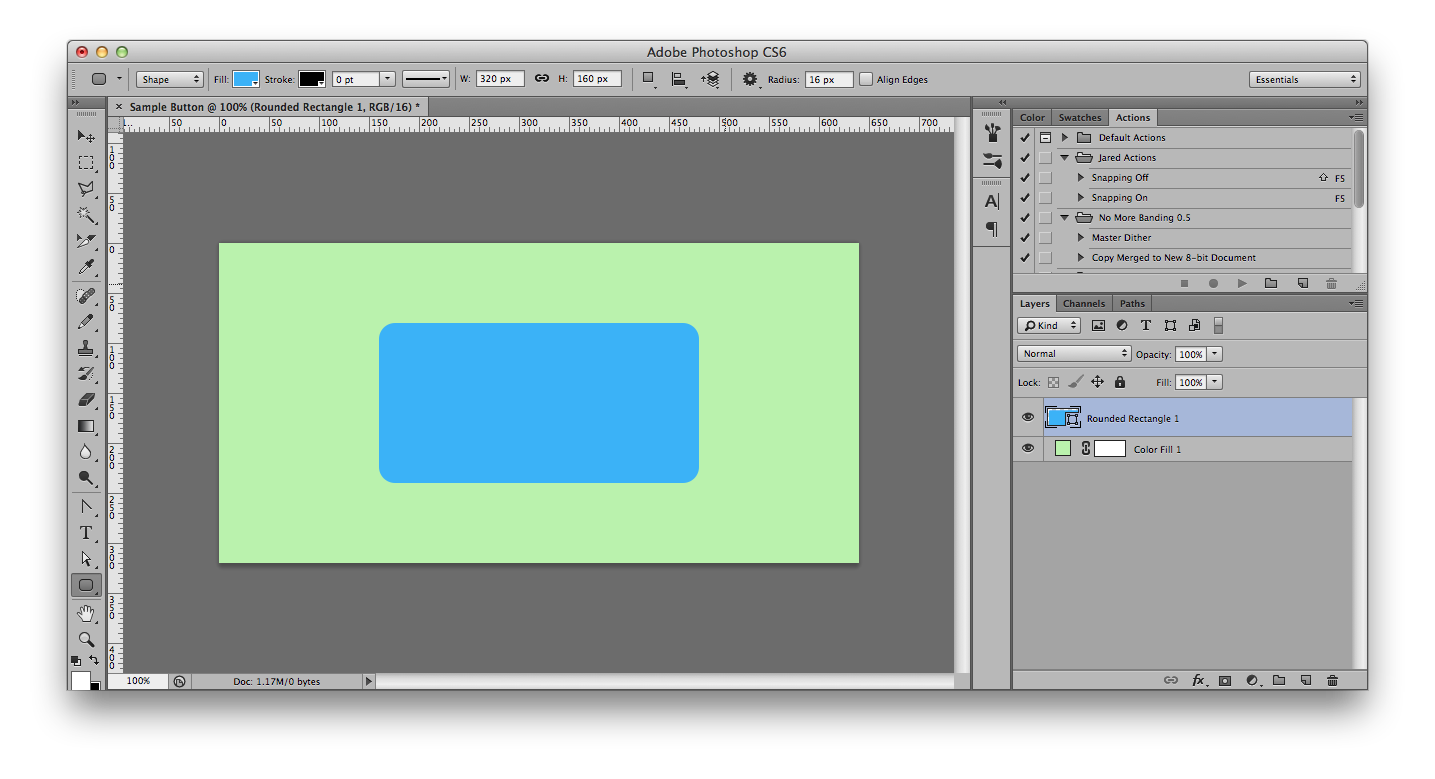
Change the corner radius to something neither too small or too large. Since this is a big button at retina scale, I think 16 pixels looks good. Now draw in your shape:
Newly-drawn Shape Layer
Notice that there is now a layer in the layers pane called “Rounded Rectangle 1”. I recommend giving a proper name to every layer in your document.
6. Change the Button’s Color
To change the fill color of your rounded rectangle, double click in the thumbnail preview for that layer in the layer pane (can it be less obvious?). This will make the color picker appear. Pick a bright blue color, but not too saturated. Something like this:
New Shape Layer ready to go
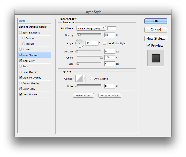
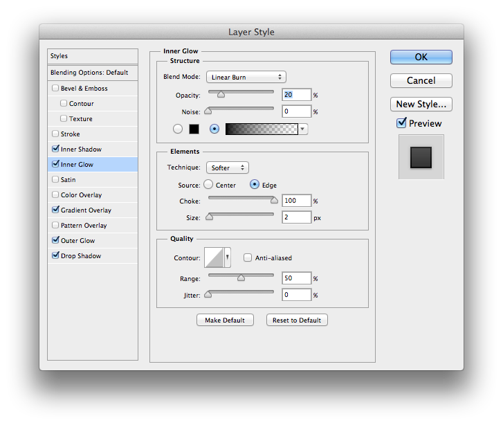
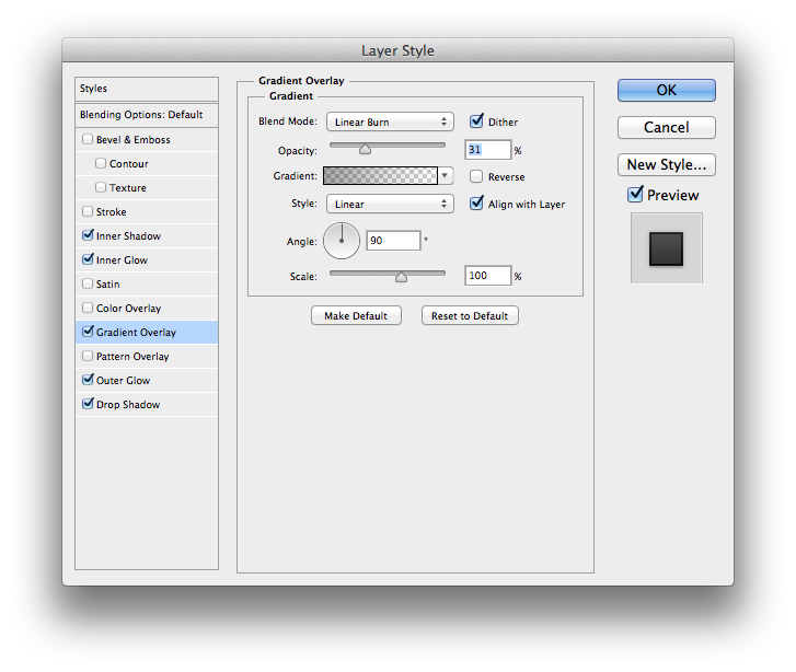
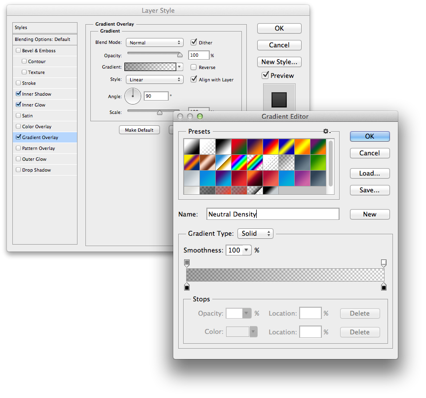
7. Experiment With Layer Styles
With the options in the Layer Styles window, there is shocking variety of possible effects you can achieve – even with just a single shape layer. The full breadth of each tool is outside the scope of this post, but I’ll give you a taste with the following recipe. To show the Layer Styles window, double click in the empty gray area of a layer row in the Layers Pane (yeah, I know, even less obvious).
Inner Shadow
Inner Glow
Gradient Overlay
Gradient Overlay Submenu
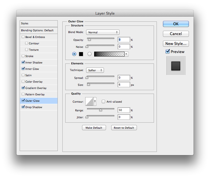
Outer Glow
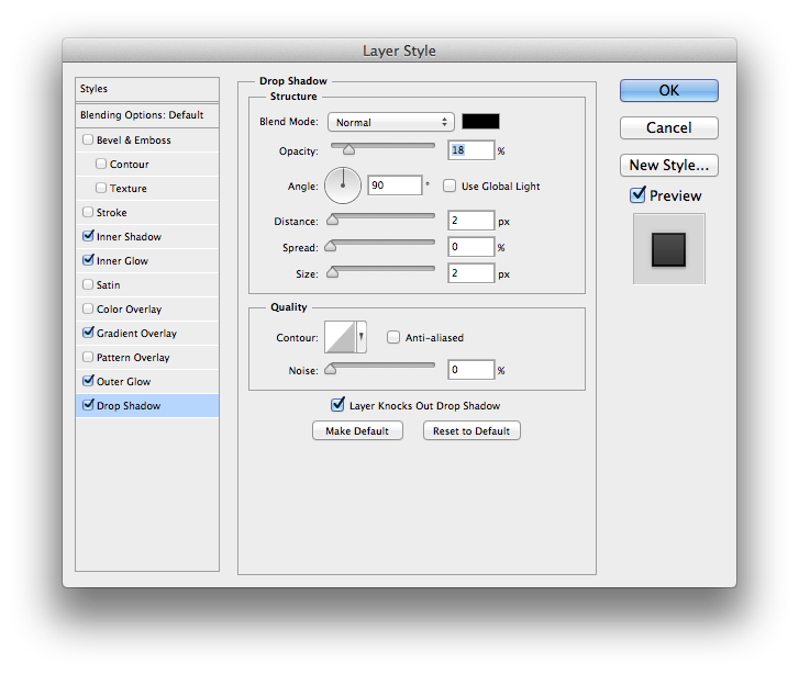
Drop Shadow
Bonus Points: Add an Icon Shape Layer
For bonus points, switch the shape tool to the custom shape option and add a white icon to your button:
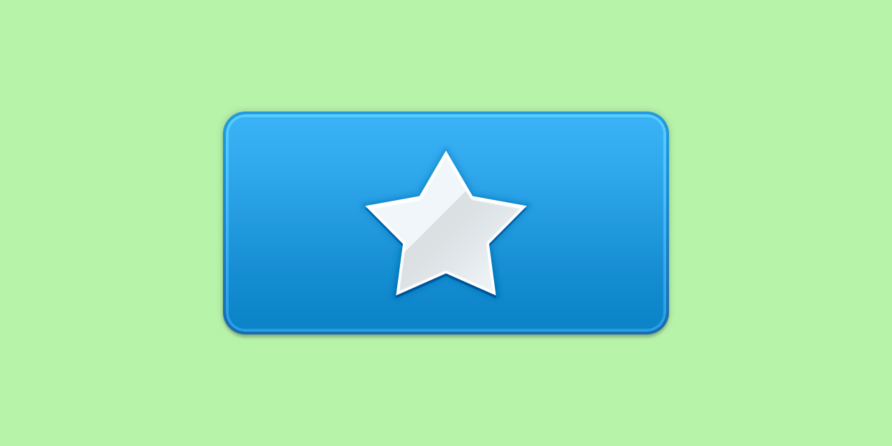
Style the icon to make it look sort of like mine does here. Remember this star is just one shape layer. You should be able to create this glossy, raised look with just its Layer Styles window alone.