Friday App Design Review – AnyList, Shared Grocery Lists
Every Friday I will post a detailed design review of an iOS app. If you’d like your app to be considered click here for more information. I am also available to consult privately on your projects.
This week’s Friday App Design Review is AnyList for iPhone, from the service of the same name. AnyList makes it easy to create grocery and shopping lists shared between you and and other members of your household.
![]()
My wife and I have been using AnyList for the last week and it works as advertised with fast, reliable syncing. We really like how it automatically sorts new grocery items by category. For the most part, we’ve been very pleased. It’s probably going to be our go-to app for grocery shopping from now on. I do have some qualms about the design, however, which I’ll address in this post.
AnyList is a freemium app, so rather than spend half of this post documenting how the app works, you should just download it now and try it for yourself. There are lots of extras and features peppered throughout the app, like built-in recipe storage, but this review is going to focus on just the list screen. My comments are applicable to the app as a whole, so hopefully this narrow focus will help clarify my points.
TL/DR
- Avoid fuzzy implied borders.
- Push beyond a stock aesthetic.
I. Avoid Fuzzy Implied Borders
There are two kinds of borders in an iOS app: real and implied. A real border should be self-explanatory. An implied border is obvious in context, even though it isn’t represented by a concrete visual border.

Most iOS toolbar icons have implied borders.
Implied borders are accomplished through the visual rhythm of multiple elements, identical in size and proportion, spaced at regular intervals. Elements of different sizes or shapes, or with an irregular arrangement, result in fuzzy implied borders. In an iOS app, fuzzy borders should be avoided, especially when arranging tappable elements.
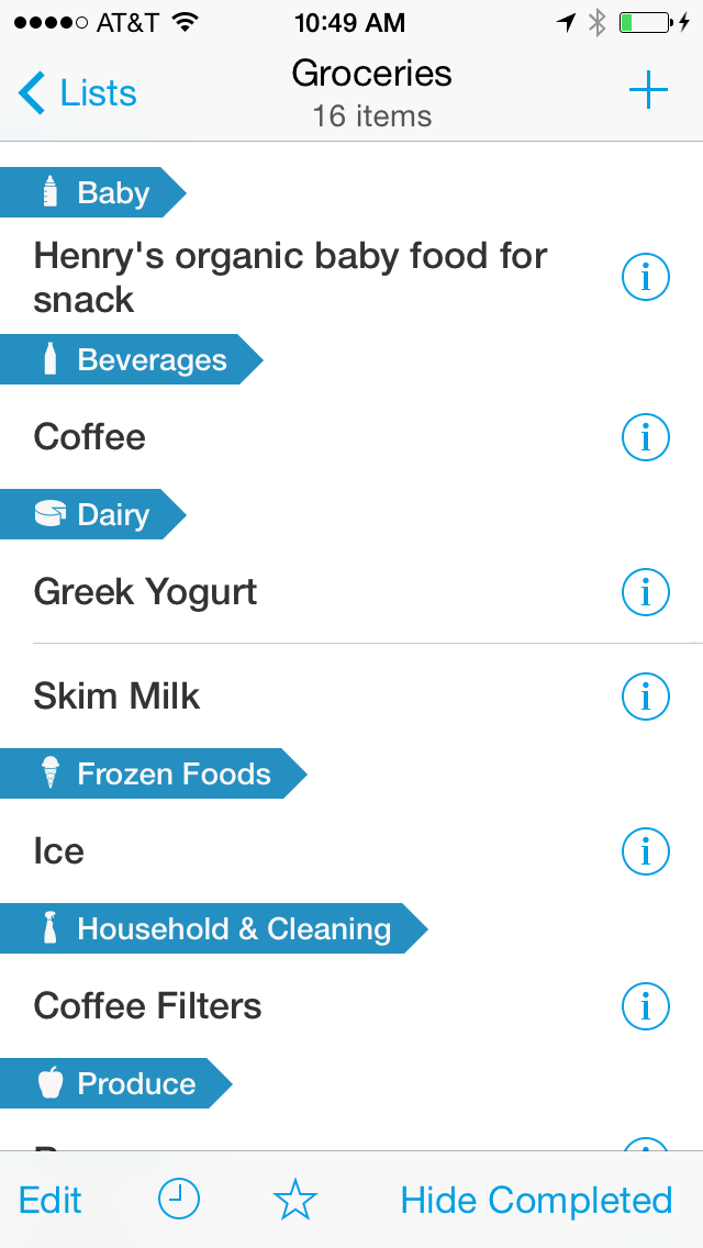
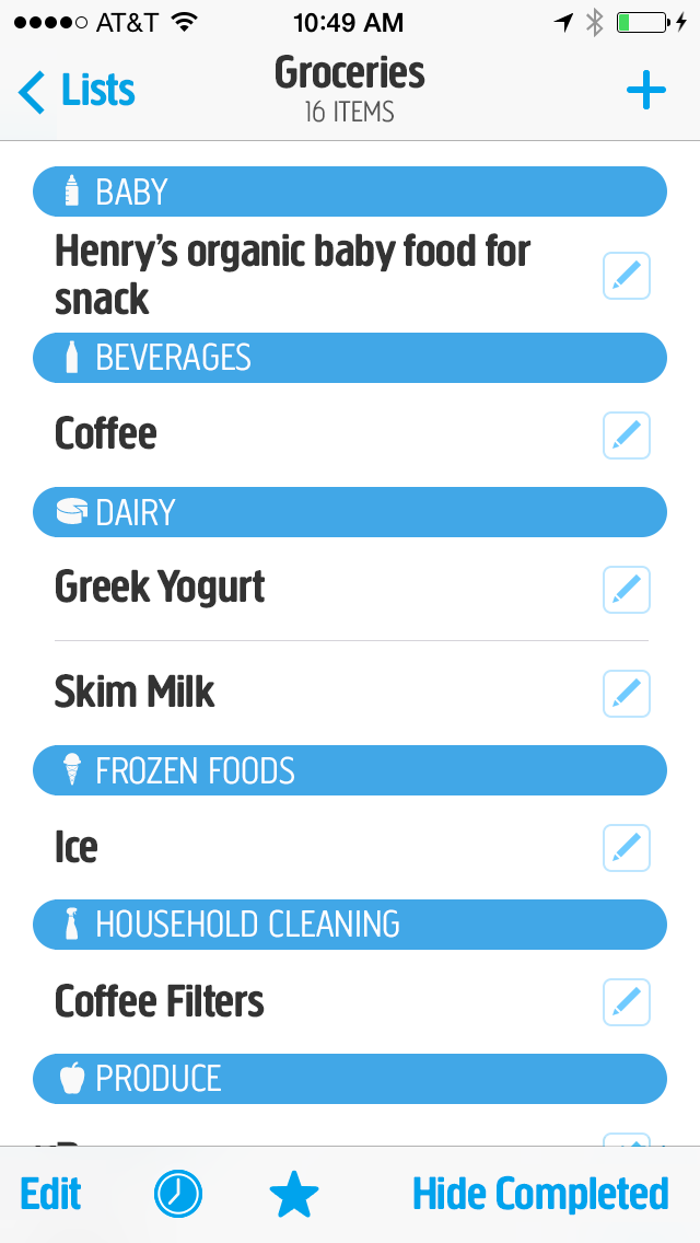
The current AnyList list screen.
AnyList’s list screens suffer from numerous fuzzy borders. Because section headers don’t span the width of the screen, and because sections with only row don’t have any row separators, it is often difficult to tell where one tappable area ends and another begins.
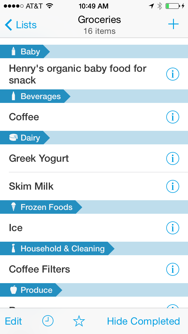
Dark areas are the most visually confusing.
To sharpen these implied borders, the section headers would need to span the width of the screen:
By extending the section headers, the tappable areas of both the rows and the detail buttons becomes more obvious. Your eye would perceive the implied borders more easily:
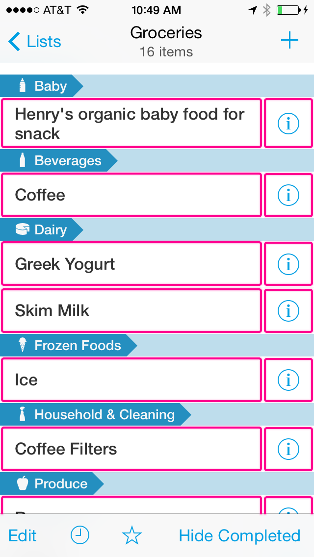
While this is easier to use, it isn’t visually interesting. Perhaps there is a way to sharpen the fuzzy implied borders while also adding tasteful visual interest.
II. Push Beyond the Stock Aesthetic
AnyList adheres almost exclusively to the stock visual language of iOS 7. Buttons and icons are thin and wispy. A predominantly solid white background color is interrupted only by occasional horizontal borders. Unadorned text abounds, except where a single accent color is in use. With few exceptions, every interface element looks the way it would if you had just dragged it from the new object panel in Interface Builder.
This stock look doesn’t do AnyList any favors. As a subscription service, AnyList aspires to build a long-term relationship with its customers. Just like a dating relationship, this story will begin with visual attraction. AnyList needs a strong personality to draw in new customers and to help create an emotional bond with them as they grow familiar with the service. The current stock aesthetic feels too utilitarian.
The outliers in the current aesthetic are the AnyList logo and word mark:
![]()
The rounded, perky logo is fantastic. I love the movement it suggests. It looks almost anthropomorphic, like the Pixar lamp bouncing on a ball. What would AnyList for iPhone look like if the character of the logo were applied throughout the app? I’ve made a mockup of one possible approach:
My rough sketch of an alternate design.
Here’s the rationale for my suggested changes:
Get rid of Helvetica.
I’ve changed Helvetica to Creighton Pro. Helvetica is not only stock, it’s a poor choice for body text. AnyList is a predominantly text-based app. The font choice has the greatest influence on the look and feel of the app. Creighton Pro is just one of many possible alternatives. It echoes the rounded corners of the AnyList logo and word mark. It’s readable, stout, and casual.
Make the toolbar icons meaty.
While I’d argue that iOS 7’s wispy icons are terrible in general, in AnyList’s case they’re also not brand-appropriate. In this mockup I’ve made the toolbar iconography meatier and more rounded, like the logo.
Improve the section headers and row separators.
The pointed arrow section headers don’t fit within the aesthetic suggested by the AnyList logo. I replaced them with the full-width roundrects, which echo the similar shapes found in the AnyList logo. The repetition of these shapes makes the logo feel inevitable in hindsight. It creates a strong visual association between the layout of the app and the AnyList brand. This look also has the extra benefit of solving the fuzzy implied border problem described above. I’ve added negative space to the right margin. Horizontal row separators no longer touch the either edge of the screen. This subtle choice is suggested by the AnyList logo itself. It also helps visually separate the scrollable content from the navigation bar and toolbar.