Designing Unread for iPad Part 5 – Comical Amounts of Negative Space
This is Part 5 in an ongoing series about the design of the iPad version of Unread.
Now that I know how I want the article view to look, I can work backwards through the other screens in the app. Those screens are:
- Article Summaries List – This is the second most-viewed screen in Unread. On the iPhone version, it’s a long list of article summaries, titles, and image thumbnails.
- Account Dashboard – The source list for navigating to an article summaries list. This screen has three sections: Articles, Folders1, and Subscriptions.
- Home screen – This screen has the list of all your accounts, plus a section for extras like settings or contact options. On the iPhone, this screen also has the UNREAD masthead, to make the app feel more like a magazine.
At this stage in the design process, the quickest way out is to use a split view controller and call it a day. That was how the earliest iPad apps solved the problem. Many others have mimicked it. But I am almost certain that this would be a mistake for Unread.
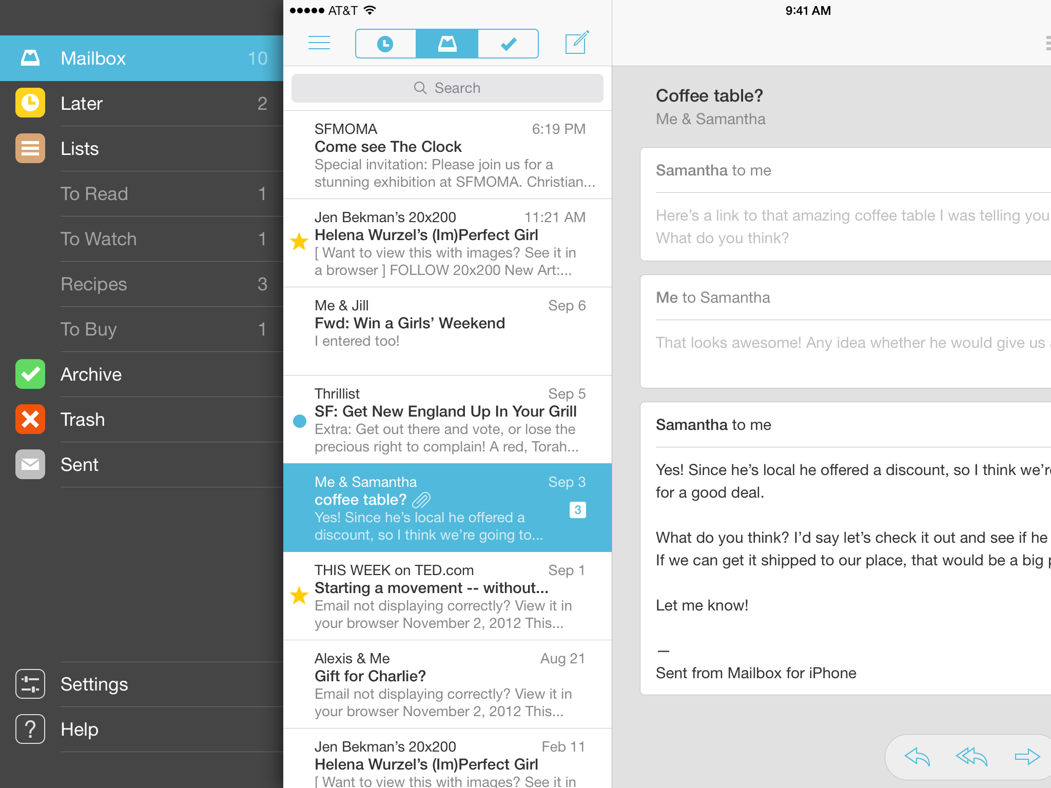
Mailbox for iPad has a bitchin’ combo of a split view controller and a basement menu.
A split view controller literally splits your attention in half. It turns an app into Minority Report Lite: flick through a list of sources on your left, while pinching and zooming in a detail view on your right. For productivity apps like Mail.app, this kind of shallow triage behavior is desirable. But it’s antithetical to Unread’s emphasis on distraction-free reading.
As jarring as it sounds, I think it would be better to use the same full-screen navigation I developed for the iPhone, but enlarge it to fill the larger display. Unread is a magazine, not a status board. The reader only needs to see one thing at a time.
This doesn’t mean that I should simply scale up the content of each iPhone screen, too. That would be a mistake. The iPad’s display gives me some room to explore alternate layouts.
Updated Design Constraints
So my list of constraints is a little longer now:
- Use comfort zones. Wherever possible, controls and navigation should be accessible within the comfortable areas on the outer middle edges of the display.
- Discourage multitasking. Only one screen should be visible at a time.
- Evoke pleasurable reading. Where prudent, borrow visual cues from leisure reading materials like literary magazines.
Finally, Some Photoshop Mockups
With these new constraints in hand, I am finally able to experiment with some high-fidelity Photoshop mockups. In making these, I discovered that my new constraints leave me with two options when designing new layouts:
- Increase Information Density – Since I have more room, I could add more content per screen. Perhaps the single-column article summaries list should be two columns, like in Instapaper.
- Increase Negative Space – On the other hand, just because I have more space doesn’t mean I need to fill it up with more stuff. I could use negative space to introduce breathing room.
If Unread was a person, it would be the kind of person who always speaks softly, even when speaking to a person across a large empty room. I think I’ll have to go with #2, even if it means using an almost comical amount of negative space for an iPad app.
Navigation Gesture
Click to see full resolution.
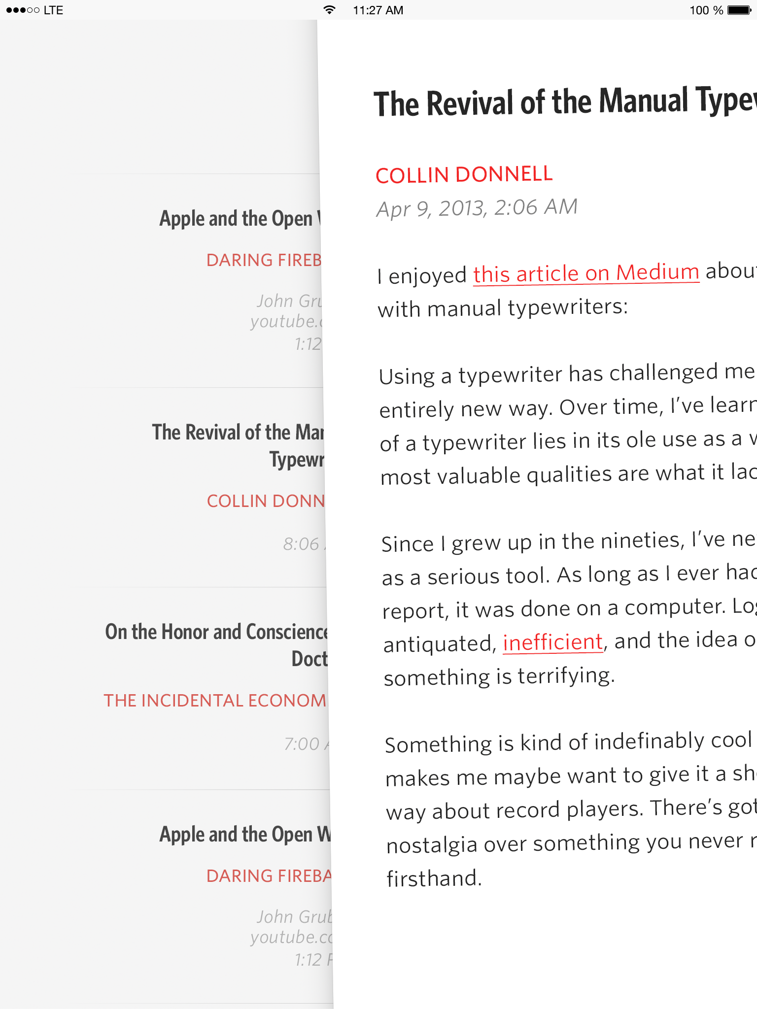
Article Summaries
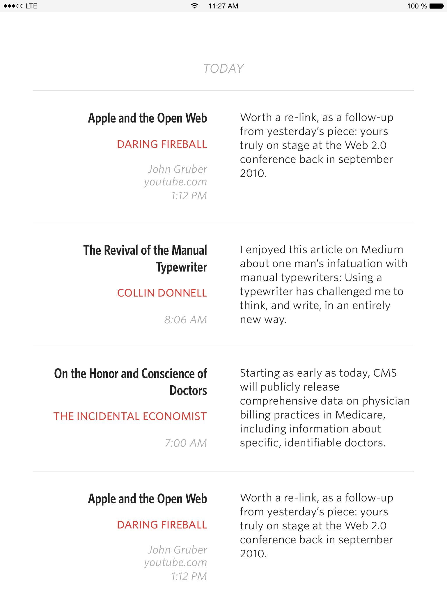
Click to see full resolution.
Account Dashboard
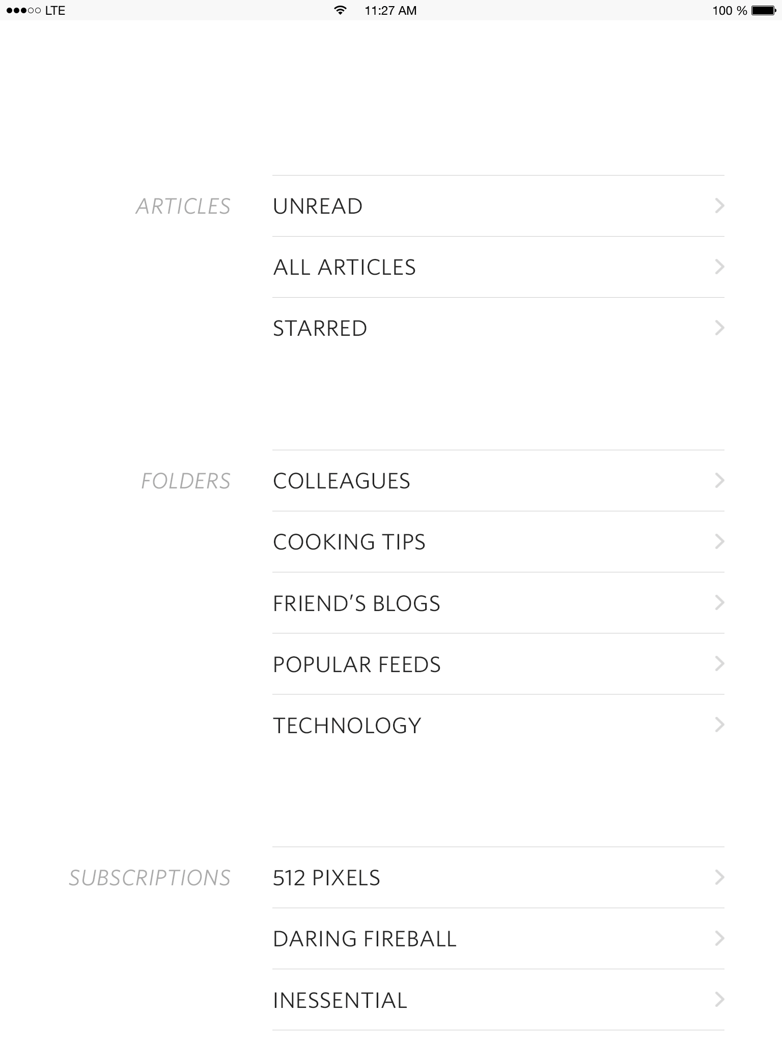
Click to see full resolution.
-
Substitute the word “folders” with whatever nomenclature is specific to your preferred RSS service: tags, groups, categories, etc. ↩
Why Unread Will Never Have a Readability View
One of Unread’s most frequent feature requests is a “Readability View” for articles with truncated RSS content. Unlike the similar feature which “mobilizes” the current web page in the in-app browser, a Readability View displays full article content without the user visiting the original site first. This view is named as such because Readability provides the most commonly-used API for the feature, though it is not the only service to do so.
Back when I was using other RSS apps, I used a Readability View all the time. For example, I subscribed to Paul Krugman’s blog at the New York Times. His writing is great, but blogs at the Times strip their RSS articles down to just one sentence summaries. To read the full content, I had to visit the actual site for every article. This was very inconvenient and contrary to the spirit of RSS. Since a Readability View was only a button tap away, I used it with abandon.
When it came time for me to consider adding a Readability View to Unread, it dawned on me how unfair that feature is to publishers. RSS articles aren’t truncated by accident. They are deliberately truncated so that readers will have to visit the original site. The most likely reason for this is so that readers will be exposed to ads, and possibly interact with them. Whether or not I (as a reader) dislike ads or feel inconvenienced by a truncated feed is irrelevant. A publisher does not owe me an ad-free experience. In many cases, ads are the only viable business model for a publisher.
It’s more important that publishers get paid, so they can continue publishing stuff that I ostensibly want to read. If a site doesn’t offer a full-text RSS feed, then I should either accept that I have to visit their site to read it, or decide that the inconvenience isn’t worth it. Maybe those sites should consider monetizing their RSS feeds with a Daring Fireball style sponsorship.1 Either way, it’s not the place of Unread or any other app to make that business decision on the behalf of publishers.
-
Because, let’s be honest, it doesn’t take much work to understand the target demographic for RSS sponsorship ads. ↩
Unread Version 1.2 Launches April 21st
The next update of Unread for iPhone is going to be a huge one. Tons of new features and fixes. Check back here on Monday April 21st for a complete list of what’s new.
Introducing Friday App Design Reviews
Starting next Friday, I will be posting a new weekly feature here on this blog: Friday App Design Reviews. I’m really excited about this.
If you’re an independent iOS developer (like me), or your team is interested in an experienced outsider’s opinion, let me know about your app.1 Every week I’ll choose an interesting submission and share detailed, constructive criticism in the form of long blog post (like this one, but more detailed, and with screenshots).
If you’d prefer a formal, private design review I am available for that as well. I’ll charge you a fair price based on the scope of the project. Public blog post reviews are free of charge.
Either way, shoot me an email with the details about your app. I won’t be able to review every submission, so be sure to help me understand how your app will be interesting to other readers of this blog.
-
You can submit someone else’s app, too, if it’s available for sale on the US App Store. ↩
Recap of My Recent Github Goodies
Under the influence of Bryan Irace, an iOS engineer at Tumblr, I’ve open-sourced a lot of handy iOS utilities lately. These are all polished, single-purpose units of code which should be cake to drop into your projects.
JTSImageViewController is like a “light box” for iOS. It’s similar to image viewers you may have seen in apps like Twitter, Tweetbot, and others. It presents an image in a full-screen interactive view. Users can pan and zoom, and use Tweetbot-style dynamic gestures to dismiss it with a fun flick. Don’t force your users to learn yet another set of gestures. Tweetbot’s are the best and should become the canonical reference.
JTSCursorMovement adds convenient gesture recognizers to a UITextView that make it easy to move the cursor forward or backward. Use one finger to move by characters, two fingers by words, and three fingers by paragraphs. JTSCursorMovement works with both plain text and attributed text, and with composed characters like emoji. I use this in all my apps. I wish every app used it.
JTSSmartPunctuation replaces common shorthands composed of dumb punctuation with their smart counterparts. It turns dumb quotes into smart quotes, three consecutive periods into an elipsis, three consecutive dashes into an em-dash, and two consecutive dashes followed by anything but a dash with an en-dash. It’s compatible with right-to-left languages and safe to use with composed character sequences, like emoji. It only scans the immediate vicinity around recent edits, so it should perform well even with very long runs of text.
JTSSemanticReload is a category method on UITableViewController for calling “reloadData” while preserving semantic content offset. Many times you don’t want to use an animated table view update, but you do want to insert new rows above the current content offset. The problem with using reloadData is that it loses the user’s current place in the content. In these situations, use the JTSSemanticReload category instead.