Friday App Design Review: Glassboard
Every Friday I will post a detailed design review of an iOS app. If you’d like your app to be considered click here for more information. I am also available to consult privately on your projects.
Set against a backdrop of new competition and jaw-dropping acquisitions, the indie messaging service Glassboard has the silhouette of a lone surfer facing a looming tidal wave. With so many larger and more ubiquitous alternatives, why would someone choose Glassboard to handle her private messaging?

Glassboard’s current app icon.
Glassboard faces obstacles in all directions. Every design choice counts. Visual design, interaction design, and branding must come together in a coordinated response to the question: Why Glassboard?
My friend Justin Williams, the brains and brawn behind Glassboard since his company Second Gear acquired it last fall, asked if Glassboard’s iPhone app could be the subject of the inaugural Friday App Design Review post. He’s a good friend — and demonstrably bonkers for taking on a project the scope of Glassboard nearly single-handed — so I’m happy to oblige.
The bad news is that I think Glassboard.app has a lot of room for improvement. The good news is that Justin has a really strong foundation to build upon. Glassboard is an opportunity to solve some really fun design challenges. My observations can be grouped roughly into three goals: declutter the hamburger basement, resolve competing hierarchies, and find a strong voice.
I. Declutter the Hamburger Basement
Basement menus1 are notorious for the spite they elicit from some people. I think these menus are neither always right nor always wrong. They can be very useful for some apps. Glassboard is one of them — sort of.
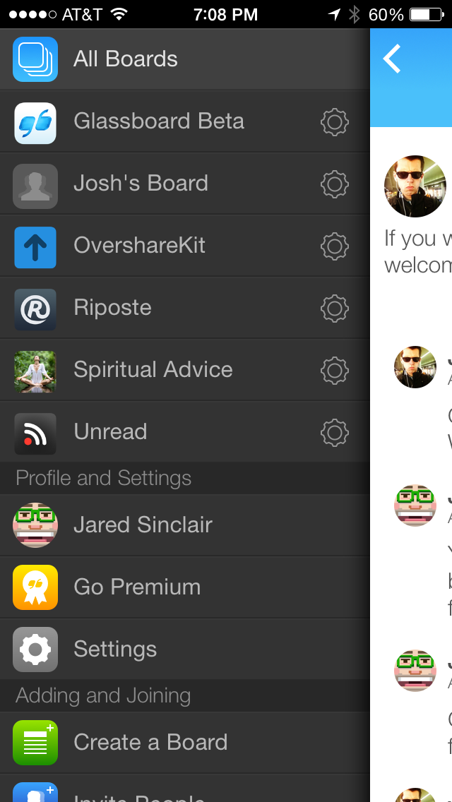
Glassboard’s basement menu.
Basement menus make sense under these conditions:
Is there a single screen where the user spends most of her time? In Riposte we use one because our users spend almost all their time reading the unified timeline. I would recommend that Justin find out how his best users spend their time on Glassboard, and then reevaluate the usefulness of a basement menu.
Is there a dynamic number of equally-weighted menu items? A Glassboard account could have two or twenty boards, each one equally important. A basement menu is better suited for this then a tab bar. Tab bars are limited to five visible items.
Are the contents of the menu easy to memorize? I doubt that Glassboard’s basement menu meets this criteria. On the one hand it’s easy to remember the list of boards since they’re my boards. But the menu also has three additional sections with a total of nine subitems – too many to remember when they’re not visible. However, there’s a caveat to this rule…
Are hard-to-memorize items used infrequently? If a menu item is rarely used, it isn’t a problem to hide it in a basement menu. It’s likely to slip out of the user’s memory no matter where you put it.
Are the number of items kept to a minimum? I would prune Glassboard’s three non-board sections down to a single section with three choices: Profile, Go Premium, and Options. Everything else can be accessed via the Options menu item. This would introduce some much-needed breathing room:
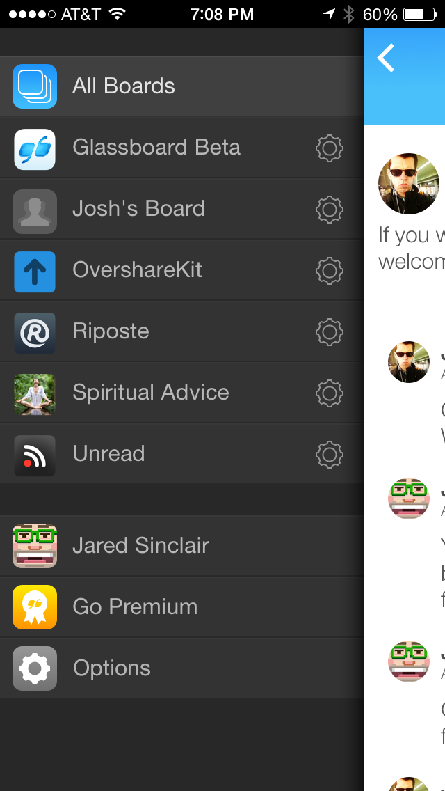
Mockup of a simplified basement menu.
II. Resolve Competing Hierarchies
Most messaging services have two levels of hierarchy:
Boards —> Messages
Glassboard has three:
Boards —> Messages —> Comments
Messages and comments are not interchangeable. Each message is the root of a new conversation. Comments are replies to a message.
Glassboard’s weak visual distinction between messages and comments confuses me. I have to slow down and concentrate before writing a new entry. It’s hard to decide whether I should write a new message or leave a comment on an existing message. It’s also easy to pick the wrong one when trying to pick the other.
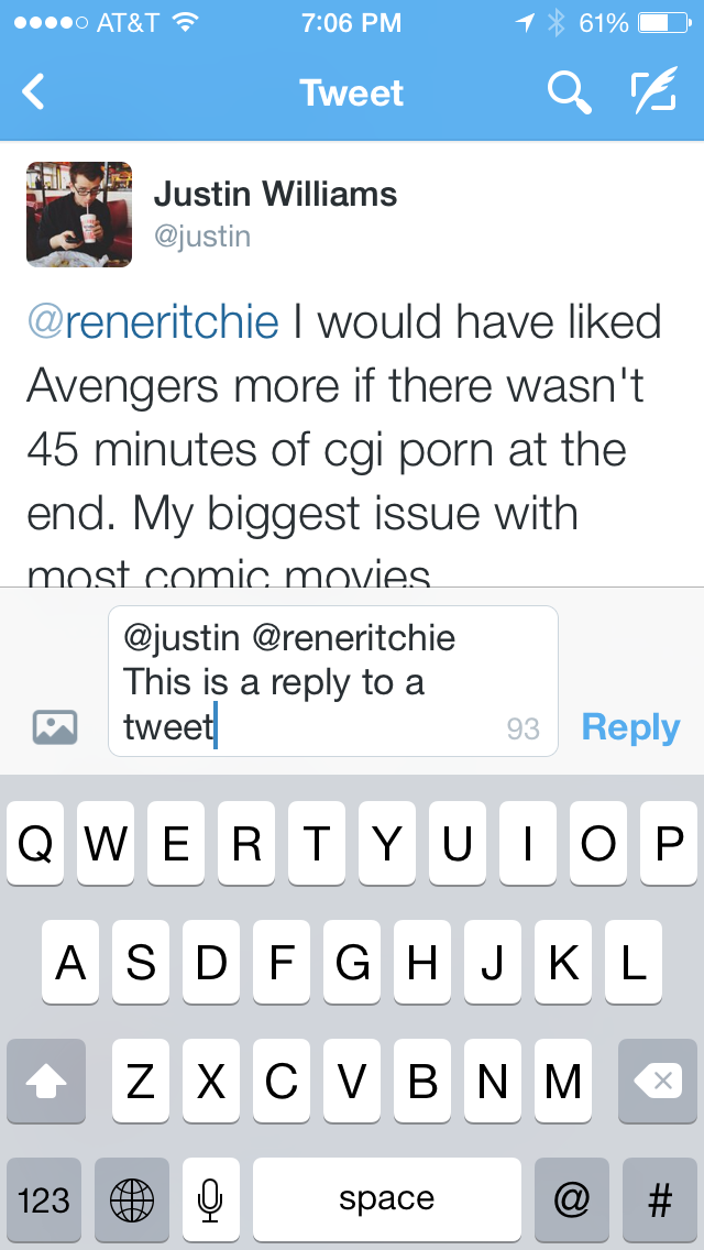
Here’s how comments and messages are currently presented:
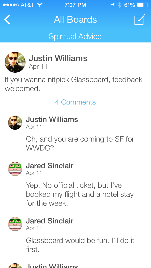
Messages or comments?
Notice how comments look like slightly smaller messages. If I’m in a hurry, it’s easy to confuse them.
The Wrong Way to Solve It
What if Glassboard gutted itself of the distinction between comments and messages? This would make Glassboard easier to learn for newcomers. But even if we ignored the incredible difficulty of migrating the API, it would still mean throwing away an opportunity for differentiation. Commenting is Glassboard’s most unique feature. Better to keep it but handle it with thoughtful boldness.
Make Messages Feel Like Conversation Pieces
Messages are more expensive than comments. A comment is a minor addition to an ongoing thread. A new message is an invitation to a fresh discussion.
A new message should feel like a conversation piece. It should be as obvious as a striking floral arrangement at the dinner table. Consider how Instagram photo posts are more prominent than their comments:

Typical Instagram timeline.
The design of an app should silently guide the user toward the right actions. New Instagram posts are composed using full-screen modals, whereas new comments are composed inline in a tiny text view at the bottom of the screen:
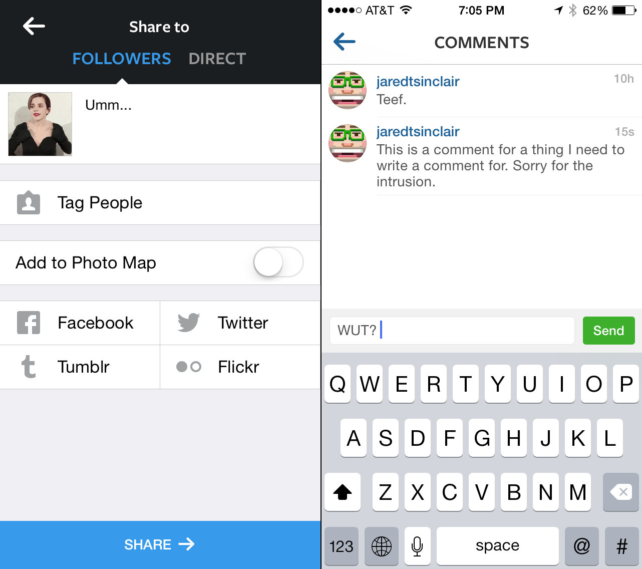
Posts versus comments.
This indirectly communicates to the user that comments are lower on the totem pole than photo posts. Twitter.app for iPhone has since adopted the same pattern, as you can see here:
Twitter’s conversation screen.
Glassboard doesn’t have to copy this layout per se. The important lesson is that messages and comments are easier to distinguish if they have vastly different visual weights.
Make Boards Feel Like Lists of Conversations
The primary screen for a board should read like a list of conversations. I would even consider renaming “messages” to “conversations,” just to make this screen’s purpose as explicit as possible. If comments are visible on this screen at all, they should be treated as mere metadata hanging off a message, like a date stamp or an unread indicator.
Here is a sketch of how the layout could be different:
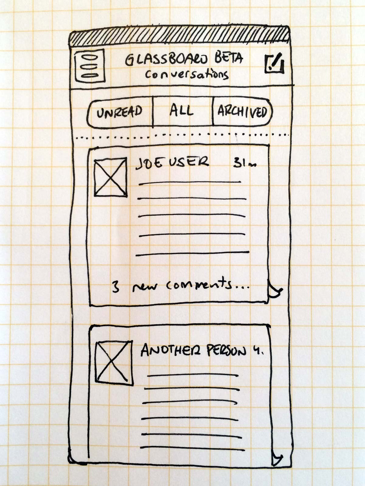
Click to see full resolution.
The goal of this layout is to give a simple overview of recent activity on a board. I’ve added a segmented control at the top of the table view that makes it easy to filter the list of conversations down to just those that are unread (or that have unread comments). I’ve also implied a hypothetical archiving feature, which would hide conversations from view until they have new activity.
I recommend studying the way Github has solved these problems with their issues pages. They have a pleasant mix of advanced options and sensible defaults. It’s also the closest analog to Glassboard’s API that I’ve found.
III. Find a Strong Voice
When starting a new design project, the hardest part is finding the project’s voice. There are no easy solutions, and more than one right solution. You discover the voice through a repeating cycle of experimentation and refinement, one following the other, over and over. You try lots of things that turn out to be dead ends. With time and effort you accumulate enough familiarity with your project until one of the possible paths seems obvious.
A strong voice for the design of an iPhone app means lots of things. It means choices that look deliberate without feeling arbitrary. It means a consistent use of whitespace, borders, and colors. It means each screen bears a family resemblance to all the others.
Glassboard’s design feels like a rough draft still waiting for a voice. It needs more consistency in the relationships between small details. It needs a stronger personality. Most importantly, it needs a recognizable brand identity.
Consistent Relationships Between Small Details
A design’s voice is expressed in part by the relationships between small details. If a button is rounded, what corner radius is used? Should it be the same for all buttons, or proportional to the size of each button? Should buttons look three-dimensional? Should they have borders? Should all buttons undergo the same visual changes when pressed?
What kind of iconography will the app use? Will it be wispy and thin like stock iOS 7 iconography, or will have some other aesthetic? How well does the iconography harmonize with the fonts used? Is the iconography consistently applied wherever it is found?
Will avatars be circles or squares? What will the proportions be between the size of avatars and the text sizes? Should there be a consistent mathematical relationship between the relative proportions of various elements?
Are colors restricted to a certain palette? Is the palette rigidly enforced? If there’s a text view, does its selection color (tint color) match one of the colors in the palette? Should it?
It’s beyond the scope of this post to answer all these questions for Glassboard. I can only point out that I think the app could benefit from further review along these lines.
A Strong Personality
A design’s voice is also expressed in the strength of its personality. A personality is a set of consistent relationships combined in such a way that they form a cohesive whole. A recent example is the game Threes. Practically any screen in Threes is instantly recognizable:
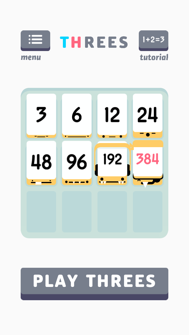
Threes iPhone game.
Threes achieves this through a surprisingly small set of constraints:
- Strict color palette.
- Complimentary, non-standard typeface.
- Lots of rounded corners.
- Consistent three-dimensional perspective.
- Generous amount of white space.
It’s important to note that Threes’ interface isn’t perfect, but it doesn’t have to be. The strength of its personality hides many sins. Users only feel a thrill of delight. It’s better to develop a strong personality first, then clean up its execution later.
Just for fun, here’s how Glassboard would look if it were designed in the style of Threes:
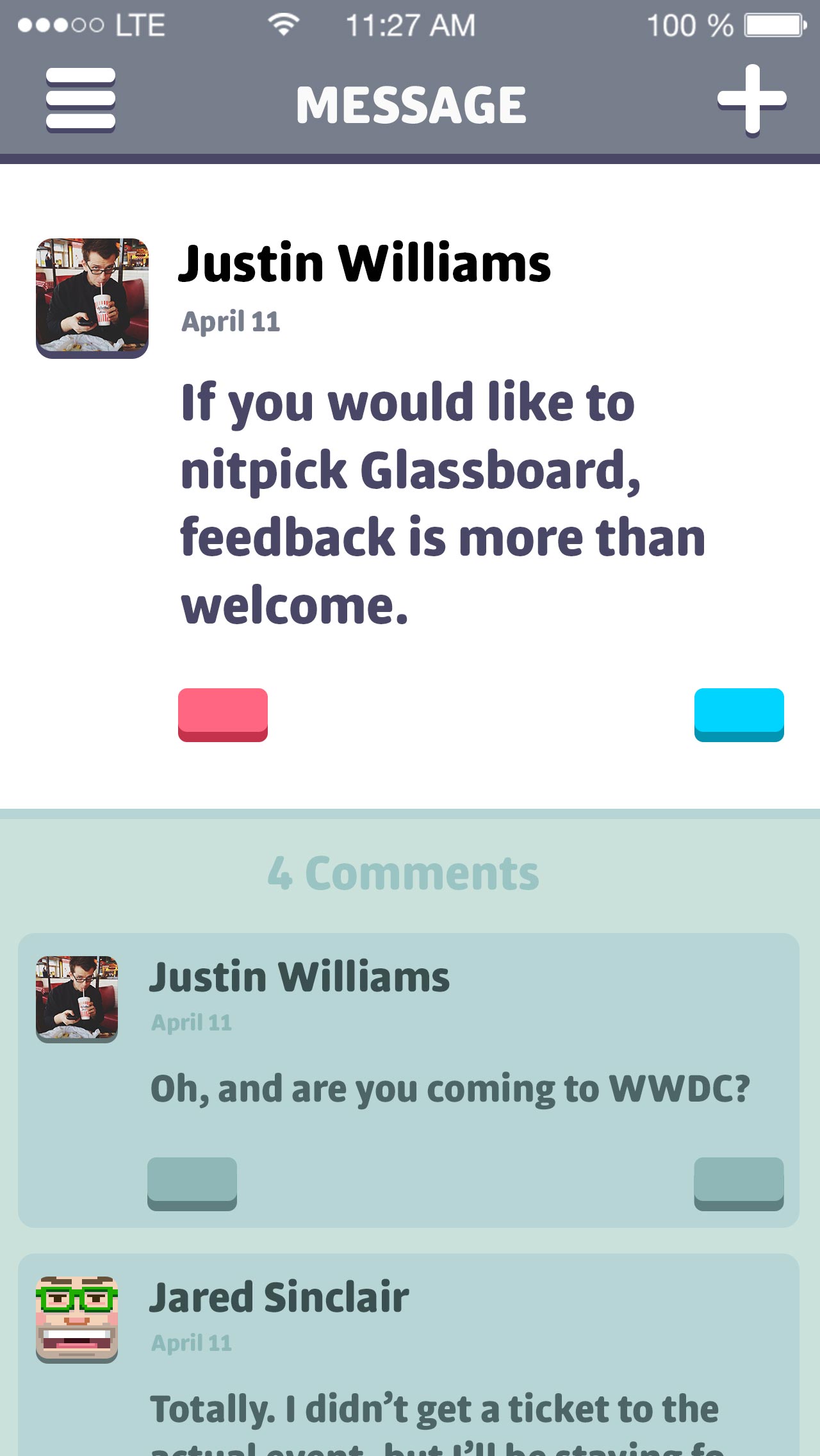
Threesboard!
Before you’ve read a single word, your mind has already assumed that this is a screen from the Threes universe. That’s what a strong personality does for an app.
Recognizable Brand Identity
A strong personality should not be limited to a single app. It should be carried over to the entire brand. The term “identity” is often used for good reason. A recognizable brand identity elevates your customer’s relationship with your company from a cold, rational transaction to a potential friendship. This is especially true for small, independent web services like Glassboard.
Justin sends an email to every new subscriber asking how they’re enjoying the service. A thoughtful visual identity could reinforce his hand-crafted approach to marketing. Perhaps Glassboard’s small stature could be transformed from a liability into a feature. If Glassboard wants me to feel like I’m on a first name basis with its founder, then the visual language of all its graphic output should exude that kind of familiarity and warmth.
The current identity feels more like a placeholder. The website has a logo that never appears in the iPhone app, and vice versa:
Which is the real logo?
Neither of these logos feels particularly inspired or warm. A better logo is outside the scope of this review, but I would urge Justin to start over from scratch, using his warm introductory emails as the spiritual center of a new approach to Glassboard’s branding.
More to Come
I’d like to thank Justin for inviting me to review Glassboard. It’s a rare thing to find unflinching design critiques of iOS apps that are written in a spirit of friendship. It’s even rarer to find developers who are brave enough to invite this kind of public skewering.
My hope is that these weekly posts can help you be more successful when designing your apps. Creative work usually happens behind a curtain, but it isn’t magic. If you have an iOS app you’d like me to critique, head here to learn more.
-
Or side panels, or sliding navigation, or whatever you want to call them. If you need one for your app, I’ve written a decent open-source version, JSSlidingViewController. It’s the same one used in Glassboard and in Riposte. ↩