Designing Unread for iPad Part 5 – Comical Amounts of Negative Space
This is Part 5 in an ongoing series about the design of the iPad version of Unread.
Now that I know how I want the article view to look, I can work backwards through the other screens in the app. Those screens are:
- Article Summaries List – This is the second most-viewed screen in Unread. On the iPhone version, it’s a long list of article summaries, titles, and image thumbnails.
- Account Dashboard – The source list for navigating to an article summaries list. This screen has three sections: Articles, Folders1, and Subscriptions.
- Home screen – This screen has the list of all your accounts, plus a section for extras like settings or contact options. On the iPhone, this screen also has the UNREAD masthead, to make the app feel more like a magazine.
At this stage in the design process, the quickest way out is to use a split view controller and call it a day. That was how the earliest iPad apps solved the problem. Many others have mimicked it. But I am almost certain that this would be a mistake for Unread.
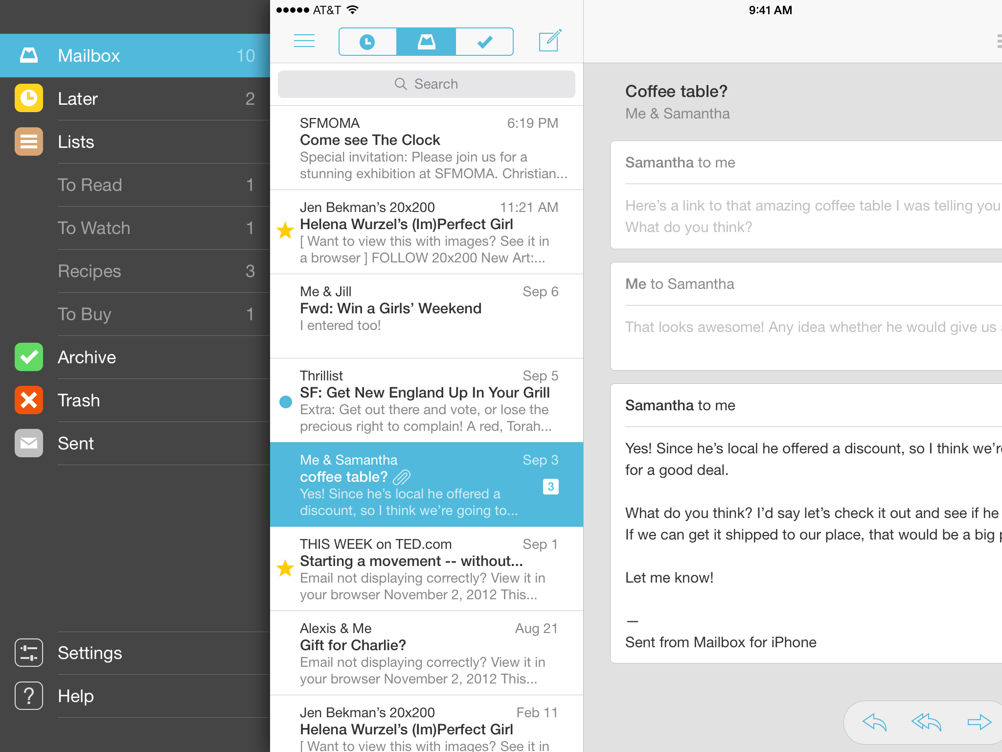
Mailbox for iPad has a bitchin’ combo of a split view controller and a basement menu.
A split view controller literally splits your attention in half. It turns an app into Minority Report Lite: flick through a list of sources on your left, while pinching and zooming in a detail view on your right. For productivity apps like Mail.app, this kind of shallow triage behavior is desirable. But it’s antithetical to Unread’s emphasis on distraction-free reading.
As jarring as it sounds, I think it would be better to use the same full-screen navigation I developed for the iPhone, but enlarge it to fill the larger display. Unread is a magazine, not a status board. The reader only needs to see one thing at a time.
This doesn’t mean that I should simply scale up the content of each iPhone screen, too. That would be a mistake. The iPad’s display gives me some room to explore alternate layouts.
Updated Design Constraints
So my list of constraints is a little longer now:
- Use comfort zones. Wherever possible, controls and navigation should be accessible within the comfortable areas on the outer middle edges of the display.
- Discourage multitasking. Only one screen should be visible at a time.
- Evoke pleasurable reading. Where prudent, borrow visual cues from leisure reading materials like literary magazines.
Finally, Some Photoshop Mockups
With these new constraints in hand, I am finally able to experiment with some high-fidelity Photoshop mockups. In making these, I discovered that my new constraints leave me with two options when designing new layouts:
- Increase Information Density – Since I have more room, I could add more content per screen. Perhaps the single-column article summaries list should be two columns, like in Instapaper.
- Increase Negative Space – On the other hand, just because I have more space doesn’t mean I need to fill it up with more stuff. I could use negative space to introduce breathing room.
If Unread was a person, it would be the kind of person who always speaks softly, even when speaking to a person across a large empty room. I think I’ll have to go with #2, even if it means using an almost comical amount of negative space for an iPad app.
Navigation Gesture
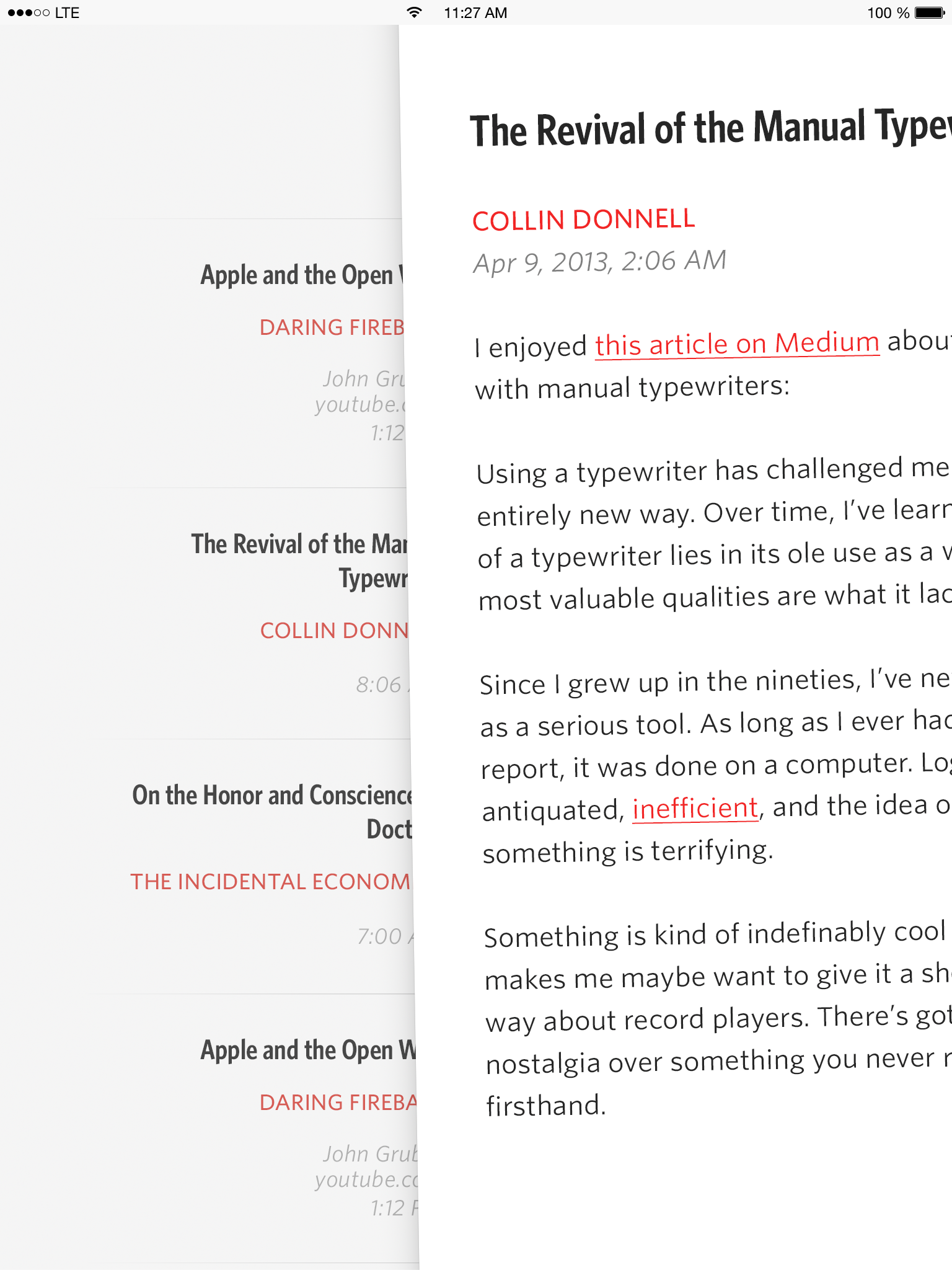
Click to see full resolution.
Article Summaries
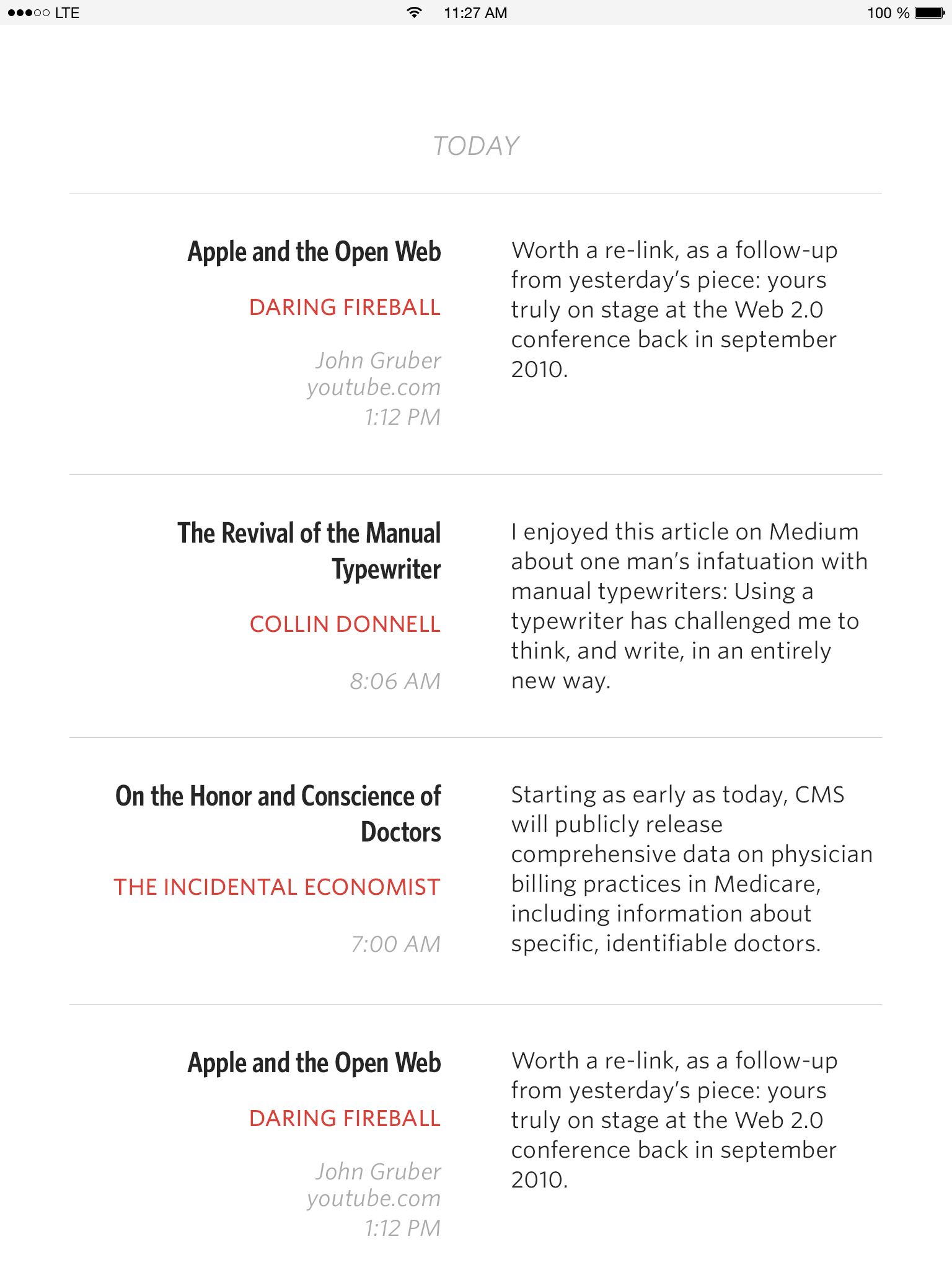
Click to see full resolution.
Account Dashboard
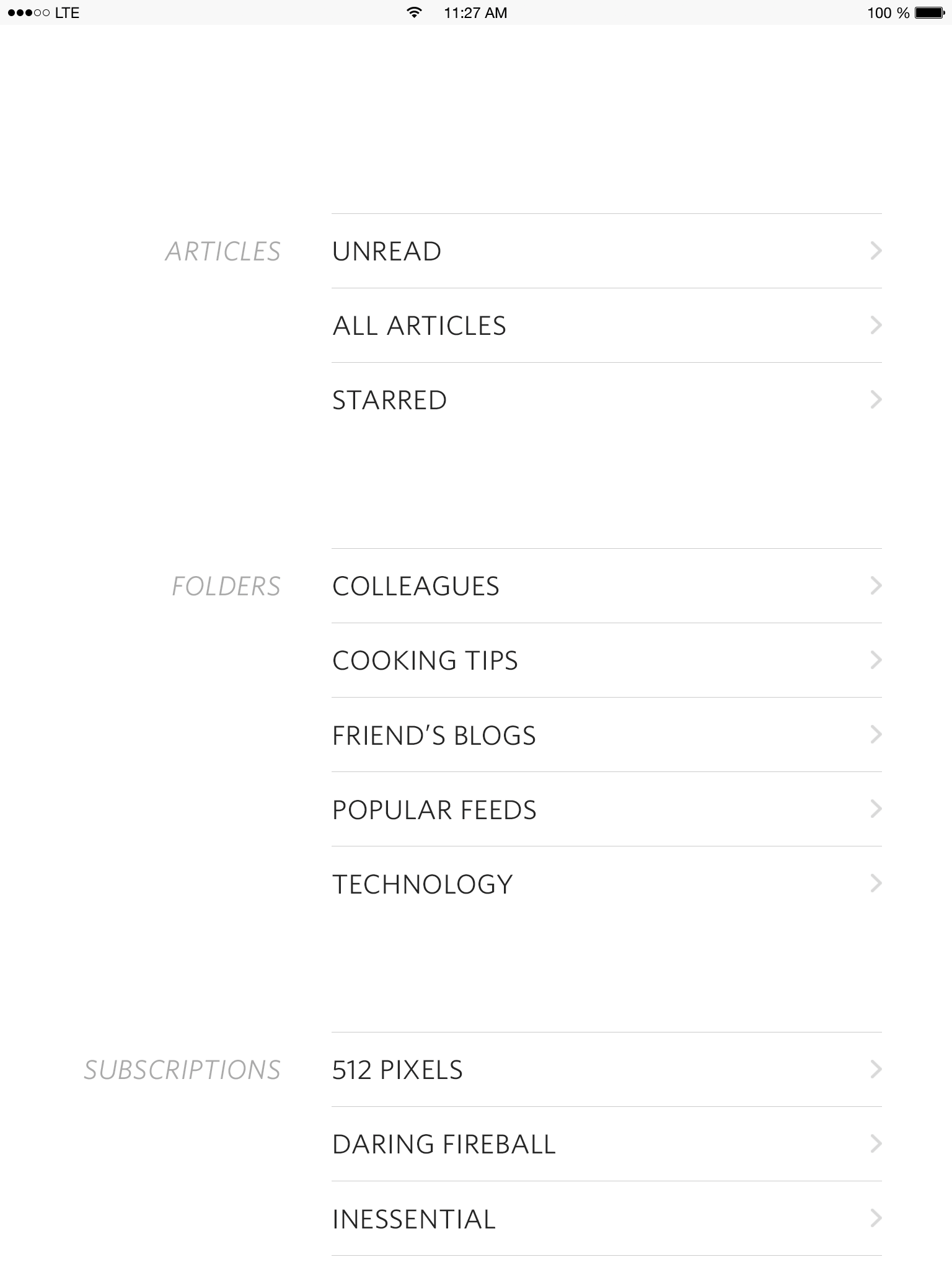
Click to see full resolution.
-
Substitute the word “folders” with whatever nomenclature is specific to your preferred RSS service: tags, groups, categories, etc. ↩