Delight is in the Details — By Shawn Blanc
Delight is in the Details — By Shawn Blanc:My internet pal Shawn Blanc has released a new book today: Delight is in the Details, a book for craftspeople about the practice of sweating the small stuff. The exhortation from the announcement email was great:
Now, go forth and make something delightful.
Spoken like a true Protestant. I look forward to reading his book this week.
Orange Is The New Black
Orange Is The New Black:My wife and I started watching Orange Is The New Black last night. I immediately understood why this show is such an instant cult hit: any given two minute slice passes the Bechdel test with flying colors.
The Bechdel test asks whether a work of fiction features at least two women who talk to each other about something other than a man.
It’s beyond refreshing to see a smart drama that isn’t another show about sociopathic men with identity crises. More like this please! Bravo.
Real Artists Fail
There’s a funny scene in the movie The World According to Garp in which Garp (Robin Williams) and his wife are looking at a house they’d like to buy. They’re standing on the sidewalk with the realtor when, without warning, a single-prop plane comes sputtering into view over the tree-line. The plane crashes into the side of the house, making a terrific mess. Garp’s wife and the realtor are horrified, watching the unscathed pilot waving hello from what’s left of the master bedroom.

This scene wasn’t in the novel, but it could have been.
“We’ll take the house!” Garp exclaims, wrapping an arm around his wife. “This house has been pre-disastered. We’ll be safe here.”
Fear of failure — and of disaster, which amounts to the same thing — disappears when the failure is no longer hypothetical. When the failure actually happens, and it becomes real, we discover that the repercussions are easier to manage than the fear itself.
So here’s the most embarrassing moment from my childhood: I was taking a math test in fourth grade. It was near the end of a long, hot day at school. I had visited the water fountain too many times and now I needed to pee, badly. It was the don’t-stop-tapping-your-foot-or-you’ll-bust kind of need to pee. I flagged down my teacher, who refused to let me go the bathroom. I’ve never resented someone so much in whole life.
I lasted about ten minutes before what you can imagine happened. Shorts darkened. Socks yellowed. Textbooks under the desk swelled and curled up at the edges. There was no stopping it. Trying to hold it back again only made it worse. So I gave in.
“Well,” I thought to myself, “at least I don’t have to pee anymore.”
I felt relieved. That was the last thing I had expected to feel. I had traded one set of problems for another. Failure relieves fear. Actual problems are solvable. Hypothetical problems are not.
In creative work, it’s easy to waste a lot of energy on the fear of failure. We measure our work against external ideals of perfection. We care about what we do, so we try to get it right. But if we’re not careful, we can let the fear of failure get in the way of doing our best work.
I’m not one of those people who by nature doesn’t give a shit about what other folks think of my work. If such a person exists, I’ve never met one. A man without doubt is a monster. I am always going to labor under the gaze of the Big Other. So any strategy that boils down to ignoring other people’s expectations of me is not going to work.
There’s another way of dealing with the fear of failure that is more plausible: give yourself permission to fail. Short-circuit the tangle of expectations you’ve inherited by adding failure to the list of what excellent craftspeople do.
Real artists fail.
Achievement Unlocked: Shawnballer
I finally found time to revamp all of jaredsinclair.com. Re-written from scratch (well, from HTML5 Boilerplate scratch). Completely unbeknownst to me, I finished just in time to get linked-to by Shawn Blanc. Whew.
You Don’t Need a Zoom Lens I stumbled across it two more...
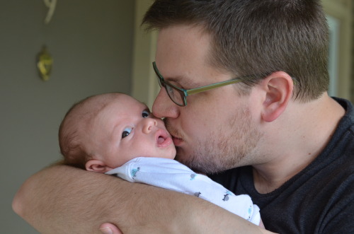
You Don’t Need a Zoom Lens
I stumbled across it two more times this week, the advice about using a high-quality prime lens instead of the zoom lens that comes with most DSLR kits. The idea is that a high-quality prime lens is much more affordable and takes sharper and more vibrant images than a zoom lens at the same price.
The loss of versatility is mostly an imagined problem. A prime “portrait” lens will work great in most scenarios. You don’t need a zoom lens. You certainly don’t need a zoom lens as much as you need your DSLR sensor to be bathed in as much light as possible, at a price you can justify to your spouse.
I purchased a Nikon AF-S 50mm f/1.4 G based on Ken Rockwell’s review. He’s not a great photographer, but he’s a fantastic product reviewer. I trust his opinions on gear more than anyone else’s. He’s also more likely to be found shooting with Nikon gear (I have a D5100), so his opinion is backed by a lot of real-world use.
For an everyday prime lens he still prefers the older AF-D model, but that lens won’t auto-focus when used with a D5100, so I went with the closest alternative. I was expecting good results, but I was not prepared for just how much better it was than our old kit zoom lens. Believe the hype.