Unexpected Design Challenges While Updating Riposte and Whisper for iOS 7
New versions of Riposte and Whisper are coming out today, coinciding with the launch of iOS 7, Apple’s beleaguered new operating system. Jamin and I are really excited about both our app updates. They were harder to accomplish than they might appear. Here are some of the hard problems we had to solve while redesigning them for iOS 7.
Riposte’s Freshened-up Timeline
Riposte is largely the same, visually. We were fortunate that our minimal approach to user interface chrome worked to our benefit during this update. The familiar flat white posts, with simple hovering buttons are still there. Swipe-to-go-back is still there. The text is laid out more accurately now, and with a little more breathing room padding each post. This makes it easier to scan a busy timeline without needing heavy borders or gradients.
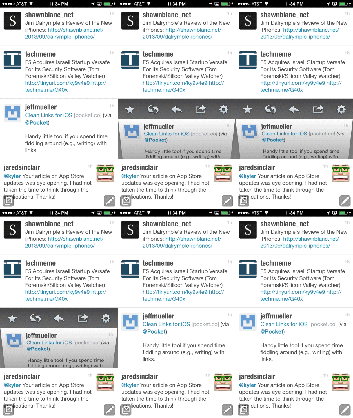
The coolest visual change to Riposte is the redesigned flip animation when you tap a post:
It’s more at home on iOS 7 with its added depth and subtle bounciness. More importantly, it solves one of our oldest problems. App.net has long posts, made even longer by our decision to present image attachments in large thumbnails that span the screen. The old animation style flipped the entire cell over, which looked pretty silly when flipping a long post. This new animation partially tilts the cell in from the bottom, so that the buttons are always accessible from the top of the post, no matter how long it is. It uses the new UIMotionEffects APIs, too. You can see them by tilting your device around in your hand after opening a post.
Better Typography
Our users love upgrading to Riposte Pro so they can customize their fonts. Every bit of text looks better on iOS 7, especially in the minor elements like buttons and settings labels. Riposte Pro users can now choose separate fonts for author names and body text for their timelines, with two additional typefaces for the former: Helvetica Neue Condensed Bold, and Avenir Next Condensed Bold. These look really good when set at one the two new enormous font sizes: “Biblical” and “Bruckheimer.”
Speaking of Helvetica Neue Condensed Bold: it’s now doing double-duty as the default Riposte font for navigation bar titles and back buttons. Apple’s redesign of the back button to use wide, borderless text instead of the familiar pointed roundrect leads to frequent overlapping between the back button text and the navigation bar title when using standard UI fonts. It’s sometimes impossible to distinguish the two from each other, especially for color-impaired users.

Our new navigation bar typography.
The solution I used in Riposte was switch to a condensed version of Helvetica Neue, which helps maintain a breezy margin between the titles and back buttons of navigation bars. Its sturdy precision introduces a different emotion, but in a way that makes Riposte Version 1.5 feel new, like a new Swiss Army Knife still in the box.
Syntax Highlighting
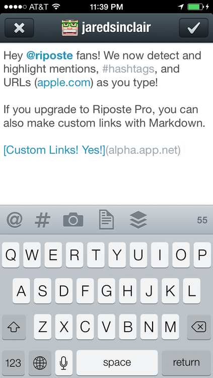
Riposte now highlights mentions, hashtags, and URLs as you type. If you upgrade to Riposte Pro, you can also use Markdown syntax to write custom links.
The syntax highlighting was made easier by one of my favorite new iOS 7 APIs, the NSTextStorageDelegate protocol. Every UITextView has a new textStorage property. Set your custom class as its delegate, and you can override the following method to make edits to text and color attributes after the user types them, but before they’re committed to the display:
- (void)textStorage:(NSTextStorage *)textStorage willProcessEditing:(NSTextStorageEditActions)editedMask range:(NSRange)editedRange changeInLength:(NSInteger)delta NS_AVAILABLE_IOS(7_0);It’s the perfect spot to replace dumb quotes with smart quotes, too.
Background Updating
People hate having gaps peppered throughout their timelines in Riposte. Jamin wired up Riposte and Whisper to take full advantage of the new background updating APIs available with iOS 7. They’ll update themselves after any push notification, and at any other time the OS thinks will help. The end result is that you can say goodbye to timeline gaps and stale conversations. New posts and messages will be there waiting for you.
Status Bar Challenges
Apple threw us all a curve ball when they redesigned the system status bar for iOS 7. I wrote about the technical implications yesterday, but there are huge design implications, too.
For years, the status bar had been made a subtle extension of the hardware, quietly separated from an app’s interface. Now it overlaps all apps by default, without any background color. Apple has capriciously left the repercussions of this decision up to each app designer to sort out on her own. We’re probably going to see as many bad solutions as good ones as app updates roll out on the App Store over the coming weeks.
The new paradigm in Apple’s own apps is to make the navigation bar background blend seamlessly into the status bar background. Neither Riposte or Whisper use navigation bars consistently, so this wasn’t an option for us. Some screens (Settings modals, New Posts, et cetera) have navigation bars, but the majority of the time our apps are full screen and nearly chrome-less. Furthermore, both apps have transient notifications and toolbars that show and hide from the top of the screen. It would have been a technical nightmare to keep these interactions consistent across all our app’s screens, making sure that all scrollable content isn’t obscured and that allowances are made for those times that navigation bars and status bars change their visibility states.
In our opinion, the iOS 6 plain black status bar is still the best solution for our users. We had to fake it with some clever changes, but it will look and behave the same in Riposte and Whisper for iOS 7 as it did on iOS 6.
Whisper Pressed Between Microscope Slides
Whisper’s visual style has been dramatically scaled-down for iOS 7. It isn’t completely flat, though. It’s more like the old Whisper has been sandwiched between microscope slides. Look closely at the new message bubbles and you’ll see that they’re subtly demarcated with top highlights and inner bottom shadows, giving the subtlest hint of depth. Borders and gradients have been drastically reduced, too, yet not eliminated.
The rationale for the Whisper redesign is, in a word, the keyboard. The system keyboard occupies half of your screen when you’re chatting with friends. Just as the iOS 6 version of Whisper borrowed color and visual cues from its keyboard, so does the iOS 7 version. Lines are thinner and shapes are less bulky, in keeping with the rice-paper-thin keyboard buttons.
We also added some fun new stickers, too, to thank our hard-working beta testers. Every tester was asked to pick a new sticker design that they wanted to have for themselves, no matter how bizarre. See if you can guess which stickers belong to whom:
Everything is Fine, Everything is Ruined
For every new API released with iOS 7, there were a dozen existing APIs that were either deprecated or downright broken. I would estimate that 90 percent of the work that went into these two updates was just getting all the broken features up and running again. A complete list of such things would be too tedious, but here’s a taste:
- Text views are now prone to leaving fragments of text after large cut & paste edits are made, under certain circumstances. This meant rewriting significant portions of the logic that lets you pull down to see the replied-to-post when writing a reply in Riposte.
- The lines between the main menu cells had to be drawn by hand, instead of using the default separator lines (including the logic to hide the lines from adjacent cells when selecting a row, ugh) because of a bug in UITableView.
- Keyboard animation changes required a major rewrite of the way Riposte and Whisper adjust toolbars and buttons while you’re writing private messages. What was already some of the most complex code in both apps is now even more complex.
- The status bar. Enough said.
You can download the latest versions of Riposte and Whisper from the App Store today, as soon as Apple flips the switch and makes them available.


