Chippy - A Fast Way to Send Stuff to Your Pivotal Tracker Icebox
Speaking of new apps, I submitted another app to the App Store today: Chippy, a single-purpose app for sending stories and bug reports to your Pivotal Tracker icebox.
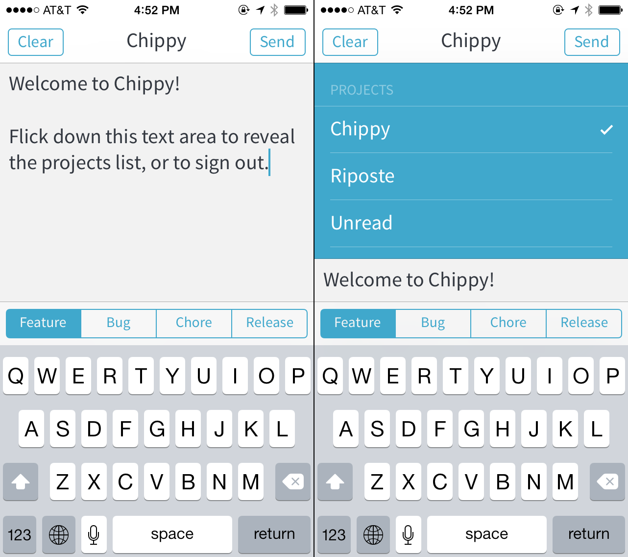
Ideas rarely occur to me when I’m at my computer. I’m usually walking the aisles at a grocery store or something. Rather than use an intermediary step like a todo list app – or worse, use the official Pivotal Tracker iOS app, which is sort of terrible – I wanted an app that does one thing and does it well. Chippy syncs the list of all your projects. It sends your plain text story ideas (marked as features, bugs, etc.) straight to the icebox of the current project. That’s it. Sometimes having no features is a feature.
Unread Launch Announcement
My new app Unread, an RSS reader for iPhone, will launch Tuesday, February 4th. It will be available for a limited time at an introductory price of $2.99 USD. The app should be up on the App Store around 12:00 AM in your local time zone. I’ll post another an App Store link on this website when the download is available.
On Healthy Shame
There are two kinds of shame. There’s the shame of being compared unfavorably against an external ideal, and there’s the shame of being compared against yourself – or more precisely, against your best self. Only the latter kind of shame is healthy and useful.
The first kind of shame is demoralizing. It’s a logic of hopelessness. The external ideal will always be better, and you will always be worse. That’s how ideals work. They’re vanishing points on the horizon of our standards. The shame you feel is the impassable distance between that far off point and the place where you are, now and forever, stuck. The distance stings doubly so because the ideal is obviously impossible, and yet you still feel guilty for not having achieved it. The ideal is a burden placed on you by the judgements of others, whether real or perceived. This kind of shame has no resolution.
The other kind of shame is upbuilding. It critiques and compliments simultaneously, in one loving expression. Instead of being compared to an impossible perfection, you are compared to yourself. Healthy shame draws a sharp distinction between you and your actions. It’s a shame that doesn’t critique you, only what you are doing. You aren’t a failure. Your actions are failures. Your choices have failed to live up to the promise of the person you already are, the person you have it in you to be. This kind of shame doesn’t feel like a burden. It feels like an inspiration.
Ignore any shame that doesn’t feel like love.
Dark Sky — Some Constructive Criticism for Today’s Update
Dark Sky has managed the impossible task of standing out in an App Store teeming with me-too weather apps. It has two amazing features: astonishingly accurate local rainfall predictions and colorful weather visualizations. Today its developers released a significant update to both the iPhone and iPad versions of the app. I don’t use Dark Sky on my iPad, so I’ll restrict my observations to the iPhone version.
Today’s update appears to be a complete rewrite of the user interface. The previous version had an admittedly awkward mix of chunky black, yellow, and blue controls on its primary view, with a gorgeous radar view hidden offscreen. The new version adds a three-panel view of week’s worth of a weather, all housed in a blurred container that is superimposed in front of a three-dimensional projection the Earth. This globe is painted with Dark Sky’s astounding animated weather radar and is interactive. It’s a significant improvement over the previous two-dimensional view.
Since the rainfall predictions are a transient feature — they’re experienced through push notifications — the most important visual elements in the new version of the app are the animated globe and the wavy prediction graphs. In my opinion, all of Dark Sky’s aesthetic choices should follow the design cues suggested by the nature of these features.
Contrary to what you might think from looking at most iOS 7 app redesigns, a white background color is not a foolproof way to elevate content above navigation. White isn’t a free color. It comes with baggage. It has its own personality like any other color. White is paper. White is an empty screen. It’s broadsheet for news articles and text boxes for blog posts. White is a dry erase marker board.
If you put ten people in a room and asked them each to name a predominant background color — the first color to come to mind — for a heat-mapped weather radar view, I would expect white not to appear on their list. The colors that are most often put to the task are pure black and dark gray. The participants’ likelihood of choosing black or gray would grow even stronger if you also told them that the name of the app in question is “Dark Sky.”
Color associations matter. Colors provide immediate, visceral clues. As Thoreau wrote, “some circumstantial evidence is strong, such as finding a trout in the milk.” Dark Sky’s new white theme points first-time users in the wrong direction. It drains the app of its vigor. The desaturated colors make the globe and the prediction graphs look like watermarks instead of category-defining innovations. White suggests that the text-based elements are more important. Newspapers and novels are monochromatic. Weather should be colorful. A dark theme with a palette of vibrant accent colors would evoke meteorological data on every screen, strengthening the association between the name of the app and its purpose. I would rather Dark Sky resemble the iOS 7 Compass app.
The raw idea for the redesign is good; the three-panel view with a side panel for the globe is an interesting riff on two established navigation patterns. But the execution is sloppy. It lacks clarity. It fails to shape the data into visually coherent elements. Titles are indistinguishable from content.
Of the three panels — current conditions, Next 24 Hours, and the week view — only the middle panel has a title, but in context the title is easily confused for a subhead. It took deliberate focus while preparing this post for me to recognize the purpose of all three tabs. I suspect a casual user will not undertake that much effort.
On the first panel, the cloud cover and temperature are rendered in a large black circle, for no discernible reason other than that circles are trendy. It looks more like a user profile than a weather summary. It is a shape without purpose. The circle does not add meaning to the data. It undermines the content-first ethos of the rest of the app.
On the second panel, the 24 hour temperature graph doesn’t have any bounding guides or axes to give the graph meaning. It’s just a line meandering through negative space. Graphs need axes to be legible.
On both the first and the second panels, all the individual sections are difficult to distinguish from one another. Whenever there are two or more things on the same screen, those things need boundaries. Boundaries, like button borders, can be real or implied. The only elements with adequate implied borders are found on the third panel, the week view. Each row in the week view resembles its neighbors above and below. This creates a consistent visual rhythm. The sections on the first two panels don’t have any rhythm, so they have no implied border. Without a real or implied border, each area of content melts into an amorphous blob. It’s disorienting and hard to read.
The third panel is not wholly exempt from criticism, however. Because the individual rows can be swiped open, they compete for the same panning gestures used to navigate between panels. The conflict between these gestures (and the lack of visual distinction between static and interactive content) makes me feel uneasy touching the app at all — a sin for an iOS app.
I’m still a huge fan of Dark Sky as a technical achievement. Its predictions are still thrillingly accurate. Our whole family depends upon them. I hope they reconsider some of the decisions unveiled today.
The Philosophy of Unread, my Forthcoming RSS App
I still love RSS. It’s the best way for thoughtful, independent writers to be read widely and carefully, despite how much the design of a typical RSS app may get in the way of their words.
RSS is an unadorned medium. It’s just plain text and a little markup. This simplicity is a call to write well. There’s no web design wizardry to hide behind. The writer’s words stand naked and raw. RSS is also a call to read well. Good writing deserves attentive readers. With RSS, there’s nothing between you and a writer’s words except a piece of glass. Or at least that’s how it should be.
Most RSS apps are patterned after email. Noisy parades of dots, dates, and tags trample over their screens. Their source lists look like overflowing inboxes instead of stately tables of contents. Toolbars bristling with options obscure the text. Putting it bluntly, using these apps feels like work.
I’m a paper subscriber of The New Yorker magazine. I like to read it in a comfortable chair with the magazine folded down to a single visible column. When held that way, it looks remarkably similar to a screenful of clean RSS paragraphs. Reading on an iPhone should feel just as satisfying.
I made Unread because I wanted to get back to a more deliberate style of reading. I designed it for times of quiet focus. With warm typography and a sparse interface, it invites me to return to the way I used to read before I fell into the bad habit of skimming and forgetting.
If you’re anything like me, you’ve subscribed to more websites than you have time or attention to read. I was paranoid that I was missing out on important writing. The irony is that the more subscriptions I had, the less I read. All too often, my “unread” articles remained exactly that.
Does Unread do all the things you expect from a typical RSS reader? Sure. But you won’t find a feature list here. Features don’t nourish your mind. I suggest that you don’t buy Unread if you aren’t interested in pruning your reading lists. Unread can handle dozens of feeds and thousands of articles with ease, but why would you want it to?
Let Unread be an opportunity to break away from your old reading habits. Let Twitter or App.net be the place for loud, busy feeds. Let RSS be the place where great independent writing thrives. Choose your favorite writers and read them closely. If you’re also a writer, write as if you were writing directly to just such a reader, the way Kierkegaard always wrote for:
… that single individual whom I with joy and gratitude call my reader…
This was written for the Unread home page. While Unread waits for App Store review, I thought it was worth reposting this here. ~ JTS.