Designing Unread
At the time I decided to make Unread, I wasn’t using RSS anymore. Months earlier, even before Google Reader announced it was shutting down, I was so busy with my day job and side projects that I couldn’t keep up with all my subscriptions. So I stopped trying. I felt relieved not to have the burden of another inbox to clear, but I missed reading my favorite writers — those who post less frequently but write with care.
Unread was more than just my first project as an indie developer. It was a chance for me to change my reading habits. Despite having a new baby boy around the same time — who has since reached six months old and change — I found some downtime left over each day to start reading again. I needed an RSS app that could help me slow down and read peacefully.
One of Riposte’s users once wrote a very flattering post about our app:
I loved @riposte almost immediately. Well designed and self-assured, the UI felt, when compared to others, both somewhat foreign and surprisingly comfortable.
The words that struck me most were “foreign and suprisingly comfortable.” While that wasn’t a deliberate goal when we made Riposte, I have consciously strived to make Unread feel unexpected yet instantly familiar, like what I look for in new music.1 I hope that’s what you’ll feel if you try Unread.
I really like the idea of an app being comfortable. Comfortable means always knowing where you are. It means not worrying about making a mistake. It means information has an obvious visual hierarchy: bold titles, tidy paragraphs, and spacious margins. Comfortable means there’s not visual clutter to distract you, except for those items that are supposed to stand out, like buttons or the damn status bar.
Comfortable also means physical comfort, which is an aspect of mobile app design that designers often forget. Anyone with a new baby knows how convenient it is to be able to use an app with one hand. Some areas of the screen are hard to reach, especially on an iPhone 5 or later. Grip your phone in one hand observe the sweep of your thumb. It’s easy to reach objects in the center, but the navigation bar is too far away to reach without adjusting your grip. Although it’s tempting to jump to the conclusion that closer is always better, positioning an item too close to your hand can cause discomfort because of the way your thumb has to flex to reach it.
I decided that best way to make Unread a comfortable app was to let the reader directly manipulate each screen anywhere her thumb might land. This freed me to remove interface chrome and focus on the text. It’s now a trite idea for design to focus on “content,” but in Unread’s case it really was an essential goal. I wanted readers to get their minds out of the email rut that has trapped their expectations of what RSS can be.
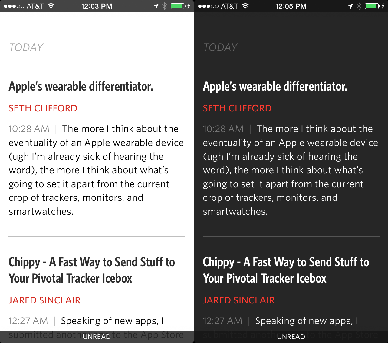
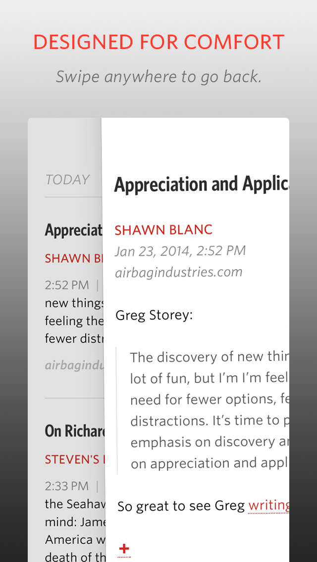
Unread doesn’t use navigation bars2, tab bars, or tool bars. It has a full-screen interface, interrupted only by the status bar at the top and a “footer bar”, paired to match the status bar, at the bottom. The footer bar shows the title of the current screen. I experimented with having no footer bar, but since the same article can appear in many different lists, I often felt lost without it.
Click to see full resolution.
Because there’s no navigation bar, there’s also no back button. To go back, you pan to dismiss the current screen, dragging from left to right. Unlike other apps, you don’t have to start dragging from the edge of the screen. You can start wherever your thumb happens to be. Swiping back through several screens feels a bit like dealing cards in a poker game. I think this interaction is really great, but don’t take my word for it. Mikhail Madnani of Beautiful Pixels had this to say:
@unread I want iOS 7 navigation to be like you. Please make them Sherlock the app and everything.
Or as he put it more emphatically on another occasion:
It gives me a boner.
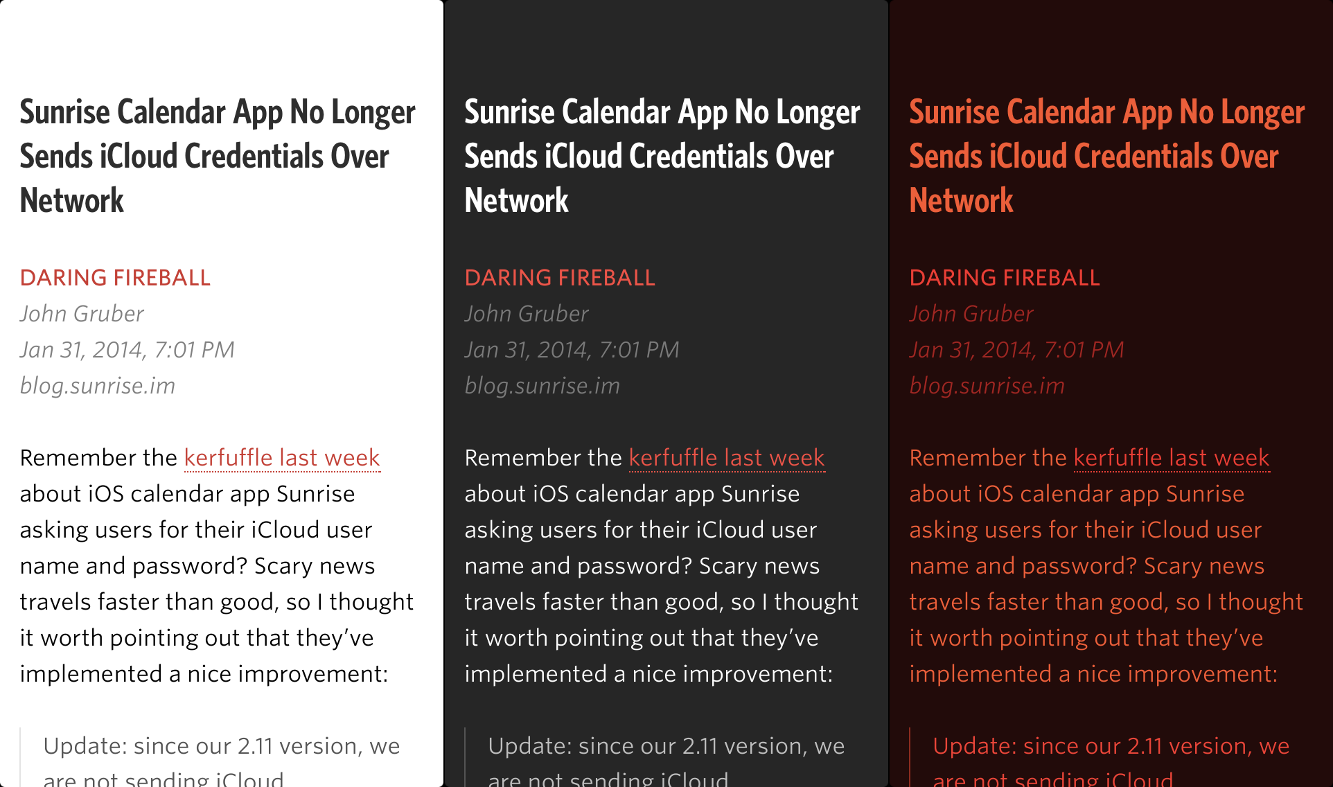
Unread’s article view is just text. There are no buttons. The status and footer bars stay hidden the entire time.3 There are two themes, one for day and one for night.4 Both themes are set in Whitney and Whitney Condensed from HOEFLER & CO. These fonts make my eyes feel relaxed. They’re warm and slightly playful in bold title weights, and subdued and crisp in body text weights.
The hardest design for me to solve was the article list screen. In a typical RSS app, this screen is the one that most resembles an email inbox. I knew I wanted to avoid email design cues, but it was really hard to find another way. All those conventions were developed for good reasons. Here’s a link to a sampling of outtakes. I’m a slow learner. It was months before I finally found the current design.
Here are links to the screenshots I am using for the App Store:
Unread’s article list screens are unlike those found in other RSS apps you may have used. There are no toolbars, no unread indicators (dots), and no buttons. Each article summary is neatly laid out with obvious consistency. The titles are set in a condensed bold font, bucking the iOS 7 trend towards unreadable thin fonts. There’s an ample amount of padding above each article title and below each article summary, which makes it easy to see where one article ends and the next one begins. You’ll notice that there are no favicons. Most websites have crappy, non-retina favicons, even sites that otherwise have an attention for detail. I think real-world favicons distract more than illustrate, so I chose not to include them.
The last word of a sentence is the most _______. That’s why Unread’s article summaries aren’t truncated at an arbitrary number of lines using elipses. Summaries are composed of whole sentences. Each summary is about the length of an App.net post, give or take a few sentences. If you subscribe to good writers who don’t bury their ledes too deeply, you’ll find that the summaries give you a good idea of what each article is like.
If an article is determined to be a Linked-List style article — i.e. the article’s URL is a link to another site and not the permalink — then the domain of the linked item’s URL is displayed at the bottom of the summary. This is a feature I’ve always wanted in an RSS reader.
Every screen in Unread has its own set of options.5 Rather then put them in a toolbar, which would add clutter and feel too familiar, the options are tucked away offscreen in an options menu. This menu is invoked by dragging the screen from right to left — just like pull-to-refresh, but sideways. Just drag your thumb wherever it may be. This helps make Unread comfortable to use with one hand, no matter what size iPhone you have or how big your hands are:
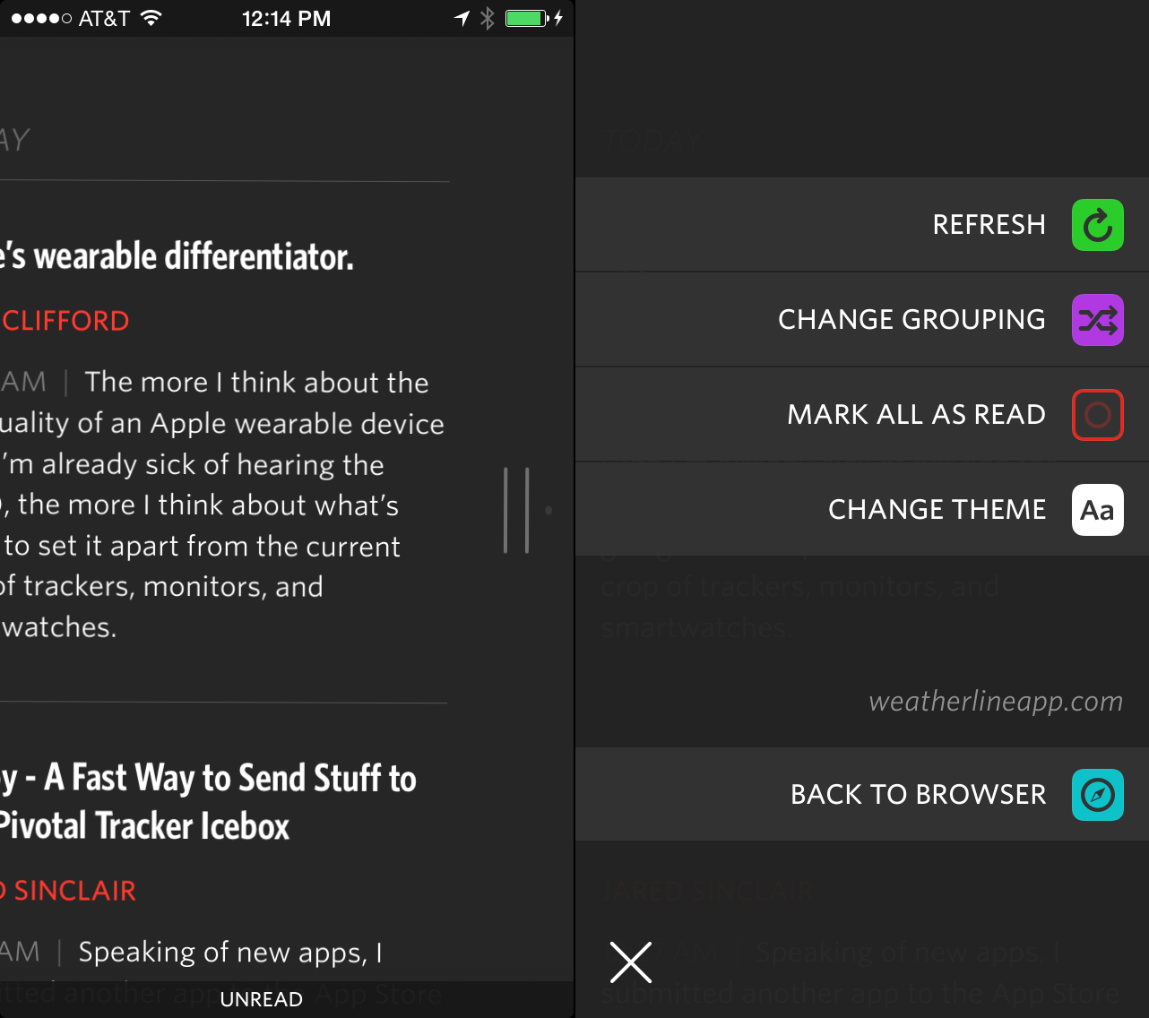
Pull sideways to trigger options menus.
There’s comfort in consistency. One of the things I learned from people’s positive feelings about Riposte was the importance of using gestures solely for navigation and not mixing navigation gestures with action gestures. The options menu doesn’t strictly adhere to that idea, but it follows the spirit of the law. The entire screen moves with your thumb. There are no competing swipe gestures on article cells that will confuse you. Gestures are the same on every screen in the app. Learn them once. Use them everywhere.
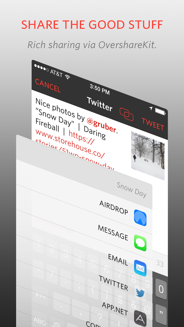
The options menus keep your screen free of invasive toolbars, but they don’t sacrifice features. Unread has lots of sharing options, with more yet to come. All the sharing features were built using OvershareKit, an open-source library made by me and Justin Williams. Try it out in your next project.
I think it’s important to reiterate what I wanted Unread to be. I didn’t make it to be a feature-for-feature replacement for an app you may already be using. That would make Unread merely a thin coat of paint on old ideas. The point of Unread is to give you an opportunity to change the way you read. Its design can only take you halfway there. I urge you to prune your subscriptions down to the writers you care about most. Look for new writers you haven’t read before. If you’re a writer, I hope it inspires you to write more thoughtfully, too.
-
Great music aims for a paradox. Each new musical phrase surprises us even as it resolves the phrase that went before it. ↩
-
Except in modal views, for a variety of reasons. ↩
-
This is an optional feature. It only applies to the article view. The footer bar is never hidden in the other screens of the app. ↩
-
There are several hidden themes, too. Hooray for Easter eggs. ↩
-
Except for modal screens, like signing into an account or composing a tweet. ↩
Unread Now Available on the App Store
Unread, an RSS reader for iPhone and my first app since going indie, is available now on the App Store.
If you’ve stopped using RSS, consider trying it again with Unread. Follow fewer subscriptions. Read better stuff, not more stuff. I’ll post a longer introduction in a bit.
The New Austerity
An excerpt from White Noise by Don DeLillo:
We ran into Murray Jay Siskind at the supermarket. His basket held generic food and drink, nonbrand items in plain white packages with simple labeling. There was a white can labeled CANNED PEACHES. There was a white package of bacon without a plastic window for viewing a representative slice. A jar of roasted nuts had a white wrapper bearing the words IRREGULAR PEANUTS. Murray kept nodding to Babette as I introduced them.
“This is the new austerity,” he said. “Flavorless packaging. It appeals to me. I feel I’m not only saving money but contributing to some kind of spiritual consensus. It’s like World War III. Everything is white. They’ll take our bright colors away and use them in the war effort.”
He was staring into Babette’s eyes, picking up items from our cart and smelling them.
“I’ve bought these peanuts before. They’re round, cubical, pockmarked, seamed. Broken peanuts. A lot of dust at the bottom of the jar. But they taste good. Most of all I like the packages themselves. You were right, Jack. This is the last avant-garde. Bold new forms. The power to shock.”
Where Is Apple Going?
The strategy that guided Apple to success during the first decade of the 21st Century has run its course, however, no new vision has taken its place. The old strategy powered a revolution; portable digital devices evolved from novelties for nerds to staples of contemporary life. Now that the old strategy has accomplished its mission, what new vision will shape Apple’s future?
Our Old New Digital Lifestyle
In 2001, Steve Jobs took the stage at Macworld and presented Apple’s vision for the coming decade. This was three years after the iMac began to lift Apple out of its death spiral of the late 1990’s. It was several months before the first iPod, seven years before the first iPhone, and nine years before the first iPad. In 2001, Apple still felt like a company who had recently cheated death. The iMac had been a Hail Mary play, executed masterfully by a talented team united around a strong vision. So the question on observers’ minds was, Where is Apple going?
In that now famous presentation, Jobs laid out what Apple called the “Digital Hub” strategy for the Mac. While industry talking heads warned of the iminent death of the personal computer, Apple saw a different future. They saw a burgeoning ecosystem of portable digital devices — still cameras, video cameras, MP3 players — without an adequate means to integrate them into our new “digital lifestyle.” The Mac was the missing piece at the center of the puzzle. More specifically, it was the Mac’s software — OS X, iTunes, and iLife — that would be the glue connecting all our devices in a way that would be greater than the sum of its parts.
The rest of the decade proved how insightful this strategy was. Digital cameras replaced our film cameras. iPods replaced CD players. iPhones replaced dumb phones. By the end of the decade, a majority of people carried at least one digital device with them at all times. As each seachange cascaded across the mobile device industry, it was the Mac that remained the stable island at the center of it all.
It is easy to misunderstand the genius of the Digital Hub strategy. It was not just a syncing solution. Syncing was only a facet of the problem. iTunes and iLife were implementation details. The Digital Hub was about enabling a new lifestyle. Without a vision for how new devices could work together seamlessly, those phones, cameras, and music players would have been stars without a constellation.
From the perspective of a pocket or a purse, the decade spanning 2001 to 2011 changed everything. In 2001, many people did not carry a mobile phone, let alone a smart one. Only fifteen percent of cameras purchased were digital cameras. Portable music players were still a relative novelty. Without Apple teaching the world how to tie them all together with easy-to-use software, it is arguable that these devices would never have become mainstream.
The Digital Hub strategy helped normal people make portable devices a transparent part of their daily lives. You could sync your photos to your Mac with minimal effort because iPhoto shipped with all the drivers it needed to connect to your camera. It just worked. Similar things could be said of iTunes with your iPod, and iMovie with your home movies. It was as simple as plugging in a new toaster or filling the tank of a new car. Apple’s vision made intelligible sense of what would otherwise have been a decade of electronic noise.
The Digital Hub strategy freed Apple to introduce new products and new product categories with confidence; the Mac would be there to weave the new devices into the existing fabric. When Jobs announced the iPhone in 2007, he touted how easy it was to keep your iPhone’s contacts, email, calendars, and more in sync using iTunes on your Mac. Anyone who owned an iPod would already understand how to do it. It wasn’t until the iPhone and the iPad reached an inflection point of popularity that this strategy began to buckle. Syncing to a single Mac was becoming untenable.
iCloud
In 2011 Jobs took the stage, for what would be his final WWDC keynote, to introduce the world to iCloud, the most complex product Apple has ever made. It wasn’t just technically complex. It was conceptually complex. Unlike Dropbox, it wasn’t a hard drive in the sky. Jobs repeatedly emphasized the multi-step syncing process: iCloud receives new data from one device, and “pushes” it down to your other devices.
The entire presentation is worth watching again, if only to note the following: it’s a forty minute presentation about syncing your data. It’s an explanation of implementation details for a mixed audience of developers and journalists. It does not address the biggest question in the room: now that everyone uses multiple devices in their day-to-day lives, what comes next?
Jobs began the iCloud keynote by hearkening back to the Digital Hub strategy. He made the observation that relying on a wired connection to a single Mac to sync data across multiple smart devices was driving people crazy. The Mac, in his words, needed to be demoted to the status of “just a device,” moving the digital hub “into the cloud.”
Jobs’ revival of the Digital Hub metaphor missed the forest for the trees. The old metaphor was about more than just syncing. It was about preparing a place in people’s lives for the devices to come. But by 2011 that problem had already been solved. The new problem was not just that the hub needed to move. The essential problem was that the digital hub was no longer a useful metaphor for the challenges waiting in Apple’s future.
Adrift
It’s 2014 and Apple has not yet found a new guiding metaphor. Looking across all of Apple’s current products and services, it’s hard to find signs that they have a vision of a post-digital-hub world. Product lines are either treading water, or slowly drifting in contradictory directions.
Is the cold, rational look of iOS 7 a signal that iOS is going to mature into a more pro-user-friendly platform? The latest iPad marketing campaign, "Your Verse", tempts me to think so. It’s a montage of stories about the iPad as a workhorse for professionals in science, arts, and the humanities. It’s beautifully shot and inspiring.
If Apple wants the iPad to be a serious tool for serious work, why have they done so little to empower developers to build and sell productivity apps? Others have written better than I could about the frustrating lack of interaction between third-party apps, or the inability to select replacements for default applications. Worse still, the App Store is being led by the horns toward freemium business models that are incompatible with the kind of apps that professionals need. A few niche apps may survive, but the iPad is a device with mass appeal. It deserves productivity apps that can be used by all kinds of people.
iCloud continues to be a frustating mish-mash of half-finished services. Photo Stream only syncs a portion of your photos. It doesn’t sync any videos, despite the fact that the iPhone is probably the most popular video camera on the planet. iCloud device backups aren’t big enough to back up all your content. Devices are sold with up to 64GB of storage each, but you can only store a total of 50GB in your iCloud account, shared by all your devices. Data backup in general is too advanced a subject for most users. It needs to “just work,” but it doesn’t. Why isn’t the digital hub in the cloud yet working as well as the old one did?
There is no shortage of other concerns: the decline in the quality of Apple’s own applications1, or the Mac App Store policies that make it hard for top-notch app developers to please their customers, etc. But I think the most important observation to be made requires taking a long view of where Apple has been and where it is going.
Fourteen years ago, Apple had an astonishing gift for perception. It saw two possible futures: one in which digital devices were isolated units of clutter, and one in which our devices were integrated with one another through the Mac, helping us to work, play, and share stories. Apple gave History a shove in the direction of the better future, and changed how we live.
That future is now our past. Where is Apple going to take us next?
-
Messages on the Mac is the most eggregious example. ↩
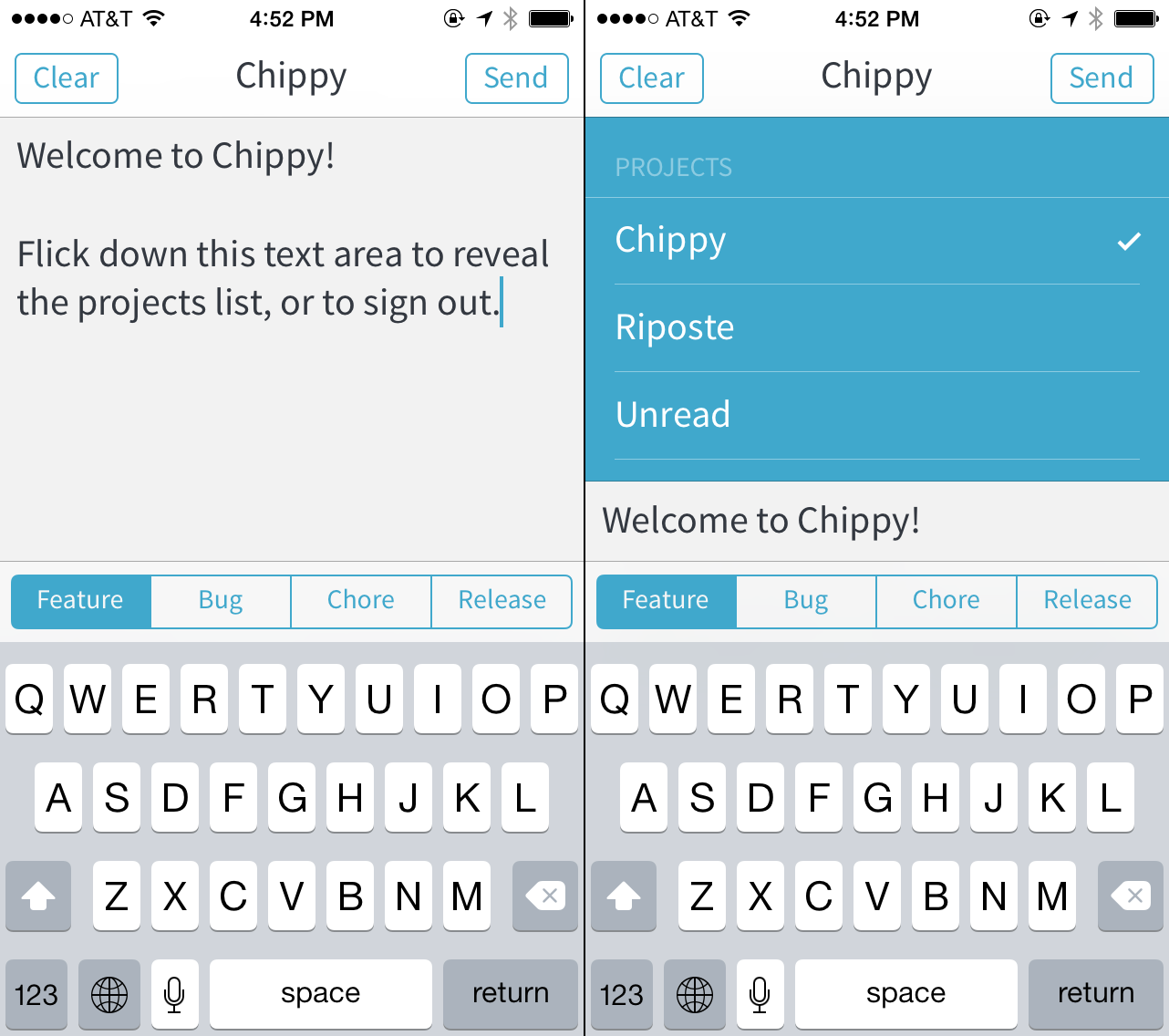
Chippy - A Fast Way to Send Stuff to Your Pivotal Tracker Icebox
Speaking of new apps, I submitted another app to the App Store today: Chippy, a single-purpose app for sending stories and bug reports to your Pivotal Tracker icebox.
Ideas rarely occur to me when I’m at my computer. I’m usually walking the aisles at a grocery store or something. Rather than use an intermediary step like a todo list app – or worse, use the official Pivotal Tracker iOS app, which is sort of terrible – I wanted an app that does one thing and does it well. Chippy syncs the list of all your projects. It sends your plain text story ideas (marked as features, bugs, etc.) straight to the icebox of the current project. That’s it. Sometimes having no features is a feature.