Designing Unread
At the time I decided to make Unread, I wasn’t using RSS anymore. Months earlier, even before Google Reader announced it was shutting down, I was so busy with my day job and side projects that I couldn’t keep up with all my subscriptions. So I stopped trying. I felt relieved not to have the burden of another inbox to clear, but I missed reading my favorite writers — those who post less frequently but write with care.
Unread was more than just my first project as an indie developer. It was a chance for me to change my reading habits. Despite having a new baby boy around the same time — who has since reached six months old and change — I found some downtime left over each day to start reading again. I needed an RSS app that could help me slow down and read peacefully.
One of Riposte’s users once wrote a very flattering post about our app:
I loved @riposte almost immediately. Well designed and self-assured, the UI felt, when compared to others, both somewhat foreign and surprisingly comfortable.
The words that struck me most were “foreign and suprisingly comfortable.” While that wasn’t a deliberate goal when we made Riposte, I have consciously strived to make Unread feel unexpected yet instantly familiar, like what I look for in new music.1 I hope that’s what you’ll feel if you try Unread.
I really like the idea of an app being comfortable. Comfortable means always knowing where you are. It means not worrying about making a mistake. It means information has an obvious visual hierarchy: bold titles, tidy paragraphs, and spacious margins. Comfortable means there’s not visual clutter to distract you, except for those items that are supposed to stand out, like buttons or the damn status bar.
Comfortable also means physical comfort, which is an aspect of mobile app design that designers often forget. Anyone with a new baby knows how convenient it is to be able to use an app with one hand. Some areas of the screen are hard to reach, especially on an iPhone 5 or later. Grip your phone in one hand observe the sweep of your thumb. It’s easy to reach objects in the center, but the navigation bar is too far away to reach without adjusting your grip. Although it’s tempting to jump to the conclusion that closer is always better, positioning an item too close to your hand can cause discomfort because of the way your thumb has to flex to reach it.
I decided that best way to make Unread a comfortable app was to let the reader directly manipulate each screen anywhere her thumb might land. This freed me to remove interface chrome and focus on the text. It’s now a trite idea for design to focus on “content,” but in Unread’s case it really was an essential goal. I wanted readers to get their minds out of the email rut that has trapped their expectations of what RSS can be.
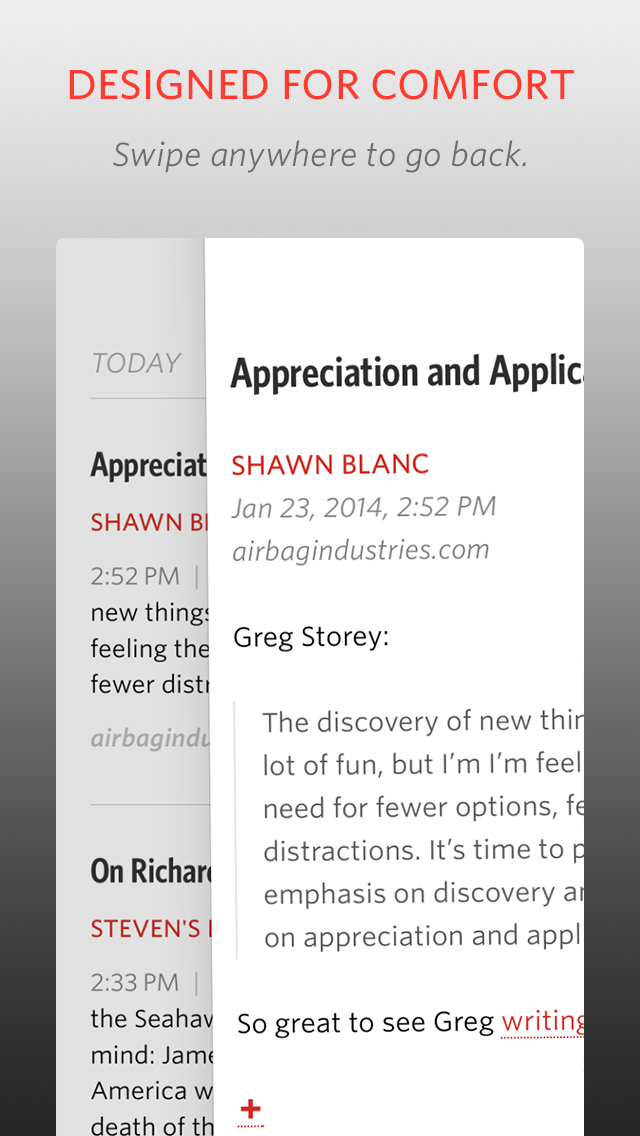
Unread doesn’t use navigation bars2, tab bars, or tool bars. It has a full-screen interface, interrupted only by the status bar at the top and a “footer bar”, paired to match the status bar, at the bottom. The footer bar shows the title of the current screen. I experimented with having no footer bar, but since the same article can appear in many different lists, I often felt lost without it.
Click to see full resolution.
Because there’s no navigation bar, there’s also no back button. To go back, you pan to dismiss the current screen, dragging from left to right. Unlike other apps, you don’t have to start dragging from the edge of the screen. You can start wherever your thumb happens to be. Swiping back through several screens feels a bit like dealing cards in a poker game. I think this interaction is really great, but don’t take my word for it. Mikhail Madnani of Beautiful Pixels had this to say:
@unread I want iOS 7 navigation to be like you. Please make them Sherlock the app and everything.
Or as he put it more emphatically on another occasion:
It gives me a boner.
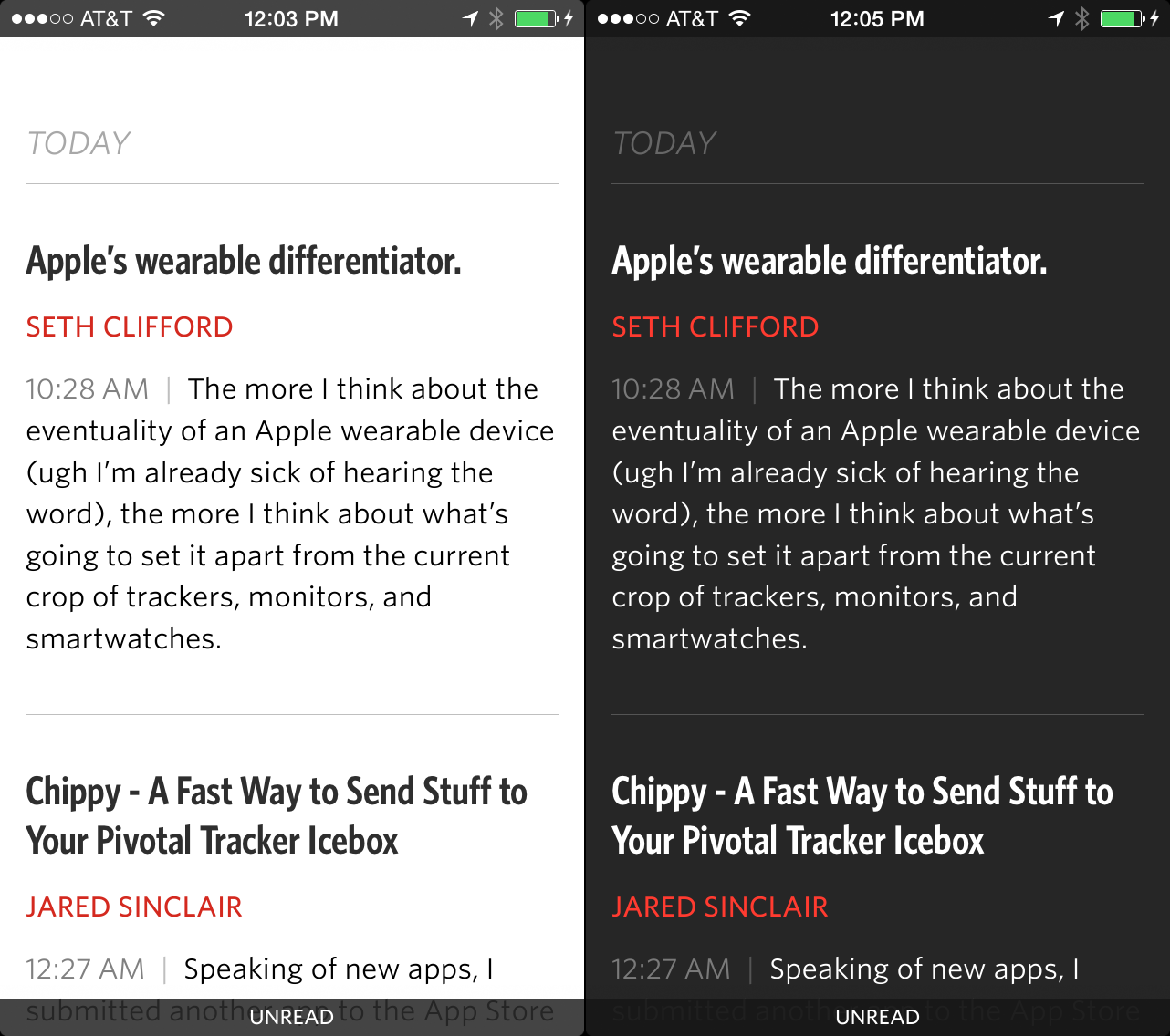
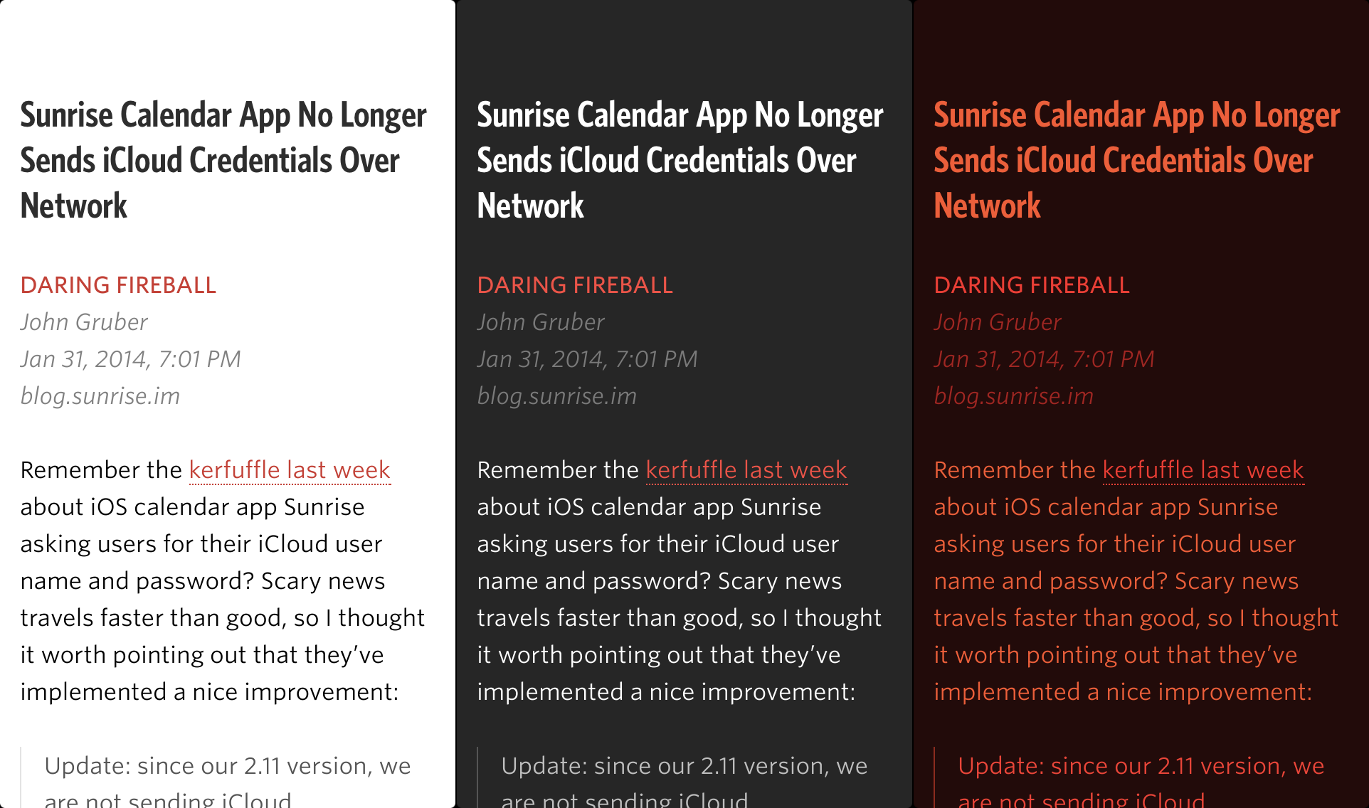
Unread’s article view is just text. There are no buttons. The status and footer bars stay hidden the entire time.3 There are two themes, one for day and one for night.4 Both themes are set in Whitney and Whitney Condensed from HOEFLER & CO. These fonts make my eyes feel relaxed. They’re warm and slightly playful in bold title weights, and subdued and crisp in body text weights.
The hardest design for me to solve was the article list screen. In a typical RSS app, this screen is the one that most resembles an email inbox. I knew I wanted to avoid email design cues, but it was really hard to find another way. All those conventions were developed for good reasons. Here’s a link to a sampling of outtakes. I’m a slow learner. It was months before I finally found the current design.
Here are links to the screenshots I am using for the App Store:
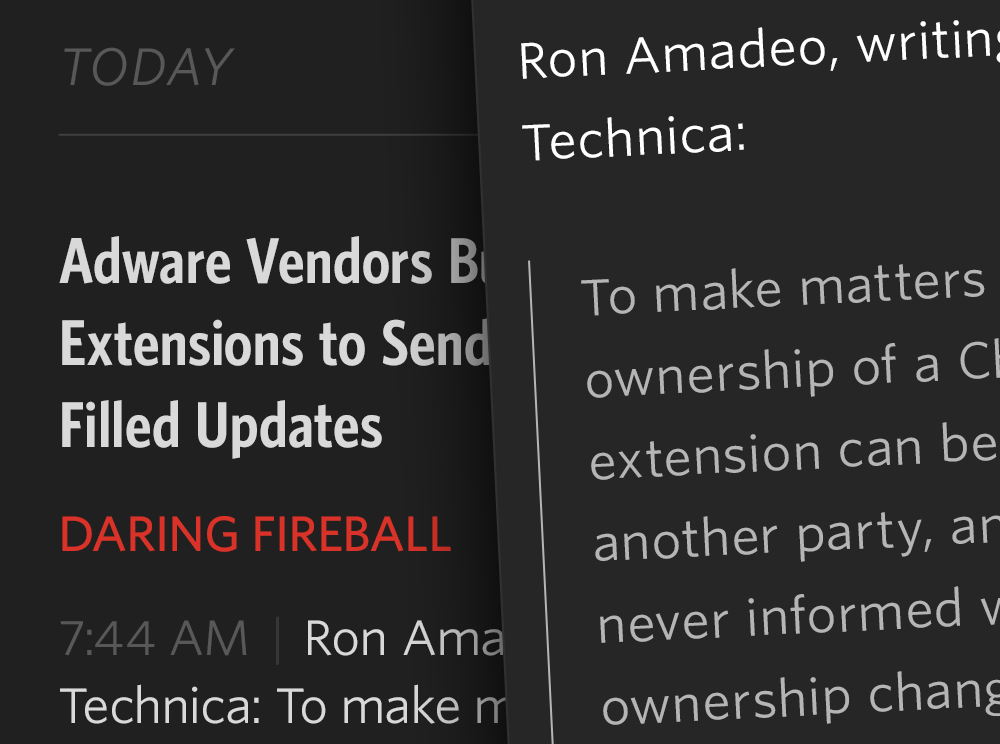
Unread’s article list screens are unlike those found in other RSS apps you may have used. There are no toolbars, no unread indicators (dots), and no buttons. Each article summary is neatly laid out with obvious consistency. The titles are set in a condensed bold font, bucking the iOS 7 trend towards unreadable thin fonts. There’s an ample amount of padding above each article title and below each article summary, which makes it easy to see where one article ends and the next one begins. You’ll notice that there are no favicons. Most websites have crappy, non-retina favicons, even sites that otherwise have an attention for detail. I think real-world favicons distract more than illustrate, so I chose not to include them.
The last word of a sentence is the most _______. That’s why Unread’s article summaries aren’t truncated at an arbitrary number of lines using elipses. Summaries are composed of whole sentences. Each summary is about the length of an App.net post, give or take a few sentences. If you subscribe to good writers who don’t bury their ledes too deeply, you’ll find that the summaries give you a good idea of what each article is like.
If an article is determined to be a Linked-List style article — i.e. the article’s URL is a link to another site and not the permalink — then the domain of the linked item’s URL is displayed at the bottom of the summary. This is a feature I’ve always wanted in an RSS reader.
Every screen in Unread has its own set of options.5 Rather then put them in a toolbar, which would add clutter and feel too familiar, the options are tucked away offscreen in an options menu. This menu is invoked by dragging the screen from right to left — just like pull-to-refresh, but sideways. Just drag your thumb wherever it may be. This helps make Unread comfortable to use with one hand, no matter what size iPhone you have or how big your hands are:
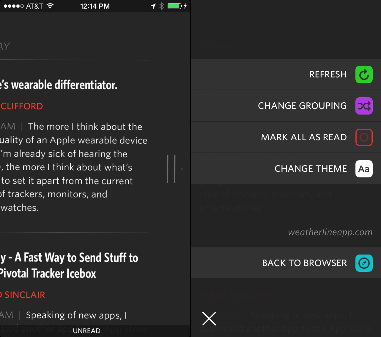
Pull sideways to trigger options menus.
There’s comfort in consistency. One of the things I learned from people’s positive feelings about Riposte was the importance of using gestures solely for navigation and not mixing navigation gestures with action gestures. The options menu doesn’t strictly adhere to that idea, but it follows the spirit of the law. The entire screen moves with your thumb. There are no competing swipe gestures on article cells that will confuse you. Gestures are the same on every screen in the app. Learn them once. Use them everywhere.
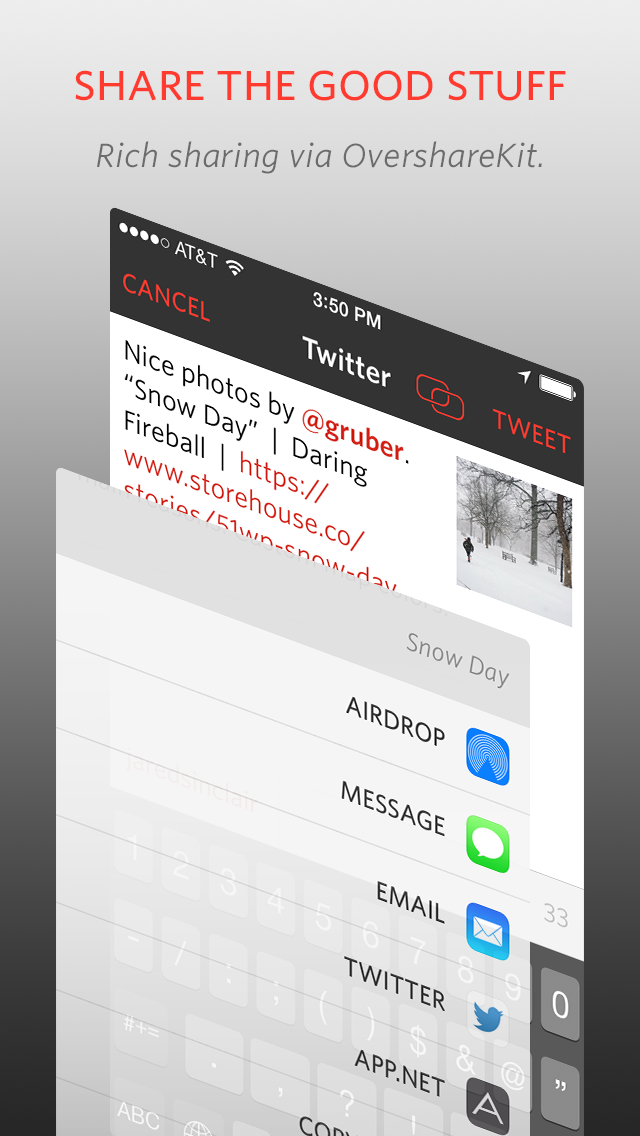
The options menus keep your screen free of invasive toolbars, but they don’t sacrifice features. Unread has lots of sharing options, with more yet to come. All the sharing features were built using OvershareKit, an open-source library made by me and Justin Williams. Try it out in your next project.
I think it’s important to reiterate what I wanted Unread to be. I didn’t make it to be a feature-for-feature replacement for an app you may already be using. That would make Unread merely a thin coat of paint on old ideas. The point of Unread is to give you an opportunity to change the way you read. Its design can only take you halfway there. I urge you to prune your subscriptions down to the writers you care about most. Look for new writers you haven’t read before. If you’re a writer, I hope it inspires you to write more thoughtfully, too.
-
Great music aims for a paradox. Each new musical phrase surprises us even as it resolves the phrase that went before it. ↩
-
Except in modal views, for a variety of reasons. ↩
-
This is an optional feature. It only applies to the article view. The footer bar is never hidden in the other screens of the app. ↩
-
There are several hidden themes, too. Hooray for Easter eggs. ↩
-
Except for modal screens, like signing into an account or composing a tweet. ↩