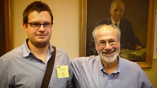
Meet Dr. Rick I finally had the opportunity to meet the...
Meet Dr. Rick
I finally had the opportunity to meet the inimitable Dr. Rick today at the NIST-ONC conference on EHR usability. Unlike the rest of us whiny doctors and nurses, Dr. Weinhaus tries to move the conversation forward by writing thoughtful, substantive suggestions on how to improve the usability of existing EHRs. See his most recent posts here, here, and here.
Dan Benjamin Responds to 5by5 Fans About The Talk Show
Dan Benjamin Responds to 5by5 Fans About The Talk Show:Heartfelt, genuine, and open: classic Dan Benjamin.
Big week? Huge week!
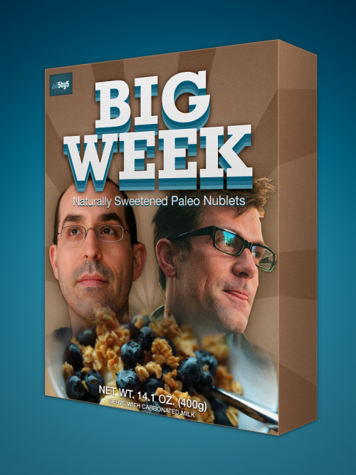
Big week? Huge week!
If only Tom Servo had had the chance to riff The Hunger Games.
If only Tom Servo had had the chance to riff The Hunger Games.
Made with Paper
Made with Paper