Designing Great Business Cards The goals I look for in a...
Designing Great Business Cards
The goals I look for in a top-notch business card: a gorgeous logo; a crisp logotype; and clean, spacious contact info that leaves room for the customer to jot down a note.
Business cards are objects in themselves. Unlike a magazine page or a sheet of photo paper, a business card isn’t a medium on which one displays content. The card itself is the content. It’s a tangible artifact. This is why the best cards tend to use things like thick paper stock, letterpress, and foil stamping. Cards that don’t use these things are an imitation of a real card.
Some cards that I think accomplish the important goals:
- Mike Hall
- Unboundary
- Weway
- Milky
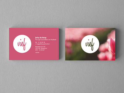
- Vief (pictured above)
Photographs on business cards are uncommon, at least among high-end cards. The reason is that a photo is an abstraction that detracts from the tangible experience of a well-made card — like the difference between solid wood and a veneer.
A photo on a card is easy to get wrong. When it’s done well, a photo can help enhance the desired experience. Look at the Vief card pictured above for a great example. Notice how the photo is blurred, and fills the frame. The photo wasn’t included to show a picture of a flower, but to add texture and color behind the stark clean silhouette of the logo. Imagine feeling the edge of the foil-stamped logo under your thumb as it slides across the back of the card.
For the curious, here’s the business card I designed for Splint:
