Preferred Orientation
I’m pretty sure the following generalization is true, with few exceptions: every iPad app has been designed for a preferred orientation. I think this is true whether the designer was conscious of the preference or not.

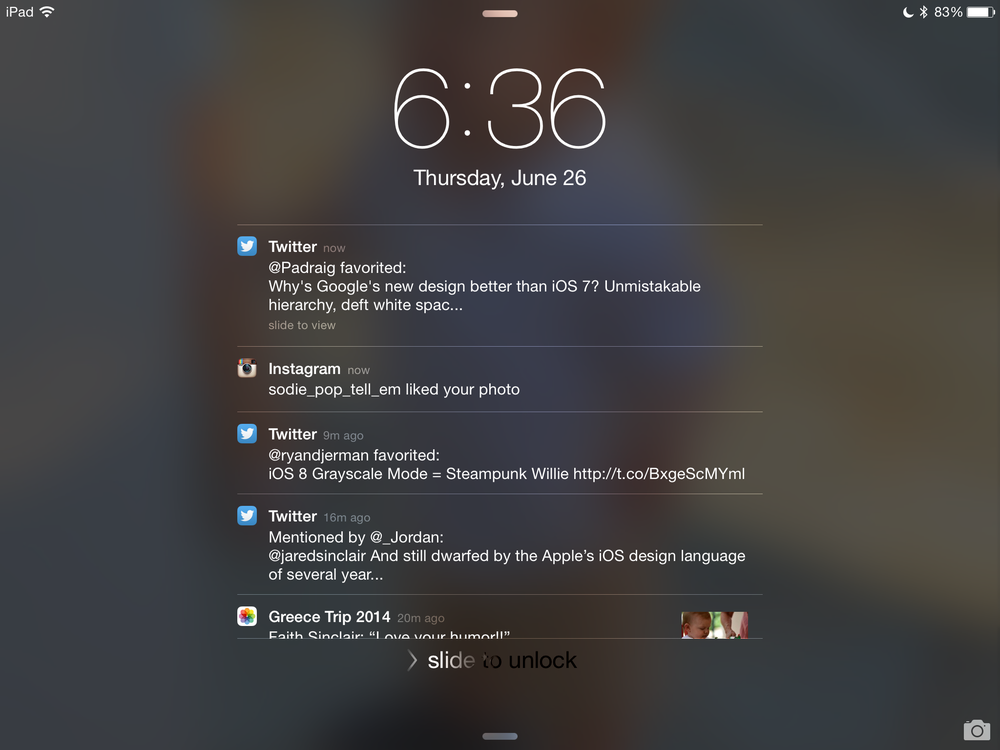
iOS lock screen, awkward in landscape.
I’m not saying that the non-preferred orientations are poorly designed, nor am I saying that they’re not useful. I mean only that every iPad app has an orientation in which it looks and works best – the way we say of a person’s appearance that he or she has “a good side.”
Here are some examples, off the top of my head:
Landscape
Portrait
- iOS 7 lock screen (see above)
- Unread
- iBooks
- Instapaper
- Photos (especially shared Photo Streams)
Notable Exceptions
- Safari
- Diet Coda
- Editorial
- 1Password 4.5
- Path