Nitpicking iOS Notification Banners
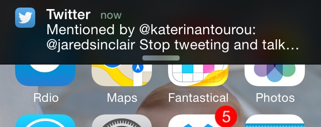
We’re all familiar by now with the iOS notification banners that appear at the top of your screen. These slide into view from offscreen in a top-down direction.

In general these are great. They’re certainly a big improvement over the full-screen alerts from iOS 4 and earlier. But the banners can get annoying when they slide over app content you need to see, especially navigation bars.
The nuclear options – the ones that turn off banners altogether – are too extreme. Luckily iOS has a simpler way. You can dismiss a banner early by swiping up, from the bottom of a banner to the top edge of your screen.
Here’s my nitpick though: why is this gesture only allowed in a vertical direction? The target region is so small that in practice I often end up triggering a tap, i.e. the exact opposite of what I intended to do.
Perhaps it’s for logical consistency. The banner appears top-to-bottom, so dismissing it occurs in reverse. But this isn’t an important enough spatial rule in my opinion.
You should be able to swipe horizontally to flick a notification off screen. We did it this way in Riposte and it was awesome.
Can you think of a good reason why horizontal dismissals shouldn’t be allowed?