Sloppy Swiping – How to Make An App Feel Comfortable
Josh Ginter has coined a memorable term for the kind of navigation used in apps like Unread or Facebook Paper:
I determined “sloppy swiping” as a way to go back a menu by swiping from the middle of the screen to the right rather than from off the screen to the right. This is probably not an accurate way of testing this, but stretching my thumb to the left-most edge of my iPhone to swipe back a menu is difficult.
Federico Viticci at MacStories agrees that sloppy swiping is easier (emphasis added):
I find that kind of gesture implementation comfortable, friendly, and natural.
Physical comfort is critical to a holistic approach to mobile app design. I’ve thought a lot about what makes an app feel physically comfortable, and I think it’s a combination of three things:
- A layout that respects the tangible size of the display.
- Realistic physical interactions.
- Encouraging muscle memory.
I. Think in Inches, Not Pixels
An iPhone has more pixels than my college laptop, but they’re scrunched into a device I can hold with one hand. It’s easy to forget this when pushing around 727,040 pixels in Photoshop. The temptation is to think of an app’s interface as a scaled-down OS X window. But a comfortable app is not a miniaturized desktop app.
It’s more helpful to think of an iPhone app as if it was a manufactured physical product. Picture it being shipped to your door in a little white box. Open a lid and retrieve a sliver of luminescent glass and metal.
Maybe I should pivot.
When you think of an app in this way, you’re more likely to make sound judgements about the size of buttons and controls. Large buttons with ample spacing are more comfortable to use than small cramped ones. Place common controls in areas where your thumbs are likely to come to rest, not in hard-to-reach corners.
II. Use Realistic Physical Interactions
Prior to iOS 7, it was easier to translate “thinking in inches” into an actual design. Buttons had realistic borders and gloss. Screens and views had natural-looking textures and shadows, as if they were made of real-world materials.
This design language is no longer appropriate on iOS 7, but it doesn’t mean your app should abandon all real-world metaphors. iOS 7 is flat, but it’s still driven by skin against glass. You should do everything you can to make your app responsive to the user’s touch.
Good iOS 7 design replaces realistic textures with realistic physical interactions. This is why sloppy swiping feels so comfortable. Far from being merely playful, it’s an effect that takes touch seriously. Another example is Tweetbot’s flick-to-dismiss image viewer, which just feels right.

“Natural Physics”
An important part of realistic physical interactions is maintaining realistic spacial relationships between the screens of your app. A comfortable app is not a flow chart. I like to picture my apps as a set of index cards laid out on a table. The main screen is here, the web browser is over there.
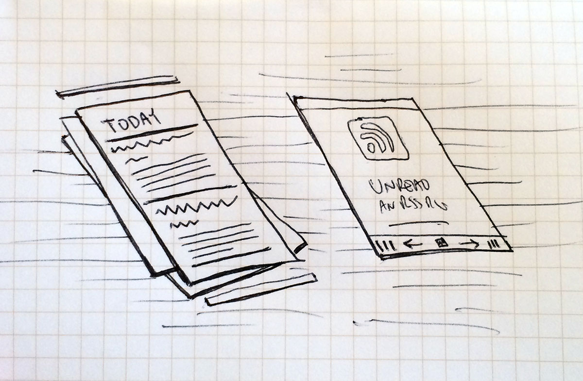
This is how I picture Unread.
Avoid impossible spacial relationships. An example of what not to do is the current New York Times iPhone app. It has a half-hearted implementation of sloppy swiping in which sliding from the screen edge goes back, whereas sliding from anywhere else jumps to an adjacent article.
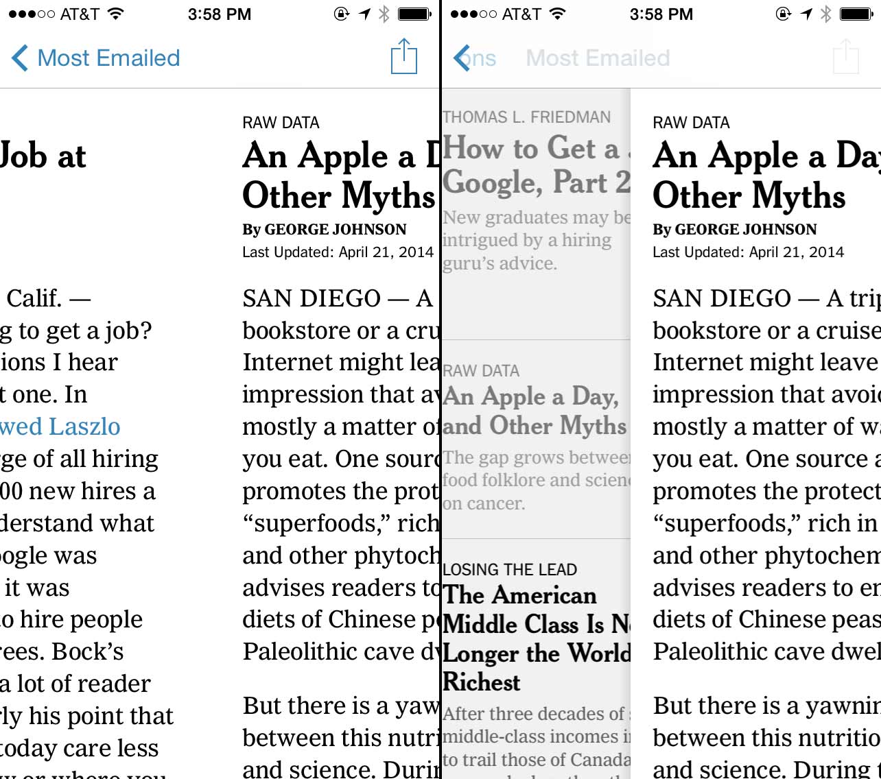
Confusing back gestures.
Unless you’re making a Monument Valley clone, don’t disorient your user with impossible spaces.
III. Encourage Muscle Memory
Our brains are optimized for turning every common task into a muscle memory. It has a lot in common with the way a programmer refactors code to be more efficient and reusable. A muscle memory can be triggered just like a function in a program. It fires off in the background without interrupting the flow of conscious thought.
When incorporating gestures into your app, take advantage of your user’s biology. Encourage the use of muscle memory with gestures that are simple, consistent, and non-destructive. Don’t undermine it with poorly considered gestures.
Sloppy swiping is much more comfortable than screen-edge gestures, but that comfort comes with a hidden cost. Apps must avoid using competing pan gestures to trigger actions like swipe-to-delete.
Mixing gestures for navigation with gestures for actions is a recipe for discomfort. It forces the user to resist her natural inclination to rely on muscle memory. Before touching anything, she has to pause to consciously recall the appropriate gesture for the current screen.
It’s better to use non-competing taps and long-presses to trigger actions, and restrict panning gestures to interactions that drag screen content along with the user’s finger. Destructive gestures should especially be avoided.