Designing Unread for iPad – Part 3
This post is part of my ongoing series of posts1 in which I’m documenting the design of Unread for iPad.
In my previous post in this series, I drew some rough paper sketches of possible layouts, ranging from the typical to the atypical. In thinking through which ones I liked more, I arrived again at a conclusion I’d reached when following the same kind of process for Unread for iPhone: I like apps that are physically comfortable, especially when frequently-used controls can be reached without having to reposition the device in my hand.
Most iPad apps put common controls at the top and bottom of the screen in hard-to-reach navigation bars or tab bars. This sacrifices comfort for the sake of familiarity. I’d rather Unread make the opposite sacrifice. The most comfortable areas to reach with one’s thumbs on an iPad are the outer edges of the screen, vertically-centered. These areas are right next to your hands if you’re holding your iPad in a typical grip. This is true of both one-handed and two-handed operation.
So this is my first design constraint: wherever possible, controls and navigation should be accessible within those comfort areas. Constraints are a necessity if I hope to finish my design in a reasonable amount of time. Like performing a gram stain on an unidentified bacterial culture, a hard design constraint decisively eliminates whole swaths of possibilities, whittling down the project to a more manageable scope.
Every screen in Unread needs a way to present a menu of options. Some screens have few options, others have many. I can only think of a few solutions to this problem within my primary constraint:
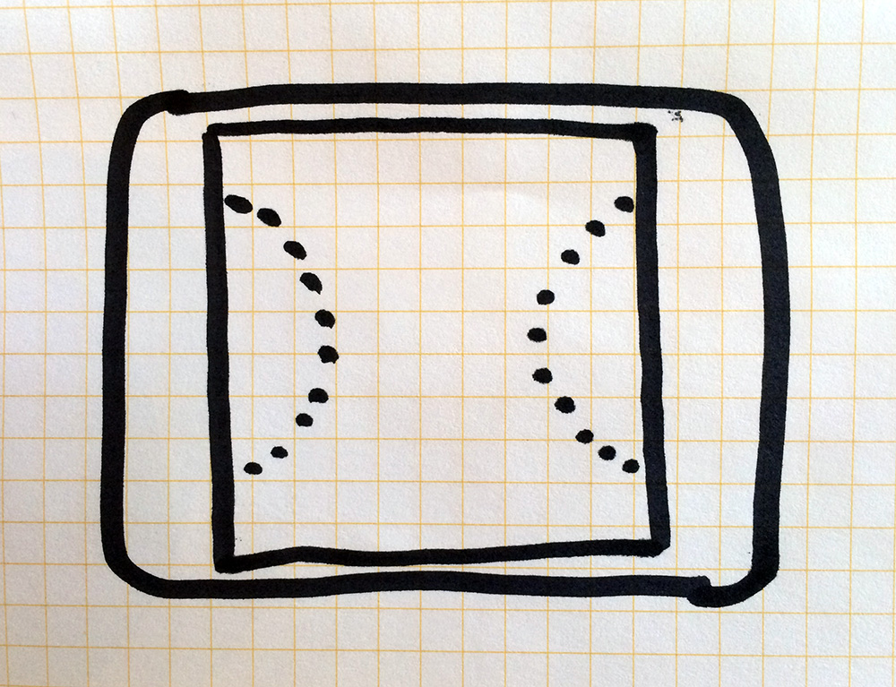
Persistent Vertical Toolbar
I could place a persistent vertical toolbar along the righthand edge of the screen. This would consist of a single column of icons without text labels.
Persistent vertical toolbar.
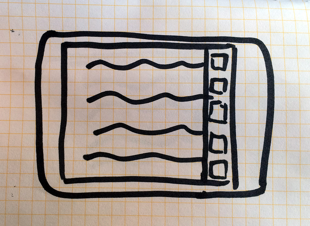
Hovering Options Button
I could place simple hovering button on the right edge of the screen. This could be persistent or transient when scrolling, but would be superimposed over all the other content in the app. Tapping the button would show a temporary options menu overlay (setting aside the options menu layout itself for another day).
Hovering Options Button.
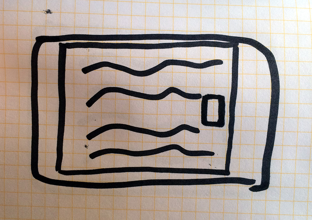
iPhone-Style Options Gesture
I could reuse the sideways pull-to-refresh gesture that I used in the iPhone app, with the transient options menu mentioned above.
iPhone-Style, unobscured content.
The persistent vertical toolbar won’t work for two reasons. First, it’s distracting, which undermines my overall goal of a comfortable reading experience. Second, icons alone aren’t enough to explain what certain options do. An icon button with a text label is more informative than the sum of its parts.
The hovering option button would be better than the persistent toolbar, but its still a distracting smudge on the interface.
So my best choice is to stick with the good solution I’ve already used on the iPhone. I could have intuited this from the beginning and saved a day of work, but it helps to think it through anyway. It’s not enough to have a good design. You have to be able to convince other people why your design is good.
-
Though I began this series as a video podcast, I think it makes more sense to continue it in whatever form makes sense for each stage. ↩