Working With Designs That Require Display Versus Text San Francisco Fonts
Some designs I receive from clients call for specific weight and family combinations for user interface fonts. Use a display font here, and a text font there. This is true of both custom fonts and system-provided fonts. Apple seems to encourage this level of finesse with system fonts in their online design resources. There are several distinct families in the downloadable San Francisco fonts available on the Apple developer site.
When requesting a system font in code, the UIFont returned will either be a display or a text font, depending on the API you use. For the systemFont(ofSize:weight:) API, the cutoff is in the neighborhood of 22 points, above which you’ll get a display font and below which a text font. Other APIs like preferredFont(forTextStyle:) might return a display or a text font regardless of point size. This is great for general purposes. An inexperienced designer can use whichever API is closest to their needs and receive a font whose family is a best-fit for that size, weight, and the characteristics of the current display.
However there are times when an experienced designer needs to specify not just a weight and a point size but also a family. In those situations, it is difficult for the developer to satisfy the design requirements. If you’re using a custom font bundled with your application, then you can create a font descriptor quite easily:
let descriptor = UIFontDescriptor(fontAttributes: [
    UIFontDescriptorNameAttribute: MY_FONT_NAME
    ])
If you need to do this with the San Francisco fonts, it is much more difficult. There are only two ways I know of to do this.
Yucky Hack
You can make some educated guesses about the behavior of the UIFont APIs and do something like this:
let textFont = UIFont.systemFont(ofSize: 6)
// .SFUIText 6pt, used for font name

let titleFont = UIFont.preferredFont(forTextStyle: .title1)
// .SFUIDisplay-Light 28pt, used for point size

let descriptor = UIFontDescriptor(fontAttributes: [
    UIFontDescriptorNameAttribute: textFont.fontName
    ])
let desiredFont = UIFont(
    descriptor: descriptor,
    size: titleFont.pointSize)
// .SFUIText 28pt, combo of desired traits
Very Yucky Hack
A more reliable but even yuckier solution: you can bundle the downloadable fonts from the developer site, and reference them by name in a font descriptor:
let descriptor = UIFontDescriptor(fontAttributes: [
    UIFontDescriptorFamilyAttribute: "SF UI Text",
    UIFontDescriptorFaceAttribute: "Semibold"
    ])
This bloats the size of your app bundle but at least you can guarantee that you’re always using a display or text font when you need one or the other.
Why Does This Matter?
To illustrate why this matters, please consider the following example. While the anecdote below is partially contrived, it’s representative of the kind of design problems I’ve had to solve on actual projects. I think it serves as a useful illustration of the shortcomings of the current UIFont APIs.
Consider a tvOS app with a horizontal collection view of cards. As each card takes the center spot, it receives focus and enlarges to about twice its unfocused size. Each card contains some body text.
Lets assume for the sake of this example that a variation of SF UI Display will be vended from whichever system font API is used to request a 44 point regular weight font.
Which font family would actually be preferable for the text on these cards? The answer is not straightforward. In the enlarged state, a display font might make sense. At a size of 44 points in the default expanded card state, a text font might look awkward in comparison. A 44 point size is probably large enough to accommodate the characteristics of a display font:
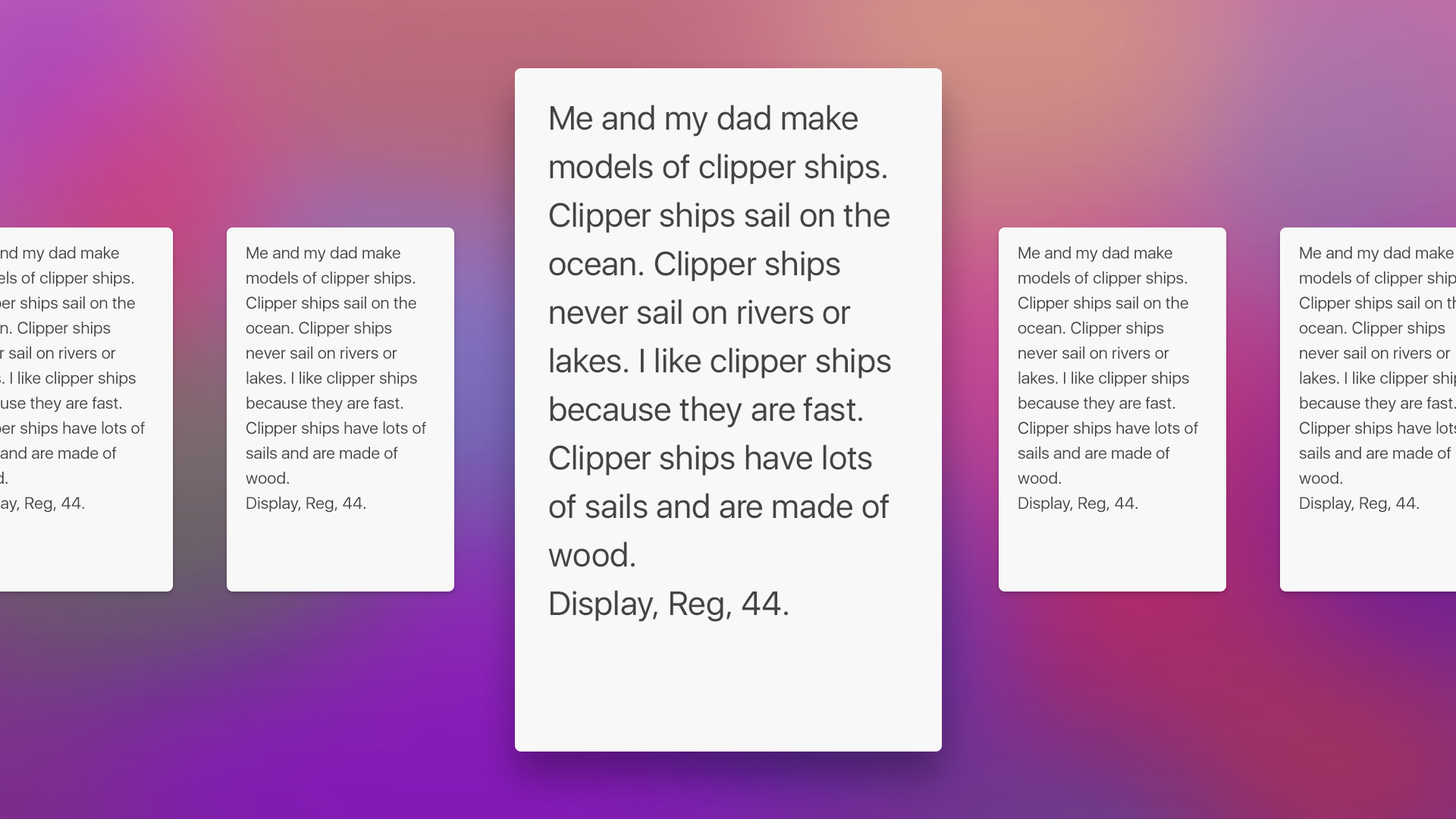
But on the other hand, for every one focused card there are always four unfocused cards (two on either side) visible at all times. If the unfocused card contents are scaled down via a scale transform, then whatever font is used at the focused size (with an identity transform) will be scaled down to a perceived “22 point” size. Note that the text is still laid out using a 44 point display font, but the unfocused card transform results in a perceived size that is much smaller. At this scaled down size, a display font would be harder to read, for example in words like “clipper” or “sail” where lowercase L’s are adjacent to lowercase I’s — especially so when staring across the room at a grainy television.
So what alternatives are there?
One alternative would be to request two fonts: one to layout the text in the focused state, and another when laying out the unfocused state. The problem here is that if this results in a display font at the 44 point size and a text font at the 22 point size, the line fragments will most likely break at different words between the two states, creating confusion for the user during focus update animations:

The more desirable alternative for this design is to always prefer a text font, since this preserves the maximum amount of legibility at all focus states:
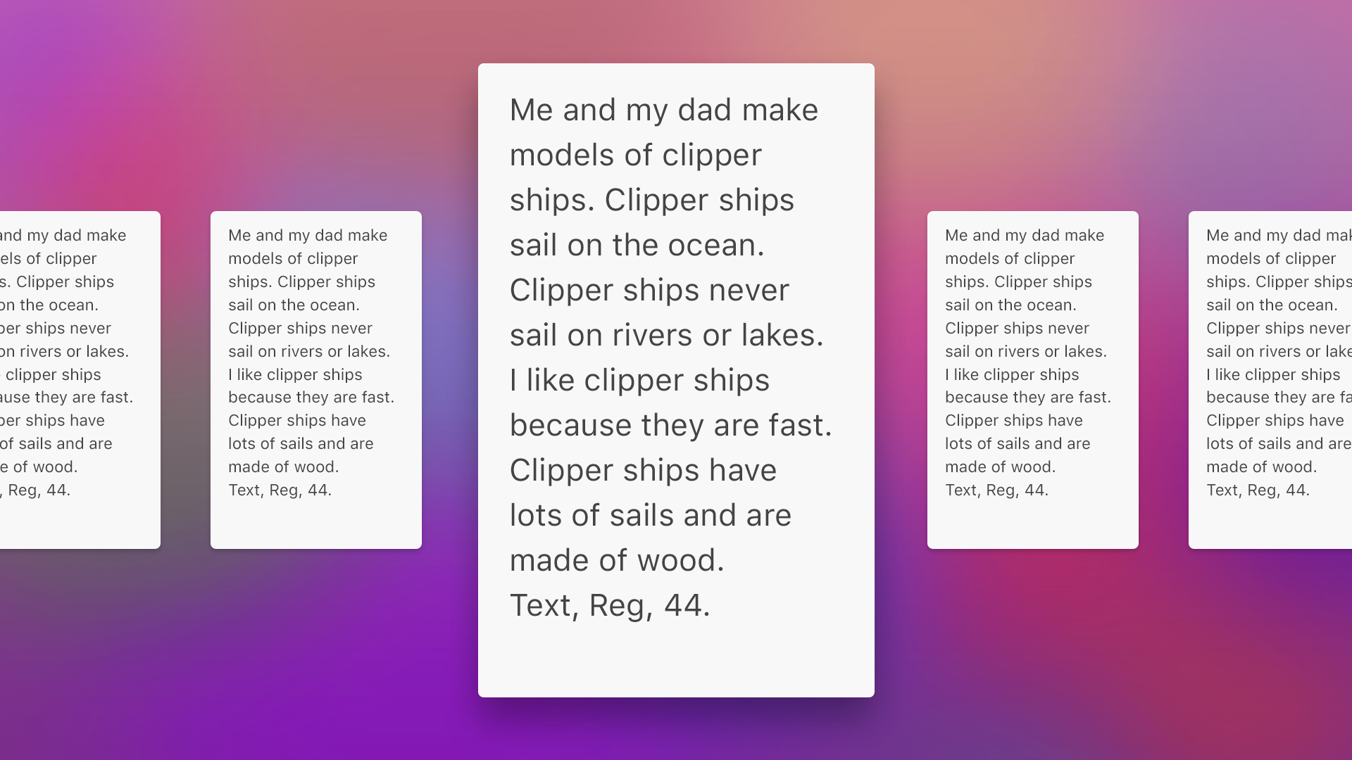
We would use a scale transform to downscale the 44-point identity-transformed text to a perceived 22-point size, preserving legibility in the both the focused/enlarged state and the unfocused/scaled-down state, and without disturbing the line breaks during the transition from one to the other.
Wishlist For Apple
If anyone from Apple is reading, I’d love if ya’ll can add programmatic access to family-based font selection of system fonts:
let bigTextFont = UIFont.systemFont(
    ofSize: 44,
    weight: UIFontWeightRegular,
    family: UIFontFamilyText
)
Stormcrow
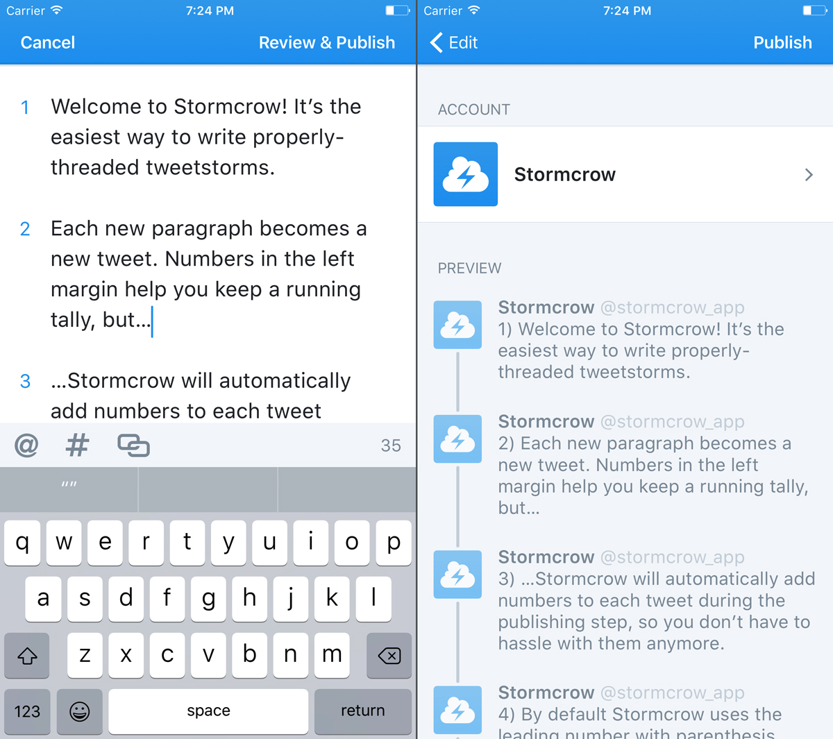
CAPTION_YO
If you’ve ever wanted an easier way to write a properly-threaded tweetstorm, my new app Stormcrow can help. Type all your tweets into a single text view. Stormcrow will automatically separate your paragraphs into a thread of automatically-numbered tweets. Publish them all at once at the tap of a button. Spend less time futzing with reply buttons and counting tweets, and focus on what you’re trying to say.
Stormcrow is available now on the App Store for $2.99 USD.
Swift Needs a Scope Keyword
Swift’s namespacing is great. It’s quite common now to see nested types like this:
class MyViewController: UIViewController {
  private enum State {
    case initialized
    case refreshing(previousModel: Model)
    case success(currentModel: Model)
    case error(Error)
  }
  private var state: State = .initialized {
    didSet { stateChanged(from: oldValue, to: state) }
  }
}
There’s no need for any class outside of MyViewController to access the State enum. Nesting it not only makes the intended usage obvious, it also lets you trim the type name down to a single word by obviating the need for a prefixed name like MyViewControllerState. Other classes are then free to nest their own State enums without worrying about name collisions.
Swift’s namespacing rules also allow you to group together related functions or constants that would otherwise be scoped at the module level:
struct Transformations {
  static func transform(_ foo: Foo) -> Bar {...}
  static func transform(_ bar: Bar) -> Foo {...}
}

struct Colors {
  static let background = UIColor.white
  static let bodyText = UIColor.black
}
Callers can then access a function like transform() without having to access a free function:
let b = Transformations.transform(f)
Please note this does not require the developer to initialize a Transformations instance. It’s hard to tell from my contrived example, but in practice it’s common to find types that would be nonsensical as instances but are nonetheless useful as scope providers.
But here’s the problem: how do you make it obvious to other developers that Transformations isn’t supposed to be initialized? One option: make the init method private:
struct Transformations {
  static func transform(_ foo: Foo) -> Bar {...}
  static func transform(_ bar: Bar) -> Foo {...}
  private init() {}
}
But that solution introduces more problems. First, it’s still not readily apparent that Transformations exists solely to provide a namespace. Second, this API pattern requires you to remember to make the init method private for every such type you ever create, which is a hassle. This is why the de rigueur solution right now is to use a caseless enum:
enum Transformations {
  static func transform(_ foo: Foo) -> Bar {...}
  static func transform(_ bar: Bar) -> Foo {...}
}
But this too is confusing because it’s not obvious that Transformations is meant to provide a namespace. It’s not really an enum. This is especially problematic in real-world examples where the functions and members of such a type are lengthy, making it impossible to tell at a glance whether there are any case declarations hidden somewhere in the file. It also does not prevent other developers from misunderstanding your intent and adding cases to the enum in the future.
I propose that Swift introduce a new scope keyword to address this common use case. My simple example might then look like this:
scope Transformations {
  static func transform(_ foo: Foo) -> Bar {...}
  static func transform(_ bar: Bar) -> Foo {...}
}
A scope can be declared the same way as structs, enums, and classes:
scope TYPENAME {
  // body
}
A scope can be declared either at a module level or nested within any type that supports nested types, including another scope:
scope OuterTurtle {
  scope MiddleTurtle {
    scope InnerTurtle {
    }
  }
}
A scope cannot be initialized, therefore a scope cannot have instance-level properties or methods. All methods and properties of a scope must be static. However, as a convenience the static keyword can be omitted since this is always implied:
scope Endpoints {
  scope Users {
    func getUser(withId id: String) -> Endpoint {...}
    func followUser(withId id: String) -> Endpoint {...}
  }
}
Scopes support the same access levels as other Swift types:
public scope Foo {
  public let qux = Bar.baz
  private scope Bar {
    let baz = "Baz"
  }
}
If you think this would be useful, please get in touch with me on Twitter.
How To Write The Software
From an interview with a career SR-71 pilot:
Q: So if I’m understanding the whole startup process is kind of like this space age Model T, where you cranked it just to get the engine up to speed?
A: Yeah. It’s just amazing, and points out a hallmark of the Skunk Works. Don’t waste energy on something you have a solution for. You’ve got a lot of things to worry about already: how to keep the glass from melting at speed, how to keep the engines running at high speeds for long periods, how do you keep the fuel from exploding. If someone had a simple solution to something, then that’s what they did. A very unique, very pragmatic approach. It was also part of the mystique of the thing, this fifty foot green flame shooting out from each engine on startup.
Source: SBNation
Tangential Thinking
I don’t know if this term is one somebody else coined, or if it has other meanings elsewhere, but what it means to me is clear. Life is a series of points on a curve of no discernible shape. No orderly function produced it. There are as many bends and folds as there are numbingly straight passages. The only guarantee is that, as it has bent before, it will bend again. The chief mistake of the student of this line is to project its future course as a tangent from the present. Someday it will bend away from that projection, and the tangent that seems so sure now will vanish. This mistake is easy to make. There are many straight passages, some so long as to suggest a guiding hand. If there is a guiding hand, it seems bent on tempting the complacent into despair and the despairing into complacency. Guard your mind against both temptations.