Pencil Stylus Review
Since I received one last week, I’ve been jotting and sketching with a Pencil stylus from Fifty Three, makers of the Paper drawing app for iPad. Paper, which was already my favorite iOS app, promised to be even better when paired with the Pencil stylus. That promise is mostly fulfilled.
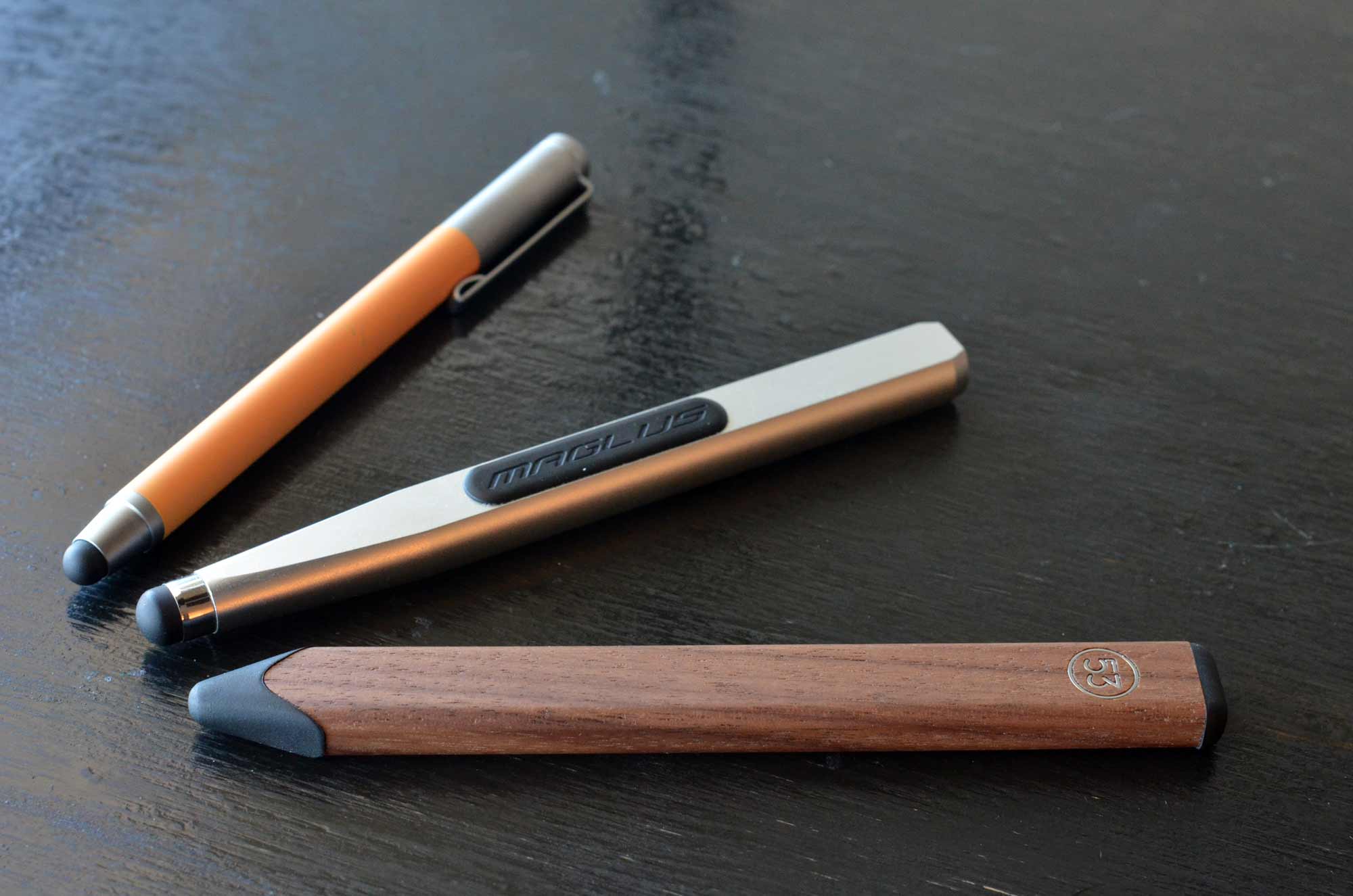
From bottom: Pencil, Maglus, and Bamboo styluses.
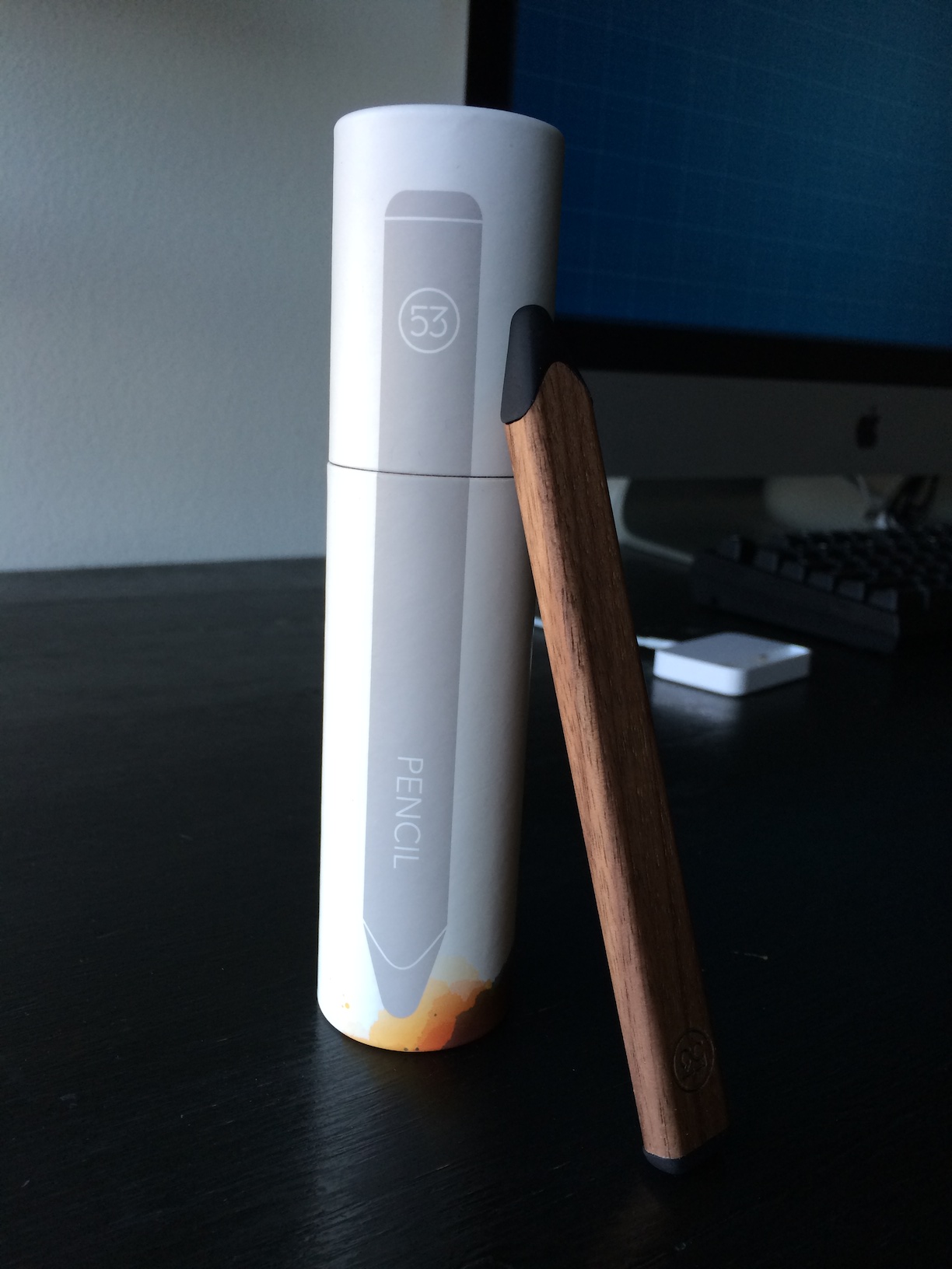
My Pencil arrived packaged in a cute cardboard tube that opens from the top like a tiny diploma canister. Pencil communicates wirelessly with the Paper app via Bluetooth, so there is an internal battery that requires charging. A warning label on a protective wrapper around the stylus reminded me about the battery. Fortunately, my stylus was already fully charged.
Pairing the stylus was easy. A short video showed me how to do it. You press the tip of the stylus against a spot on the left edge of the tool tray. It pairs after pressing and holding that spot for a few seconds — faster than I was expecting, but not as fast as I would like. It is disappointing that the stylus must be re-paired after an extended period without using it. In practice, I have found that I need to pair the stylus every time I pick up my iPad. Your experience may differ, since I probably use my iPad less than most folks.
You don’t need to pair Pencil to use it as a stylus. Pairing is only necessary to unlock the features specific to the Paper app. You can see these features here. All of them work as advertised, almost without caveat. Even the palm rest detection was perfect. The eraser was the only new feature to give me trouble. The eraser tip’s shape, a wide thin rectangle, is different from the shape actually used by the app, a small circle. This makes it hard to judge what areas you’ll actually be erasing.
As a stylus, Pencil is better than most of the others I’ve tried, but it is not the best. That accolade still belongs to the Maglus by Applydea.
Pencil’s tip collapses easily and requires too much force to trigger a touch recognition. This is a common problem with every stylus I’ve used except the Maglus. The black material at Pencil’s tip may be resilient, but it feels fragile. It buckles under the tip of my finger. By comparison, the Maglus’ tip is sturdy, and feels paradoxically stiffer as I apply more and more force. The tip retains more of its resting shape under pressure than the tips of other styluses, making the Maglus the most accurate stylus I’ve used.
Like the Maglus, Pencil is shaped like a carpenter’s pencil, though Pencil’s shape is much closer to the real thing. Pencil’s body feels smooth and light — too light, I think. I ordered the walnut version. It’s definitely machined from real wood, but hollowed out until the walls of the stylus are thin. A matte finish was applied thinly over the fine grain, leaving behind a satisfying texture. The part line where the black tip meets the wood exterior would benefit from higher manufacturing tolerances. This part line is where the electronics separate from the body when you need to recharge the battery. There’s a distracting contrast there, unfortunately placed right where your fingers spend the most time. I feel anxious that I might break what feels like a fragile seal.
In contrast, the Maglus is a tank, constructed from a solid piece of aluminum. It’s pleasantly heavy and practically indestructible. Both Pencil and the Maglus have magnets embedded in their bodies to make it easy to stow them on your iPad’s Smart Cover or on the side of a filing cabinet. Pencil’s magnet is much weaker than the Maglus’ magnet, and placed near the eraser end, making it harder to attach it to your iPad with confidence. The Maglus’ magnet is in the middle, right under the black rubber skids, and is so strong that I don’t think I could ever accidentally brush it off.
If you love the Paper app as much as I do, you’ll find that Pencil is an indispensable companion when using that app. While it isn’t the most comfortable or accurate stylus you can find, the features it unlocks in the app are enough to overcome its weaknesses. On the other hand, if you are looking for a general purpose stylus, the Maglus still can’t be beat. The Bamboo stylus, pictured above, is the best alternative for folks looking for something that feels more like a pen than a carpenter’s pencil.
Accessible No. 4: “They’re Not Stupid”
I was a guest on this week’s Accessible podcast by Steven Aquino and Ben Alexander. We talked about teaching Siri to understand folks who stutter; how my wife is much smarter than me; what Ellie Sattler’s Jurassic fern frond has to say about iOS 7; web leather, mobile leather; and how a pile of dog parts on your living room floor doesn’t make a Lassie.
Tumblr's iOS App Updated for iOS 7
This app is unabashedly my vote for the best iOS-6-to-iOS-7 redesign I’ve seen. It retains the spirit and flavor of the previous version, while still treading safely within the new flatness dictated by iOS 7. Get it here.
Playful animations are easy to spot but not overbearing, which is difficult to achieve. My favorite animation is the animating hearts when tapping a like button (I sure hope people don’t get push notifications every time I tap a heart button, because I can’t keep myself from tapping them again and again).
If I could change one thing, it would be the use of the blurring views behind the status and navigation bars. They’re so heavily tinted blue that the resulting effect is a distracting flicker when scrolling. The true purpose of iOS 7’s blur is to create the illusion that your “content” is always visible, even from behind a navbar. This goal would be better achieved in Tumblr’s case by using semi-translucent non-blurring blue bars.
Hidden Goodies in OvershareKit
Together with Justin Williams, I recently announced an open-source iOS sharing library called OvershareKit (available on GitHub). It makes it trivial to add rich sharing options to your iOS apps. There’s enough material in OvershareKit to warrant many blog posts, but I figure I should start with some of the cooler bits that you might not discover right away:
OSKTextView: A Better UITextView
OvershareKit comes with OSKTextView, a fork of JTSTextView, my open source UITextView wrapper (until Apple fixes some bad iOS 7 bugs with UITextView). The OvershareKit version has some nifty additions. It can highlight links, hashtags, and @mentions as you type. You can move the cursor with the Riposte-style swipe gestures: one finger to move by character, two fingers by words, and three fingers by paragraphs. It also automatically converts dumb quotes to smart quotes.
Built-In Support for In-App Purchases
This was Justin’s killer idea. Your app may have certain sharing activities that require in-app purchases (e.g. Riposte only shows the OmniFocus and Things options if you’ve upgraded to Riposte Pro). Why hide those from the share sheets, when OvershareKit could do more? Once you mark your chosen activity types as requiring in-app purchase, OvershareKit will badge those activity icons with little price tag indicators until they’re purchased. If a user taps one of them, OvershareKit queries the relevant OSKPresentationManager delegate for your custom purchasing view controller. You are still responsible for making the purchase from the App Store, and for storing/validating purchase receipts.
Optional Dark Mode
More and more customers are realizing how nice it is when an app shifts to a low-light mode or “dark mode” during evening hours. OvershareKit has an optional dark mode setting, which you can trigger through the OSKPresentationManager’s style delegate. You can also customize many of the default colors.
1Password Buttons
The username / password screens in OvershareKit show 1Password search buttons if that app is installed. Tapping the button launches 1Password with a search query based on the activity, e.g. “Instapaper.” This logic is based on some open source code I wrote for Riposte, available on GitHub.
Account Management
With the exception of Pocket, all third-party services in OvershareKit support multiple accounts. We included an account management screen that you can use to add or remove accounts for each service. You can see the accounts screen in the sample app by tapping the left navigation bar button from the app’s main screen. You’ll know best where this screen should live in your application.
VoiceOver and Localization
OvershareKit’s views and alerts have 100-percent VoiceOver coverage. All user-facing strings are in English, but you can provide localizations via the localizationDelegate of OSKPresentationManager. Never ship an app without VoiceOver, and never ship a new design without testing its accessibility implications first. Ask your users for help. You probably already have some tech-savvy users with visual or other impairments that would love to join your beta team. Look for smart folks like Marco Zehe and Steven Aquino.
“Form Follows Function” Is More Complicated Than iOS 7 Thinks
Dave Brasgalla has an interesting write-up on the iconography of the first Alien film and its parallels to the iconography of iOS 7. In the course of his article, he offers his take on iOS 7:
For my part, I have a very positive feeling towards iOS 7, for one main reason: it brings computer iconography firmly back around to concentrating on communication rather than illustration – function over form. This is the realm of the graphic designer, where informed decisions about composition and colour create successful, strong symbology that will outlast trends, and is applicable over multiple uses.
I think everything he writes makes sense, but I also think what he says is totally irrelevant to why most people buy and enjoy iPhones and iPads.
People don’t choose an iOS device out of respect for Apple’s adherence to formal design principles. They are only dimly aware, if at all, of the design battles being waged between people who make apps and smartphones for a living. People buy iPhones and iPads because they are the first computers that you can use without feeling stupid.
The warm, evocative design of iOS 1 through 6 made using a computer easy and fun. For many, many people, this was an entirely novel experience. Most people had only ever owned or used clunky, complicated Windows PCs for work or school. It was walking on egg shells, and it was never fun. The iPhone changed all that.
Designers with more rarified tastes may cringe at torn paper textures and green felt, but these extremes were the exceptions, not the norm. This bears repeating: the sqeuomorphic excesses of iOS 1-6 were the exception, not the norm. The norm was much more nuanced. The aesthetics were focused on making things intuitive and fun:
Notes.app Icon: On iOS 6, the Notes.app icon was a little roundrect version of a yellow legal pad. It was warm, cute, and — most importantly — easy to understand. It immediately conveyed its purpose: this is for jotting down notes. The new icon looks like nothing at all. It has been designed with strict adherence to Apple’s new formal visual rules for their app icons, but only against that metric could it be called a success. The new icon puts form before function.
Buttons: On iOS 6, buttons had subtle gradients and borders, not as whizz-bang, but to make it abundantly clear where you were being invited to tap — just as sidewalks make it abundantly clear where you are being invited to walk. On iOS 7, it is often impossible to tell what is a button and what is not.
Slide-to-Unlock: On iOS 1-6, the lock screen slider was composed of a sliding button and a track. It was so easy to understand that babies literally figured it out on their own. The springy physics were reminiscent of the spring-loaded locks on gym locker doors, which helped both convey the slider’s purpose and how to use it. On iOS 7, the obvious slider has been replaced by a tiny chevron on de-valued visual footing against many similarly-colored elements. There is no visual affordance for how the unlock gesture is supposed to work. The “slide to unlock” text label is still there, but a) it doesn’t specify what or where you are supposed to slide, and b) is so thin and glittery that it is often impossible to read. Try starting a turn-by-turn Maps.app session and then look at your lock screen. It’s incomprehensible.
We’ve all heard the old design adage that “form follows function.” Those of us who make apps for a living have heard it so many times that it’s easy to ignore it as trite. In reality it is very difficult to adhere to that principle. It is difficult because separating form from function is a messy exercise. It must be done delicately, and with respect for what our users think and feel.
On iOS, putting function before form is not as simple as paring down icons to a strict grid and color palette. There are functions beyond literal communication that iOS designers must balance. Making icons warm and inviting serves many deeper purposes. It builds your confidence in the device. It makes you feel in control. It sets your mind and thumbs at ease. It communicates through feeling and memory, and when done well, resonates with human experience in a way that PCs never could.